grid
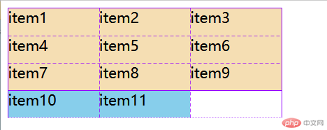
1.隐式网格
<!DOCTYPE html><html lang="zh-CN"><head> <meta charset="UTF-8"> <meta http-equiv="X-UA-Compatible" content="IE=edge"> <meta name="viewport" content="width=device-width, initial-scale=1.0"> <title>Document</title> <style> .container{ width: 300px; height: 120px; display: grid; grid-template-columns:repeat(3,1fr); grid-template-rows:repeat(3,1fr); /* 行优先 */ grid-auto-flow: row; /* 设置1fr 则可以让隐式网格完整均匀的显示 */ grid-auto-rows: 1fr; } .container .item{ background-color: wheat; } .container .item.other{ background-color: skyblue; } </style></head><body> <div class="container"> <div class="item">item1</div> <div class="item">item2</div> <div class="item">item3</div> <div class="item">item4</div> <div class="item">item5</div> <div class="item">item6</div> <div class="item">item7</div> <div class="item">item8</div> <div class="item">item9</div> <div class="item other">item10</div> <div class="item other">item11</div> </div></body></html>
2.对齐的前提
- 对齐前提: 必须存在”剩余空间”
- 对齐方案: “剩余空间”在”项目”之间的分配方式
- “剩余空间”在grid中主要是容器和单元格
- 容器中: place-content, place-items项目中: place-self
项目在”容器”中的对齐:
place-content: 垂直方向 水平方向;默认值: 垂直居上, 水平居左place-content: start start;垂直居中,水平居右place-content: center end;全部居中place-content: center center;垂直两端对齐 水平分散对齐place-content: space-between space-around;垂直分散对齐 水平两端对齐place-content: space-around space-between;全部两端对齐place-content: space-between;全部分散对齐place-content: space-around;
2. 项目在”单元格”中的对齐
单元格中必须要有剩余空间, 即: 项目 < 单元格 place-items: 垂直方向 水平方向; place-items: start start;(默认值)place-items: center end;place-items: center center;
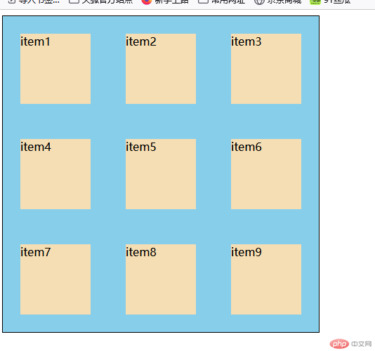
3.设置设置某个项目在单元格对齐方式(与众不同),只需要用到伪类选择器即可 单一设置
<!DOCTYPE html><html lang="zh-CN"><head> <meta charset="UTF-8"> <meta http-equiv="X-UA-Compatible" content="IE=edge"> <meta name="viewport" content="width=device-width, initial-scale=1.0"> <title>Document</title> <style> .container{ display: grid; grid-template-columns:repeat(3,100px); grid-template-rows:repeat(3,100px); } .container .item{ background-color: wheat; } /* 创建剩余空间 */ .container{ width: 450px; height: 450px; border: 1px solid black; background-color: skyblue; /* 改变项目在容器内的排列 */ place-content: space-around; } </style></head><body> <div class="container"> <div class="item">item1</div> <div class="item">item2</div> <div class="item">item3</div> <div class="item">item4</div> <div class="item">item5</div> <div class="item">item6</div> <div class="item">item7</div> <div class="item">item8</div> <div class="item">item9</div> </div></body></html>
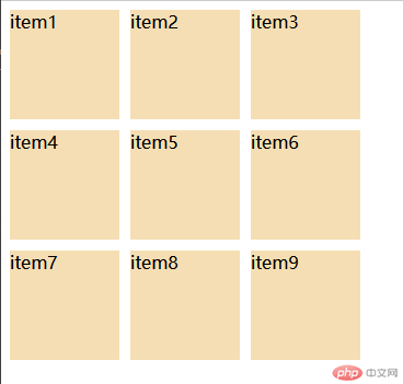
3.行列间隙的设置方式
<!DOCTYPE html><html lang="zh-CN"><head> <meta charset="UTF-8"> <meta http-equiv="X-UA-Compatible" content="IE=edge"> <meta name="viewport" content="width=device-width, initial-scale=1.0"> <title>Document</title> <style> .container{ display: grid; grid-template-columns:repeat(3,100px); grid-template-rows:repeat(3,100px); /* 不使用margin 只需要使用gap即可*/ /* gap:垂直方向 水平方向 */ gap: 10px; } .container .item{ background-color: wheat; } </style></head><body> <div class="container"> <div class="item">item1</div> <div class="item">item2</div> <div class="item">item3</div> <div class="item">item4</div> <div class="item">item5</div> <div class="item">item6</div> <div class="item">item7</div> <div class="item">item8</div> <div class="item">item9</div> </div></body></html>
