

作业
盒模型知识点 以及位置大小计算
- 边框的样式有:solid(实线),dashed(虚线),dotted(电线)。
- border(边框)以内的盒子区域 统称为盒子的可视区域,内容只能出现在width和height设置的区域。
- marigin(外边距)主要用来改变盒子的位置关系,只影响到盒子的排列位置,不影响大小。padding(内边距)主要用来改变内容的位置关系。
- 默认盒子的计算公式:内容区+内边距+边框,
盒子模型的实际宽度 : width+左右padding+左右border,
盒子模型的实际长度 : width+上下padding+上下border。
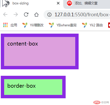
box-sizing
- box-sizing属性允许我们在元素的总宽度和高度中包含填充和边框
- 盒模型box-sizing尺寸有两种:content-box 和 border-box; 默认的是 content-box; 区别是两者的盒子的宽度是否包含边框和内边距.
<!DOCTYPE html><html lang="zh-cn"><head><meta charset="utf-8" /><title>box-sizing</title><style>.test {width: 200px;height: 70px;padding: 10px;border: 10px solid blueviolet;box-sizing: content-box;background: plum;}.test2 {width: 200px;height: 70px;padding: 10px;border: 10px solid blueviolet;box-sizing: border-box;background: palegreen;margin-top: 20px;}</style></head><body><div class="test">content-box</div><div class="test2">border-box</div></body></html>
绝对定位和相对定位
-绝对定位的应用
<title>绝对点位</title><style>p {position: absolute;width: 120px;height: 120px;top: 100px;left: 0px;background-color: gold;}div {position: absolute;width: 300px;height: 300px;top: 80px;left: 180px;border: 1px solid;background-color: honeydew;}</style></head><body><p>相对于页面定位,距离页面的顶部100像素,距离左边0像素</p><div>相对于页面定位的div元素,距离顶端80像素,距离左边180像素<p>相对于父元素div定位的,距离div元素的顶端100像素,距离div元素的左边0像素</p></div></body>
运行结果
相对定位
<title>相对定位</title><style>div {width: 200px;height: 400px;border: 1px solid;margin-left: 80px;margin-top: 100px;}p {width: 150px;height: 100px;background-color: #c8edff;}.left {position: relative;left: -50px;}.right {position: relative;left: 140px;}</style></head><body><div><p>正常段落的状态</p><p class="left">相对自己的正常位置向左偏移了50像素</p><p class="right">相对自己的正常位置向右偏移了140像素</p></div></body>
运行结果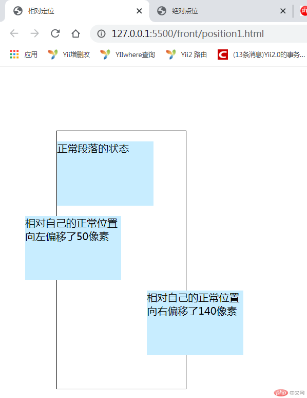
固定定位和绝对定位的区别
固定定位于绝对定位最根本的区别还是偏移基准的不同,固定定位是相对于浏览器窗口,而绝对定位是相对于父级元素。
<head><meta charset="UTF-8" /><title>固定定位和绝对定位</title><style>#gd {width: 300px;height: 300px;background: plum;position: fixed;}#jd {width: 300px;height: 300px;background: greenyellow;position: absolute;left: 400px;top: 400px;}</style></head><body><div id="jd">我是绝对定位,我的位置会随着窗口大小变化</div><div id="gd">我是固定定位,我的位置不会随着浏览器滚动条变化</div></body>
运行结果对比

绝对定位实现垂直居中
<head><meta charset=" utf-8" /><title>垂直居中</title><style type="text/css">* {margin: 0;padding: 0;box-sizing: border-box;}.father {background-color: yellowgreen;width: 500px;height: 500px;margin: 0 auto;position: relative;}.children {background-color: red;position: absolute;width: 200px;height: 200px;top: 0;left: 0;right: 0;bottom: 0;margin: auto;}</style></head><body><div class="father"><div class="children">垂直居中</div></div></body>
运行结果
绝对定位实现两列布局
<head><meta charset="UTF-8" /><title>两列布局</title><style>* {margin: 0px;padding: 0px;}.main {background: powderblue;position: relative;overflow: hidden;}.border {background-color: lightgreen;border: 2px solid red;height: 300px;}.left {width: 200px; /*定宽的列*/height: 600px;}.right {width: 100%; /*自适应宽度的列*/height: 600px;position: absolute;top: 0px;left: 220px;}</style></head><body><div class="main"><div class="left border"></div><div class="right border"></div></div></body>
运行结果
浮动实现三列布局
<head><meta charset="UTF-8" /><meta name="viewport" content="width=device-width, initial-scale=1.0" /><title>三列布局</title><style>@import url(buju3.css);</style></head><body><!-- 头部 --><div class="header"><div class="content"><ul><li><a href="">首页</a></li><li><a href="">秒杀</a></li><li><a href="">团购</a></li><li><a href="">精品女装</a></li><li><a href="">客服</a></li></ul></div></div><!-- 主体 --><div class="container"><div class="left">左侧</div><div class="main">内容</div><div class="right">右侧</div></div><!-- 底部 --><div class="footer"><div class="content"><p>这是 底部 ,没啥好写的</p></div></div></body>
/* buju3.css代码(初始化开始) */* {margin: 0;padding: 0;box-sizing: border-box;}a {/* 去掉下滑线 */text-decoration: none;color: red;}/* 鼠标悬停改变颜色 */a:hover {color: yellowgreen;}/* 列表去掉小黑点 */li {list-style: none;}/* ( 初始化结束)头部和底部 */.header,.footer {height: 40px;background-color: lightcyan;}.content {width: 1000px;margin: auto;}.content:first-of-type li {float: left;padding: 0 20px;line-height: 40px;}.footer {text-align: center;line-height: 40px;}/* 主体内容区 */.container {width: 1000px;background-color: thistle;margin: 20px auto;/* 绝对定位(设置为定位父级) */position: relative;min-height: 550px;}/* 左侧 */.left {width: 200px;background-color: yellow;min-height: 550px;/* 绝对定位 */position: absolute;top: 0;left: 0;}/* 左侧 */.right {width: 200px;background-color: yellow;min-height: 550px;position: absolute;top: 0;right: 0;}.main {width: 600px;background-color: slateblue;min-height: 550px;position: absolute;top: 0;left: 200px;}
运行结果
<head><meta charset="UTF-8" /><meta name="viewport" content="width=device-width, initial-scale=1.0" /><title>圣杯布局(三列布局)</title><style>.container {margin-top: 100px;overflow: hidden;padding: 0 200px;}.container * {min-height: 400px;float: left;}.container > .left,.container > .right {width: 200px;background-color: teal;}.container > .main {width: 100%;background-color: tomato;}.container > .left {margin-left: -100%;position: relative;right: 200px;}.container > .right {margin-left: -200px;position: relative;left: 200px;}</style></head><body><div class="container"><div class="main">内容</div><div class="left">左侧</div><div class="right">右侧</div></div></body>
运行结果