

flex实现PC三列布局
HTML代码:
<!DOCTYPE html><html><head><title>flex实现PC三列布局</title></head><body><header><a href=""><img src="https://dgss0.bdstatic.com/5bVWsj_p_tVS5dKfpU_Y_D3/res/r/image/2017-09-27/297f5edb1e984613083a2d3cc0c5bb36.png"></a><a href="">首頁</a><a href="">熱門</a><a href="">推薦</a><a href="">推荐</a><a href="">登录</a></header><div class="container"><aside>左边栏</aside><main>中心内容区中心内容区中心内容区中心内容区中心内容区中心内容区中心内容区中心内容区中心内容区中心内容区中心内容区中心内容区中心内容区中心内容区中心内容区中心内容区中心内容区中心内容区中心内容区中心内容区中心内容区中心内容区中心内容区中心内容区中心内容区中心内容区中心内容区中心内容区中心内容区中心内容区</main><aside>右边栏</aside></div><footer><p>******版权所有 © 备案*********</p><p>地址:*****************</p></footer></body></html>
CSS代码:
*{margin: 0px;padding: 0px;box-sizing: border-box;}body{/*自适应 不设宽度 */display: flex;flex-flow: column nowrap;/*border: 1px solid green;*/}header{height: 50px;display: flex;background-color: black;/*header默认是flex-flow:row方向 nowrap不换行*//*设置交叉轴的对齐方向 居中*/align-items: center;}/*设置a链接样式*/a{text-decoration: none;color: white;}/*设置header下的A项目 基本属性:增长比例 缩减比例 默认大小 */header > a{/*设置项目 不可以增长 可以缩减 宽度100px*/flex: 0 1 100px;/*文本内容居中*/text-align: center;}/*设置logo图片大小*/header > a >img{width: 60%;}/*将logo撑开 是导航元素向右推*/header > a:first-of-type{/* 方法一:margin-right 把导航元素向右推 *//*margin-right: 50px;*//* 方法二:给flex 不增长 不缩减 基础宽度定200px*/flex: 0 0 200px;}/*margin-left:auto 将“登陆按钮”向最右边推*/header > a:last-of-type{margin-left: auto;}/*排除第一个A元素的鼠标经过效果*/header > a:hover:not(:first-of-type){color: orange;}/*主题区设置*/.container{/*设置flex*/display: flex;/*最小高度支撑显示*/min-height: 400px;/*主轴的对齐方式:两端对齐*/justify-content: space-between;}/*左右栏 */.container > aside{background-color: green;/*设置不增长 不缩减 基本宽度200px*/flex: 0 0 200px;}/*设置中心内容区*/.container > main {/*开启不增长 不缩减 基本宽度600px*/flex:0 0 600px;}/*底部设置*/footer{height: 100px;background-color: black;color: white;/*设置flex*/display: flex;/*设置主轴:column方向 nowarp不换行*/flex-flow: column nowrap;/*主轴 水平居中*/justify-content: center;/*文本内容居中*/text-align: center;/*和上一样 达到居中效果*//*align-items: center;*/}/*媒体监控 *//*当屏幕宽度小于900PX,隐藏右边栏,中间内容区自适应*/@media screen and (max-width: 900px){aside:last-of-type{display: none;}/* 主体区自适应大小变化 */.container > main {flex: auto;}}/*当屏幕小于700px,隐藏导航,左右边栏,页脚*/@media screen and (max-width: 700px){footer,aside,header > a:not(:first-of-type):not(:last-of-type){display: none;}}
默认运行结果: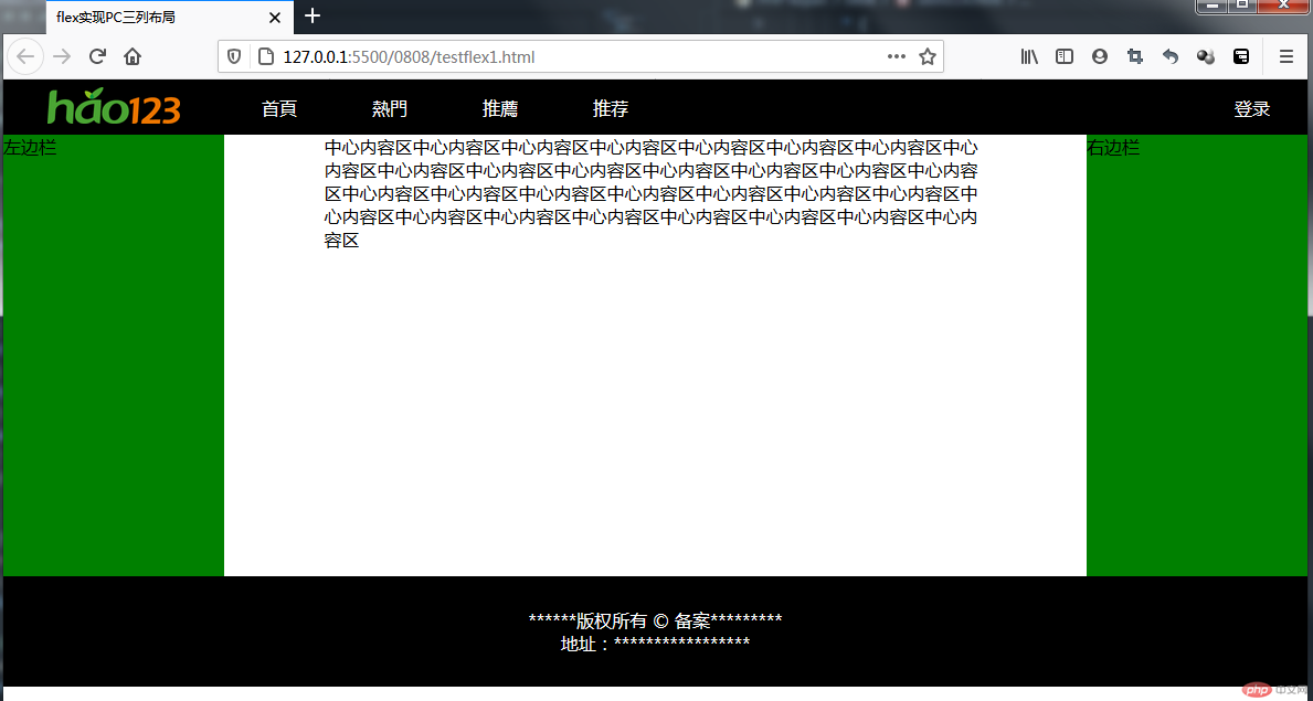
监控max-width:900px: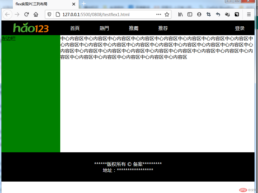
监控max-width:700px: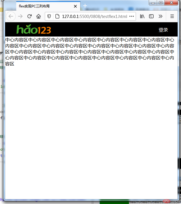
flex模仿m.php.cn首页
HTML代码:
<!DOCTYPE html><html lang="en"><head><meta charset="UTF-8"><meta name="viewport" content="width=device-width, initial-scale=1.0"><link rel="stylesheet" href="static/font_icon/iconfont.css"><title>flex模仿m.php.cn</title></head><body><header><a href=""><img src="https://img.php.cn/upload/avatar/000/012/411/59832646266b4495.jpg" alt=""></a><a href=""><img src="https://m.php.cn/static/images/logo.png" alt=""></a><span class="iconfont"></span></header><div class="slider"><img src="https://m.php.cn/static/images/ico/1.jpg" alt=""></div><nav><div><a href=""><img src="https://m.php.cn/static/images/ico/html.png" alt=""></a><a href="">HTML/CSS</a></div><div><a href=""><img src="https://m.php.cn/static/images/ico/html.png" alt=""></a><a href="">HTML/CSS</a></div><div><a href=""><img src="https://m.php.cn/static/images/ico/html.png" alt=""></a><a href="">HTML/CSS</a></div><div><a href=""><img src="https://m.php.cn/static/images/ico/html.png" alt=""></a><a href="">HTML/CSS</a></div><div><a href=""><img src="https://m.php.cn/static/images/ico/html.png" alt=""></a><a href="">HTML/CSS</a></div><div><a href=""><img src="https://m.php.cn/static/images/ico/html.png" alt=""></a><a href="">HTML/CSS</a></div><div><a href=""><img src="https://m.php.cn/static/images/ico/html.png" alt=""></a><a href="">HTML/CSS</a></div><div><a href=""><img src="https://m.php.cn/static/images/ico/html.png" alt=""></a><a href="">HTML/CSS</a></div></nav><h2 class="title">推荐课程</h2><div class="recommend"><div class="course-img"><div><a href=""><img src="https://img.php.cn/upload/course/000/000/001/5d242759adb88970.jpg" alt=""></a></div><div><a href=""><img src="https://img.php.cn/upload/course/000/000/001/5d242759adb88970.jpg" alt=""></a></div></div><div class="course-img"><a href=""><img src="https://img.php.cn/upload/course/000/000/035/5d2941e265889366.jpg" alt=""></a><div><h2><a href="">CI框架30分钟极速入门</a></h2><span>中级</span><span>350887播放</span></div></div><div class="course-img"><a href=""><img src="https://img.php.cn/upload/course/000/126/153/5aa23f0ded921649.jpg" alt=""></a><div><h2><a href="">2018前端入门_HTML5</a></h2><span>初级</span><span>350887播放</span></div></div></div><h2>最新更新</h2><div class="new"><div class="new-desc"><a href=""><img src="https://img.php.cn/upload/course/000/000/001/5f155b2f296de744.png" alt=""></a><div class="new-info"><h2><a href="">《我的十年撸码生涯》</a></h2><p class="new-info-intro">主题:《十年撸码生涯:聊聊没羞没臊的工作和生活》主讲:西门大官人(php中文网的人肉CPU) 特邀嘉宾: 灭绝小师太(php中文网唯一美女讲师) 时间:2020.7.21 晚20:00 全国直播</p><div class="new-info-zy"><span>初级</span><span>350887播放</span></div></div></div><div class="new-desc"><a href=""><img src="https://img.php.cn/upload/course/000/000/001/5f155b2f296de744.png" alt=""></a><div class="new-info"><h2><a href="">《我的十年撸码生涯》</a></h2><p class="new-info-intro">主题:《十年撸码生涯:聊聊没羞没臊的工作和生活》主讲:西门大官人(php中文网的人肉CPU) 特邀嘉宾: 灭绝小师太(php中文网唯一美女讲师) 时间:2020.7.21 晚20:00 全国直播</p><div class="new-info-zy"><span>初级</span><span>350887播放</span></div></div></div><div class="new-desc"><a href=""><img src="https://img.php.cn/upload/course/000/000/001/5f155b2f296de744.png" alt=""></a><div class="new-info"><h2><a href="">《我的十年撸码生涯》</a></h2><p class="new-info-intro">主题:《十年撸码生涯:聊聊没羞没臊的工作和生活》主讲:西门大官人(php中文网的人肉CPU) 特邀嘉宾: 灭绝小师太(php中文网唯一美女讲师) 时间:2020.7.21 晚20:00 全国直播</p><div class="new-info-zy"><span>初级</span><span>350887播放</span></div></div></div></div><footer><a href=""><span class="iconfont hot"></span><span>首页</span></a><a href=""><span class="iconfont hot"></span><span>视频</span></a><a href=""><span class="iconfont hot"></span><span>社区</span></a><a href=""><span class="iconfont hot"></span><span>我的</span></a></footer></body></html>
css代码:
/* 初始化设置 */*{padding: 0;margin: 0;box-sizing: border-box;}/* 设置链接的基本样式 */a{text-decoration: none;color: #888888;}/* 设置宽高为窗口宽高 */html{width: 100vw;height: 100vh;color: #888888;font-size: 12px;}/* 将body转为flex 以垂直为主轴 不换行 */body{/* 设置最小宽度 */min-width: 400px;background-color: #edeff0;display: flex;flex-flow: column nowrap ;}/* 设置顶部转为flex*/body > header{background-color: #2d353c;width: 100vw;display: flex;/* 主轴对齐:两端对齐 */justify-content: space-between;/* 交叉轴对齐:居中 */align-items: center;padding: 0 10px;height: 45px;/* 固定定位在顶部 */position: fixed;}/* 设置右边图标的颜色与大小 */header > .iconfont{color: white;font-size: 1.6rem;}/* 设置头像图的圆角,边框,高度 */header > a:first-of-type > img{border-radius: 50%;border: 1px solid #8F9498;height: 25px;}/* 设置LOGO图 的高度 */header > a:last-of-type > img{height: 45px;}/* 轮播图 */.slider {/* 距离顶部45PX 以免给固定的顶部header遮挡 */margin-top: 45px;/* 图像高度150px */height: 150px;}/* 设置导航图像100% */.slider > img{height: 100%;width: 100%;}/* 导航栏 */nav{height: 200px;/* 设置flex */display: flex;/* flex 水平方向,换行 */flex-flow: row wrap;/* 项目交叉轴分散对齐 */align-content: space-around;/* margin-top: 10px; */}/* 设置Nav下的项目 为flex */nav > div{display: flex;width: 25vw;/* flex 垂直为主轴 不换行 */flex-flow: column nowrap;/* 项目交叉轴居中 */align-items: center;}nav > div img{/* 设置图片大小 */width: 50%;}/* 设置div下第一个a元素图片 文本居中 */nav > div > a:first-of-type{text-align: center;}/* 栏目标题 */.title{padding: 10px;}/* 推荐课程 */.recommend{display: flex;flex-flow: column nowrap;padding: 10px;}/* 设置推荐下的图片宽度100% */.recommend img{width: 100%;}/* recommend下的项目course-img设置flex */.recommend > .course-img{display: flex;padding: 5px;}/* 设置第一个div可增长 可收缩 */.recommend > .course-img:first-of-type >div{flex:1;padding: 0 10px 0 0;}.recommend > .course-img:not(:first-of-type) > a{/* 设置图片区 初始化占45% */flex-basis: 45%;}.recommend > .course-img:not(:first-of-type) > div{/* 设置文本区 初始化占55% */flex-basis: 55%;}/* 设置文本区内的H2样式 */div > h2{color: #888888;font-size: 1.3rem;margin-bottom: 10px;font-weight: normal;}/* 设置文本区,等级的显示样式 */.recommend > .course-img > div span:first-of-type{color: white;background-color: #595757;border-radius: 8px;padding: 3px;}/* 最新更新 */.new{display: flex;/* flex 垂直为主轴 不换行 */flex-flow: column nowrap;padding: 10px;/* 后面是footer 增加一个底部margin 支撑内容不被底部栏遮挡 */margin-bottom: 40px;}/* NEW容器下的项目设置为flex */.new > .new-desc{display: flex;margin: 10px;}/* 设置new-desc下的图片最大高度不超过100px */.new > .new-desc > a >img{border-radius: 10px;max-height: 100px;}/* 设置new-desc下div项目 */.new > .new-desc >div{padding: 0 15px;/* 可增长 可缩减 初始化大小自动 */flex: auto;}/* 设置图片高度100% */.new img{height: 100%;}/* 设置简介超出用省略号代替 */.new-info-intro{width: 200px;text-overflow: ellipsis;overflow: hidden;white-space: nowrap;flex: 1 0 200px;}/* 设置视频等级 样式 */.new-info-zy > span:first-of-type{color: white;background-color: #595757;border-radius: 8px;padding: 3px;}/* 设置播放数量向右移动 */.new-info-zy > span:last-of-type{margin-left: 45%;}/* 页脚 */footer{/* 设置flex */display: flex;/* 绝对定位 bottom:0 定在底部 */position: fixed;bottom: 0;background-color: #edeff0;height: 55px;width: 100vw;/* 主轴对齐方式 分散对齐 */justify-content: space-around;/* 交叉轴对齐方式 居中 */align-items: center;}/* footer下的项目 再设置成flex */footer >a{display: flex;/* flex方向以垂直为主轴 */flex-flow: column;/* 项目交叉轴对齐方式 居中 */align-items: center;}footer > a:hover{color:#ff0000;}/* 设置字体和图标大小 */footer >a >span{font-size: 1.2rem;}
运行结果: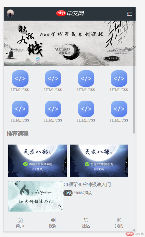

总结
flex布局使用不是很难,但是flex-basis,flex-grow,使用还不够好,窗口宽度变动的时候,图片区与文本区的自适应变动还没有做好