
今天我们通过使用FLex布局实现PC端和移动端网页布局
Flex PC端通用布局方案
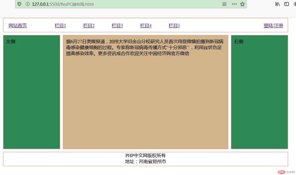
代码如下:
<!DOCTYPE html><html lang="en"><head><meta charset="UTF-8"><meta name="viewport" content="width=device-width, initial-scale=1.0"><title>flex PC端布局</title><style>* {margin: 0;padding: 0;box-sizing: border-box;}body {display: flex;flex-flow: column nowrap;}header,footer {height: 50px;border: 1px salmon solid;width: 1000px;margin: 0 auto;}header {display: flex;align-items: center;}header>a {flex: 0 1 100px;text-align: center;}header>a:first-of-type {margin-right: 50px;}header>a:last-of-type {margin-left: auto;}header>a:hover:not(:first-of-type) {color: seagreen;}.container {display: flex;flex-flow: row nowrap;min-height: 400px;margin: 10px auto;justify-content: center;}.container>aside {background-color: seagreen;border: 1px salmon solid;padding: 10px;flex: 0 0 200px;}.container>main {background-color: tan;border: 1px salmon solid;flex: 0 0 580px;padding: 10px;margin: 0 10px;}footer {display: flex;flex-flow: column nowrap;align-items: center;}</style></head><body><header><a href="">网站首页</a><a href="">栏目1</a><a href="">栏目2</a><a href="">栏目3</a><a href="">栏目4</a><a href="">栏目5</a><a href="">登陆/注册</a></header><div class="container"><aside>左侧</aside><main>据6月27日美媒报道,加州大学旧金山分校研究人员首次用显微镜拍摄到新冠病毒感染健康细胞的过程。专家称新冠病毒传播方式“十分邪恶” ,利用丝状伪足提高感染效率。</main><aside>右侧</aside></div><footer><p>PHP中文网版权所有</p><p>地址:河南省郑州市</p></footer></body></html>
flex 移动端通用布局方案
请忽略截图中 底部的内容在图片中间显示哦!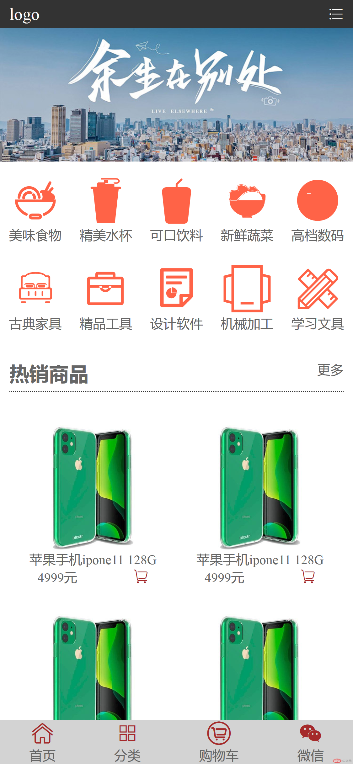
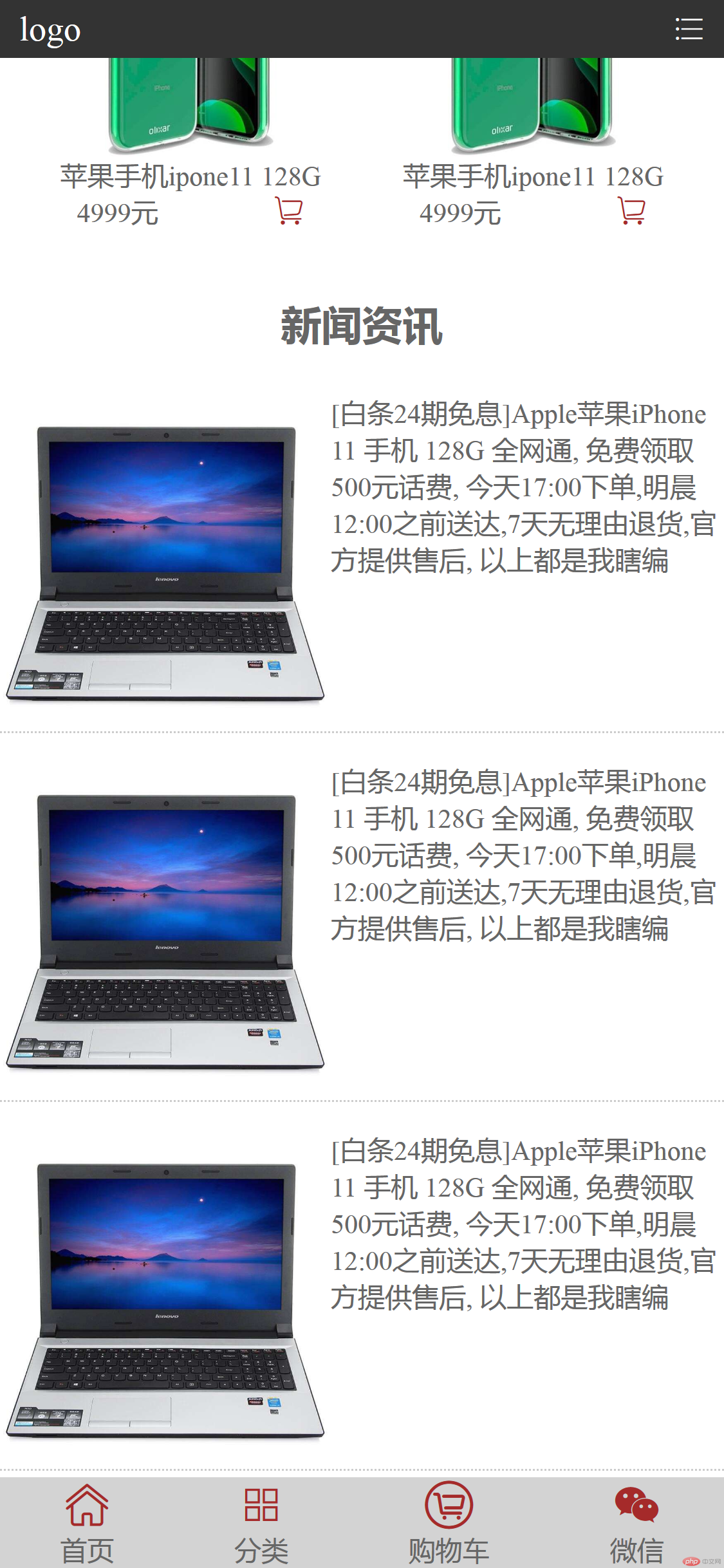
<html lang="en"><head><meta charset="UTF-8"><meta name="viewport" content="width=device-width, initial-scale=1.0"><title>flex 移动端布局</title><link type="text/css" rel="stylesheet" href="//at.alicdn.com/t/font_1915214_vgr1grfl9jc.css" /><style>* {margin: 0;padding: 0;box-sizing: border-box;}li {list-style: none;}html {width: 100vw;height: 100vh;font-size: 14px;color: #666;}a {color: #666;text-decoration: none;}a:hover {color: #666;}header {height: 30px;background-color: #333;display: flex;justify-content: space-between;padding: 0 10px;align-items: center;position: fixed;top: 0;left: 0;width: 100vw;}header>a {color: white;font-size: 18px;}header>a:hover {color: white;}header>span {color: white;}.slider>img {width: 100%;}.nav>ul {display: flex;flex-flow: row wrap;}.nav>ul>li {width: 20%;display: flex;flex-direction: column;margin: 10px 0;align-items: center;}.nav>ul>li a:first-of-type {font-size: 50px;color: tomato;}.hotpro {margin: 20px 0;padding: 0 10px;}.hotpro>.h2 {display: flex;padding-bottom: 5px;border-bottom: 1px dotted #333;}.hotpro>.h2 a {margin-left: auto;}.hotpro>ul {display: flex;flex-wrap: wrap;margin-top: 20px;}.hotpro>ul>li {width: 50%;display: flex;flex-direction: column;text-align: center;margin: 15px 0;}.hotpro>ul>li>a>img {max-width: 100%;display: block;}.hotpro>ul>li>div {display: flex;justify-content: space-around;}.hotpro>ul>li>div span:last-of-type {color: brown;}.newslist {margin-bottom: 50px;}.newslist h2 {text-align: center;height: 30px;line-height: 30px;}.newslist>ul {margin: 20px 0;}.newslist>ul>li {width: 100%;display: flex;border-bottom: 1px dotted #ccc;margin-bottom: 15px;}.newslist>ul>li a {display: block;}.newslist>ul>li p {}.newslist>ul>li img {max-width: 100%;}footer {display: flex;justify-content: space-around;position: fixed;bottom: 0;left: 0;width: 100vw;background-color: lightgrey;}footer>a {display: flex;flex-direction: column;text-align: center;}footer>a>i {font-size: 25px !important;color: brown;}</style></head><body><header><a href="">logo</a><span class="iconfont icon-fenlei"></span></header><section class="slider"><img src="images/banner.jpg"></section><section class="nav"><ul><li><a href="" class="iconfont icon-shiwu"></a><a href="">美味食物</a></li><li><a href="" class="iconfont icon-_fuzhi-"></a><a href="">精美水杯</a></li><li><a href="" class="iconfont icon-yinliao"></a><a href="">可口饮料</a></li><li><a href="" class="iconfont icon--"></a><a href="">新鲜蔬菜</a></li><li><a href="" class="iconfont icon-danfan"></a><a href="">高档数码</a></li><li><a href="" class="iconfont icon-jiaju"></a><a href="">古典家具</a></li><li><a href="" class="iconfont icon-gongju"></a><a href="">精品工具</a></li><li><a href="" class="iconfont icon-huabancopy"></a><a href="">设计软件</a></li><li><a href="" class="iconfont icon-jixie"></a><a href="">机械加工</a></li><li><a href="" class="iconfont icon-wenju"></a><a href="">学习文具</a></li></ul></section><section class="hotpro"><div class="h2"><h2>热销商品</h2><a href="">更多</a></div><ul><li><a href=""><img src="images/iphone.jpg"></a><p>苹果手机ipone11 128G</p><div><span>4999元</span><span class="iconfont icon-gouwuche"></span></div></li><li><a href=""><img src="images/iphone.jpg"></a><p>苹果手机ipone11 128G</p><div><span>4999元</span><span class="iconfont icon-gouwuche"></span></div></li><li><a href=""><img src="images/iphone.jpg"></a><p>苹果手机ipone11 128G</p><div><span>4999元</span><span class="iconfont icon-gouwuche"></span></div></li><li><a href=""><img src="images/iphone.jpg"></a><p>苹果手机ipone11 128G</p><div><span>4999元</span><span class="iconfont icon-gouwuche"></span></div></li><li><a href=""><img src="images/iphone.jpg"></a><p>苹果手机ipone11 128G</p><div><span>4999元</span><span class="iconfont icon-gouwuche"></span></div></li><li><a href=""><img src="images/iphone.jpg"></a><p>苹果手机ipone11 128G</p><div><span>4999元</span><span class="iconfont icon-gouwuche"></span></div></li></ul></section><section class="newslist"><h2>新闻资讯</h2><ul><li><a href=""><img src="images/newsimg.jpg"></a><p>[白条24期免息]Apple苹果iPhone 11 手机 128G 全网通, 免费领取500元话费, 今天17:00下单,明晨12:00之前送达,7天无理由退货,官方提供售后,以上都是我瞎编</p></li><li><a href=""><img src="images/newsimg.jpg"></a><p>[白条24期免息]Apple苹果iPhone 11 手机 128G 全网通, 免费领取500元话费, 今天17:00下单,明晨12:00之前送达,7天无理由退货,官方提供售后,以上都是我瞎编</p></li><li><a href=""><img src="images/newsimg.jpg"></a><p>[白条24期免息]Apple苹果iPhone 11 手机 128G 全网通, 免费领取500元话费, 今天17:00下单,明晨12:00之前送达,7天无理由退货,官方提供售后,以上都是我瞎编</p></li></ul></section><footer><a href=""><i class="iconfont icon-shouye"></i><pan>首页</pan></a><a href=""><i class="iconfont icon-fenlei1"></i><pan>分类</pan></a><a href=""><i class="iconfont icon-gouwuche1"></i><pan>购物车</pan></a><a href=""><i class="iconfont icon-gongzhonghao"></i><pan>微信</pan></a></footer></body></html>
总结
Flex布局比浮动和定位来布局,代码简洁,书写方便 推荐大家使用。