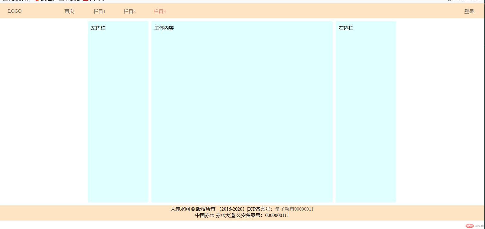
PC端布局的通用解决方案
<!DOCTYPE html><html lang="en"> <head> <meta charset="UTF-8" /> <meta name="viewport" content="width=device-width, initial-scale=1.0" /> <title>PC端布局的通用解决方案</title> <style> * { margin: 0; padding: 0; box-sizing: border-box; } a { color: #666666; text-decoration: none; } /* 把body转为flex */ body { /* 最小宽度 */ min-width: 680px; /* 转为弹性盒子 */ display: flex; /* 主轴垂直方向,不换行 */ flex-flow: column nowrap; } /* 页眉,页脚公共样式 */ header, footer { height: 50px; background-color: bisque; } /* 把页眉转为flex */ header { display: flex; /* 所有项目在交叉轴方向上居中显示 */ align-items: center; } header > a { /* 禁止放大 允许收缩 100px宽度 */ flex: 0 1 100px; /* 文本居中 */ text-align: center; } /* logo 伪类选择第一个*/ header > a:first-of-type { /* 给第一个A标签右边距80px */ margin-right: 80px; } /* 登录 伪类选择最后一个*/ header > a:last-of-type { /* 给最后一个A标签左边距自动铺满 */ margin-left: auto; } /* 鼠标悬停时忽略logo */ header > a:hover:not(:first-of-type) { color: lightcoral; } .container { min-height: 600px; /* 转为弹性盒子 */ display: flex; /* 主轴横向方向,不换行 默认值,可以不用写 */ flex-flow: row nowrap; margin: 10px auto; justify-content: center; } .container > aside, .container > main { background-color: lightcyan; padding: 10px; } .container > aside { /* 不放大 不收缩 宽200px */ flex: 0 0 200px; } .container > main { /* 不放大 不收缩 宽600px */ flex: 0 0 600px; /* 左右边距10px */ margin: 0 10px; } footer { display: flex; /* 主轴垂直方向,不换行 */ flex-flow: column nowrap; /* 文本居中 */ text-align: center; } </style> </head> <body> <!-- 页眉 --> <header> <a href="">LOGO</a> <a href="">首页</a> <a href="">栏目1</a> <a href="">栏目2</a> <a href="">栏目3</a> <a href="">登录</a> </header> <!-- 主体 --> <div class="container"> <!-- 左边栏 --> <aside>左边栏</aside> <!-- 主体 --> <main>主体内容</main> <!-- 右边栏 --> <aside>右边栏</aside> </div> <!-- 页脚 --> <footer> <p> 大赤水网 © 版权所有 (2016-2020)|ICP备案号:<a href="" >备了就有00000011</a > </p> <p>中国赤水 赤水大道 公安备案号:0000000111</p> </footer> </body></html>
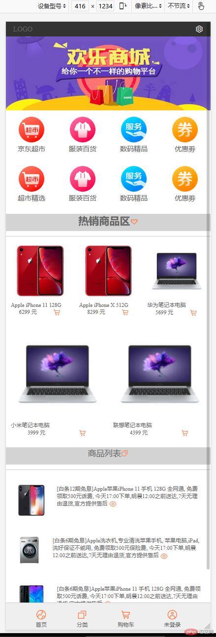
移动端布局解决方案
<!DOCTYPE html><html lang="en"> <head> <meta charset="UTF-8" /> <meta name="viewport" content="width=device-width, initial-scale=1.0" /> <!-- 加载阿里字体图标 --> <link rel="stylesheet" href="css.css" /> <title>移动端布局解决方案</title> <style> * { margin: 0; padding: 0; box-sizing: border-box; } a { text-decoration: none; color: #666; } html { /* vw: 可视区宽度,100指百分比 */ /* vh: 可视区高度,100指百分比 */ width: 100vw; height: 100vh; font-size: 14px; color: #666; } body { min-width: 360px; background-color: #fff; display: flex; /* 主轴垂直方向,不换行 */ flex-flow: column nowrap; } body > header { color: white; background-color: #333; height: 30px; display: flex; align-items: center; /* 两端对齐 */ justify-content: space-between; /* 固定定位 */ position: fixed; width: 100vw; padding: 0 15px; } body > .slider { height: 180px; } body > .slider > img { /* 宽高100% */ width: 100%; height: 100%; } h2 { text-align: center; background-color: lightgray; height: 35px; } /* 主导航区 */ nav { height: 200px; margin-bottom: 10px; /* 弹性盒子 */ display: flex; /* 转为多行容器 */ flex-flow: row wrap; /* 分散对齐 */ align-content: space-around; } nav > div { /* 25% 一排四个 */ width: 25vw; display: flex; flex-flow: column nowrap; align-items: center; } nav > div > a:first-of-type { text-align: center; } nav > div img { width: 50%; } /* 每个区域的标题样式 */ .title { margin-top: 10px; font-size: 1.2rem; font-weight: normal; text-align: center; } /* 热销商品区 */ .hot-goods { border-top: 1px solid #cdcdcd; margin-top: 10px; font-size: 0.8rem; display: flex; /* 水平多行容器 */ flex-flow: row wrap; } .hot-goods img { width: 100%; } .hot-goods > .goods-img { /* 内边距并重置大小 */ padding: 10px; box-sizing: border-box; /* 允许放大不允许缩小,否则项目不会换行,多行容器失效 */ flex: 1 0 30vw; /* 再将每个商品描述转为flex */ display: flex; /* 主轴垂直且不允许换行 */ flex-flow: column nowrap; justify-content: center; } /* 商品描述的最后一个区域转flex,并设置项目在主轴上排列对齐方式 */ .hot-goods > .goods-img > div { display: flex; /* 分散对齐 */ justify-content: space-around; } /* 热销样式 */ .hot { color: coral; } /* 商品列表区 */ .list-goods { padding: 10px; border-top: 1px solid #cdcdcd; margin-top: 10px; font-size: 0.8rem; display: flex; /* 主轴必须是垂直 */ flex-flow: column nowrap; } /* 每个项目也转为flex */ .list-goods > .goods-desc { margin: 10px 0; display: flex; } /* 列表中每个项目的样式,加些间距 */ .list-goods > .goods-desc > a { padding: 10px; box-sizing: border-box; } .list-goods > .goods-desc > a:last-of-type:hover { color: lightseagreen; } /* 图片全部适应项目空间 */ .list-goods img { width: 100%; } body > footer { color: #666; background-color: #efefef; border-top: 1px solid #ccc; height: 55px; position: fixed; bottom: 0; width: 100vw; display: flex; /* 平均对齐 */ justify-content: space-evenly; } body > footer a { margin-top: 10px; font-size: 0.8rem; display: flex; /* 垂直排列不换行 */ flex-flow: column nowrap; /* 交叉轴项目居中显示 */ align-items: center; } body > footer a > span:first-of-type { /* 图标字体应该大一些 */ font-size: 1.6rem; } </style> </head> <body> <!-- 页眉 --> <header> <a href="">LOGO</a> <span class="iconfont"></span> </header> <!-- 轮播图区 --> <div class="slider"> <img src="images/banner.jpg" alt="" /> </div> <!-- 主导航区 --> <nav> <div> <a href=""><img src="images/link1.webp" alt="" /></a> <a href="">京东超市</a> </div> <div> <a href=""><img src="images/link2.webp" alt="" /></a> <a href="">服装百货</a> </div> <div> <a href=""><img src="images/link3.webp" alt="" /></a> <a href="">数码精品</a> </div> <div> <a href=""><img src="images/link4.webp" alt="" /></a> <a href="">优惠劵</a> </div> <div> <a href=""><img src="images/link1.webp" alt="" /></a> <a href="">超市精选</a> </div> <div> <a href=""><img src="images/link2.webp" alt="" /></a> <a href="">服装百货</a> </div> <div> <a href=""><img src="images/link3.webp" alt="" /></a> <a href="">数码精品</a> </div> <div> <a href=""><img src="images/link4.webp" alt="" /></a> <a href="">优惠劵</a> </div> </nav> <!-- 热销商品 --> <h2> 热销商品区<span class="iconfont hot" style="color: coral;"></span> </h2> <div class="hot-goods"> <div class="goods-img"> <a href=""><img src="images/goods1.jpg" alt="" /></a> <p>Apple iPhone 11 128G</p> <div> <span>6299 元</span> <span class="iconfont hot"></span> </div> </div> <div class="goods-img"> <a href=""><img src="images/goods1.jpg" alt="" /></a> <p>Apple iPhone X 512G</p> <div> <span>8299 元</span> <span class="iconfont hot"></span> </div> </div> <div class="goods-img"> <a href=""><img src="images/goods2.jpg" alt="" /></a> <p>华为笔记本电脑</p> <div> <span>5699 元</span> <span class="iconfont hot"></span> </div> </div> <div class="goods-img"> <a href=""><img src="images/goods2.jpg" alt="" /></a> <p>小米笔记本电脑</p> <div> <span>3999 元</span> <span class="iconfont hot"></span> </div> </div> <div class="goods-img"> <a href=""><img src="images/goods2.jpg" alt="" /></a> <p>联想笔记本电脑</p> <div> <span>4399 元</span> <span class="iconfont hot"></span> </div> </div> </div> <!-- 商品列表区 --> <h2 class="title"> 商品列表<span class="iconfont hot" style="color: coral;"></span> </h2> <div class="list-goods"> <div class="goods-desc"> <a href=""><img src="images/goods4.jpg" alt="" /></a> <a href="" >[白条12期免息]Apple苹果iPhone 11 手机 128G 全网通, 免费领取500元话费, 今天17:00下单,明晨12:00之前送达,7天无理由退货,官方提供售后 <span class="iconfont hot" style="vertical-align: middle;" ></span ></a > </div> <div class="goods-desc"> <a href=""><img src="images/goods3.jpg" alt="" /></a> <a href="" >[白条6期免息]Apple洗衣机,专业清洗苹果手机, 苹果电脑,iPad,洗好保证不能用, 免费领取500元保险费, 今天17:00下单,明晨12:00之前送达,7天无理由退货,官方提供售后 <span class="iconfont hot" style="vertical-align: middle;" ></span ></a > </div> <div class="goods-desc"> <a href=""><img src="images/goods5.png" alt="" /></a> <a href="" >[白条6期免息]Apple苹果iPhone 11 手机 128G 全网通, 免费领取500元话费, 今天17:00下单,明晨12:00之前送达,7天无理由退货,官方提供售后 <span class="iconfont hot" style="vertical-align: middle;" ></span ></a > </div> <div class="goods-desc"> <a href=""><img src="images/goods2.jpg" alt="" /></a> <a href="" >华为笔记本MateBook 14 全面屏轻薄性能笔记本电脑 十代酷睿(i5 16G 512G MX250 触控屏 多屏协同)灰<span class="iconfont hot" style="vertical-align: middle;" ></span ></a > </div> </div> <footer> <a href=""> <span class="iconfont hot"></span> <span>首页</span> </a> <a href=""> <span class="iconfont hot"></span> <span>分类</span> </a> <a href=""> <span class="iconfont hot"></span> <span>购物车</span> </a> <a href=""> <span class="iconfont hot"></span> <span>未登录</span> </a> </footer> </body></html>