
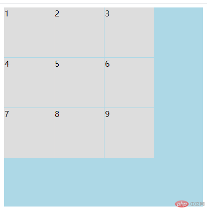
grid 简单用法
- grid-template-rows: 100px 100px 100px; 这个是grid的横向布局
- grid-template-columns: 100px 100px 100px; 这个是grid的纵向布局
- grid-template-columns: repeat(3,1fr); repeat(3,1fr)里面有两个参数 第一个是复制几次 第二个是占几份 当然也可以写auto 自动分配比例
- grid-template-rows: repeat(3,1fr); 这是横向 原理同上
- 发现一个简写办法 grid-template: repeat(3,1fr)/ repeat(3,1fr); 用斜线隔开 第一个是横向 第二个是纵向
<!DOCTYPE html><html lang="en"><head><meta charset="UTF-8"><title>Title</title><style>.con{width: 400px;height: 400px;background: lightblue;display: grid;grid-template-rows: 100px 100px 100px;grid-template-columns: 100px 100px 100px;grid-template: repeat(3,1fr)/ repeat(3,1fr);border: 1px solid #ddd;gap: 1px 10px;}.items{border: 1px solid #ddd;background: #dddddd;}</style></head><body><div class="con"><div class=" items items1">1</div><div class=" items items2">2</div><div class=" items items3">3</div><div class=" items items4">4</div><div class=" items items5">5</div><div class=" items items6">6</div><div class=" items items7">7</div><div class=" items items8">8</div><div class=" items items9">9</div></div></body></html>

grid 的多参数写法
- 这边用简写 grid-template: 100px 100px 100px / 100px 100px 100px; 可以用px写
- grid-template: 20% 40% auto /100px auto 100px; 可以用百分比和px,auto 混搭
- grid-template: 1fr 1fr 2fr/1fr 1fr 1fr; 按照比例写
- grid-template:repeat(3,1fr)/repeat(3,1fr) ;可以用重复的办法写
- grid-template:repeat(1,50px 100px 10px 30px 40px)/repeat(3,1fr) ;分组来填写
- grid-template: repeat(2,minmax(50px ,100px)) /repeat(3,minmax(150px,1fr));弹性设置 第一个参数是最小值 第二是最大值 适用于手机
grid-template:repeat(auto-fill,100px)/repeat(auto-fill,100px) ;auto-fill 自动填充
<!DOCTYPE html><html lang="en"><head><meta charset="UTF-8"><title>设置单元格的数量和大小</title><style>.con{width: 400px;height: 400px;background: darkcyan;display: grid;/*固定值*//*grid-template-columns: 100px 100px 100px;*//*grid-template-rows:100px 100px 100px;*//*!*百分比*!*//*grid-template-columns: 20% 40% auto;*//*grid-template-rows:100px auto 100px;*//*!*按比例*!*//*grid-template-columns: 1fr 1fr 2fr;*//*grid-template-rows:1fr 1fr 1fr;*//*!*重复设置*!*//*grid-template-columns: repeat(3,1fr) ;*//*grid-template-rows:repeat(3,1fr);*//*按分组来设置*//*grid-template-columns: repeat(1,50px 100px 10px 30px 40px) ;*//*grid-template-rows:repeat(3,1fr);*//*弹性设置*//*grid-template-columns:repeat(2,minmax(50px ,100px));*//*grid-template-rows:repeat(3,minmax(150px ,1fr));*//*自动填充 auto-fill*/grid-template-columns:repeat(auto-fill,100px);grid-template-rows:repeat(auto-fill,100px);}.item{font-size: 2rem;background: lightgreen;}</style></head><body><div class="con"><div class="item">1</div><div class="item">2</div><div class="item">3</div><div class="item">4</div><div class="item">5</div><div class="item">6</div><div class="item">7</div></div></body></html>
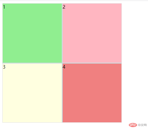
使用默认网格线来划分单元格
- grid-row-start: 1; grid-row-end: 3; grid-column-end: 1;grid-column-start: 3; 操作子元素的操作办法
- grid-row: 1/3; grid-column: 3/5;简写
- grid-row: 3/span 2; grid-column: 1/span 2; 使用偏移量 span 是隔几个
- grid-row-end: span 2; grid-column-end: span 2; 用偏移量 省去代码
<!DOCTYPE html><html lang="en"><head><meta charset="UTF-8"><title>Title</title><style>.con{width: 400px;height: 400px;background: lightblue;display: grid;/*!*grid-template-rows: 100px 100px 100px;*!*//*!*grid-template-columns: 100px 100px 100px;*!*//*grid-template-columns: repeat(3,auto);*//*grid-template-rows: repeat(3,1fr);*/grid-template: repeat(4,1fr)/ repeat(4,1fr);gap: 1px 1px;}.items{border: 1px solid #ddd;background: #dddddd;}.items1{background: lightgreen;grid-row-start: 1;grid-row-end: 3;grid-column-start: 1;grid-column-end: 3;}.items2{background: lightpink;grid-row: 1/3;grid-column: 3/5;}.items3{background: lightyellow;grid-row: 3/span 2;grid-column: 1/span 2;}.items4{background: lightcoral;grid-row-end: span 2;grid-column-end: span 2;}</style></head><body><div class="con"><div class=" items items1">1</div><div class=" items items2">2</div><div class=" items items3">3</div><div class=" items items4">4</div><!--<div class=" items items5">5</div>--><!--<div class=" items items6">6</div>--><!--<div class=" items items7">7</div>--><!--<div class=" items items8">8</div>--><!--<div class=" items items9">9</div>--></div></body></html>
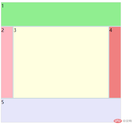
设置命名网格区域
- grid-template-areas: “header header header””left main right” “footer footer footer”;
- 在子元素 grid-area: header; 用来命名子元素
- 简写就是 grid-template-areas: “header header header””…” “footer footer footer”;因为在中间这个本身就是自然分配所以可以用点点点来显示然后 在子元素grid-area: left;删掉即可
<!DOCTYPE html><html lang="en"><head><meta charset="UTF-8"><title>Title</title><style>.con{width: 400px;height: 400px;background: lightblue;display: grid;grid-template: 80px auto 80px/ 40px auto 40px;grid-template-areas: "header header header""left main right""footer footer footer";gap: 1px 1px;}.items{border: 1px solid #ddd;background: #dddddd;}.items1{background: lightgreen;grid-area: header;}.items2{background: lightpink;grid-area: left;}.items3{background: lightyellow;grid-area: main;}.items4{background: lightcoral;grid-area:right ;}.items5{background: lavender;grid-area: footer;}</style></head><body><div class="con"><div class=" items items1">1</div><div class=" items items2">2</div><div class=" items items3">3</div><div class=" items items4">4</div><div class=" items items5">5</div><!--<div class=" items items6">6</div>--><!--<div class=" items items7">7</div>--><!--<div class=" items items8">8</div>--><!--<div class=" items items9">9</div>--></div></body></html>
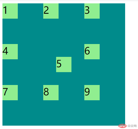
子元素在容器中的对齐方式
和felx 差不多行的使用方式
justify-content: end;
justify-content: start;
justify-content: center;
justify-content: space-between;
align-content: end;
align-content: start;
align-content: center;
align-content: space-between;简写方式为
/place-content: 垂直对齐 水平对齐;/
place-content: center start;<!DOCTYPE html><html lang="en"><head><meta charset="UTF-8"><title>设置单元格在容器中的对齐方式</title><style>.con{width: 400px;height: 400px;background: darkcyan;display: grid;grid-template-columns: repeat(3,50px);grid-template-rows:repeat(3,50px);justify-content: end;justify-content: start;align-content: end;align-content: start;align-content: center;justify-content: center;justify-content: space-between;align-content: space-between;grid-template-columns: repeat(3,auto);align-content: stretch;/*简写*//*place-content: 垂直对齐 水平对齐;*/place-content: center start;}.item{font-size: 2rem;background: lightgreen;}</style></head><body><div class="con"><div class="item item1">1</div><div class="item item2">2</div><div class="item item3">3</div><div class="item item4">4</div><div class="item item5">5</div><div class="item item6">6</div><div class="item item7">7</div><div class="item item8">8</div><div class="item item9">9</div></div></body></html>
子元素在容器中的对齐方式
- place-items: center end; 操纵所有子元素的方法
justify-items: stretch; align-items: stretch; justify-content: start; align-items: center; 这些方法使用方式和flex一样 写法不同而已
<!DOCTYPE html><html lang="en"><head><meta charset="UTF-8"><title>设置项目在单元格中的对齐方式</title><style>.con{width: 400px;height: 400px;background: darkcyan;display: grid;grid-template-columns: repeat(3,1fr);grid-template-rows:repeat(3,1fr);/*justify-items: stretch;*//*align-items: stretch;*//*justify-content: start;*//*align-items: center;*/place-items: center end;}.item{width: 50px;height: 50px;font-size: 2rem;background: lightgreen;}</style></head><body><div class="con"><div class="item item1">1</div><div class="item item2">2</div><div class="item item3">3</div><div class="item item4">4</div><div class="item item5">5</div><div class="item item6">6</div><div class="item item7">7</div><div class="item item8">8</div><div class="item item9">9</div></div></body></html>
设置某个项目在单元格中的对齐方式
- justify-self: end; align-self: center; 单独子元素的排列方式
place-self: center; 简写
<!DOCTYPE html><html lang="en"><head><meta charset="UTF-8"><title>设置某个项目在单元格中的对齐方式</title><style>.con{width: 400px;height: 400px;background: darkcyan;display: grid;grid-template-columns: repeat(3,1fr);grid-template-rows:repeat(3,1fr);}.item{width: 50px;height: 50px;font-size: 2rem;background: lightgreen;}.item5{justify-self: end;align-self: center;/*简写*/place-self: center;}</style></head><body><div class="con"><div class="item item1">1</div><div class="item item2">2</div><div class="item item3">3</div><div class="item item4">4</div><div class="item item5">5</div><div class="item item6">6</div><div class="item item7">7</div><div class="item item8">8</div><div class="item item9">9</div></div></body></html>
grid的间距
用gap就行很简单
<!DOCTYPE html>
<html lang="en">
<head>
<meta charset="UTF-8">
<title>设置某个项目在单元格中的对齐方式</title>
<style>.con{width: 400px;height: 400px;background: darkcyan;display: grid;grid-template-columns: repeat(3,1fr);grid-template-rows:repeat(3,1fr);/*列间距*/column-gap: 5px;/*行间距*/row-gap: 5px;/*简写*/gap: 5px 10px;/*超级简写*/gap: 5px;}.item{font-size: 2rem;background: lightgreen;}
</style>
</head>
<body>
<div class="con">
<div class="item item1">1</div>
<div class="item item2">2</div>
<div class="item item3">3</div>
<div class="item item4">4</div>
<div class="item item5">5</div>
<div class="item item6">6</div>
<div class="item item7">7</div>
<div class="item item8">8</div>
<div class="item item9">9</div>
</div>
</body>
</html>