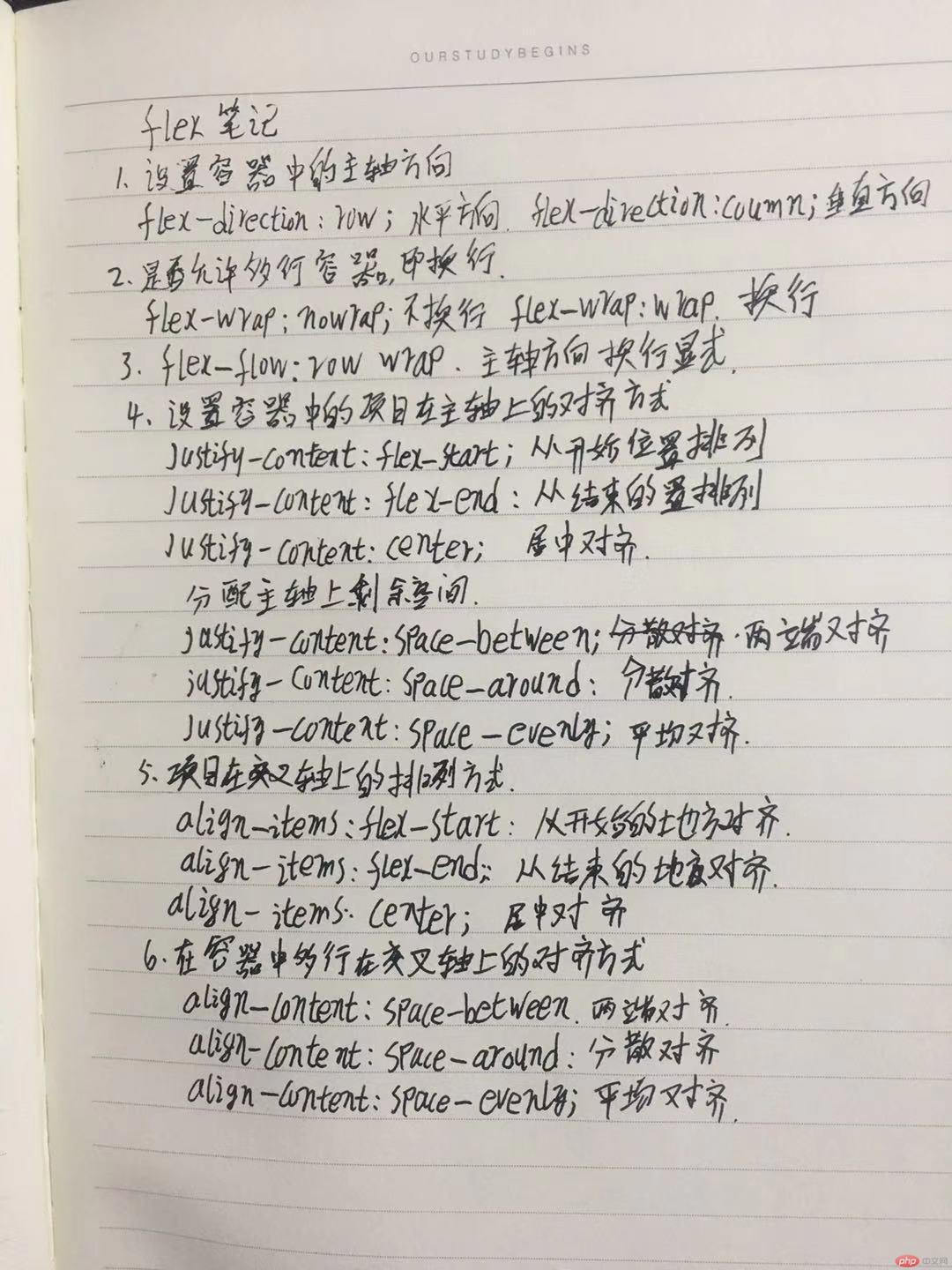
flex布局——子元素定位篇
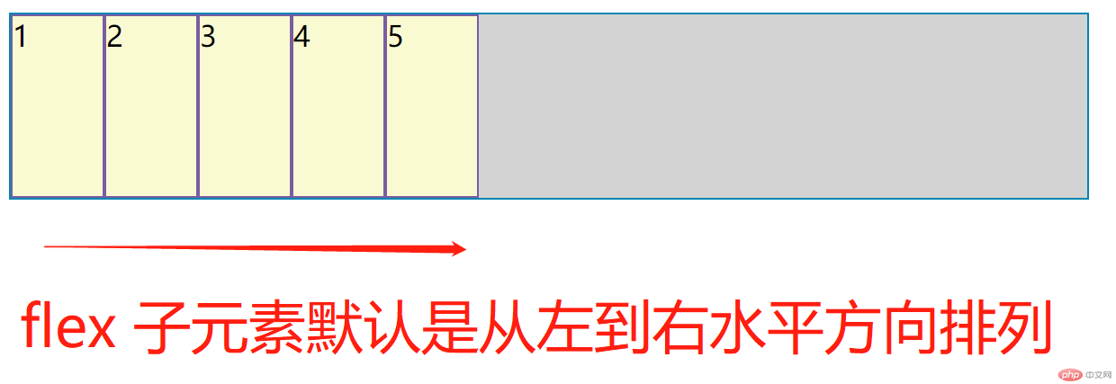
1、主轴方形
- 默认为水平轴,默认方向为 从左到右 其父元素
css属性默认lex-direction: row;为下图所示;
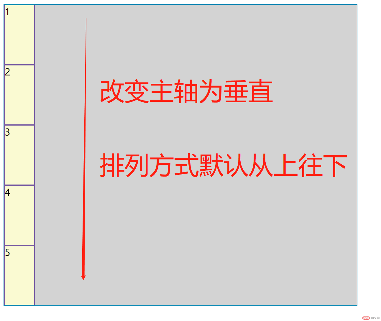
- 改变flex为垂直轴,默认方向为从上往下其父元素
css属性为lex-direction: column;如下图;
2、子元素排列方式
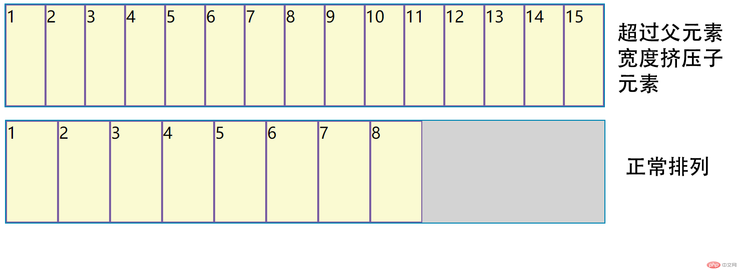
- 默认子元素排列方式为一行排列,如超过父元素的宽度,则同时缩小子元素的宽度,如下图;
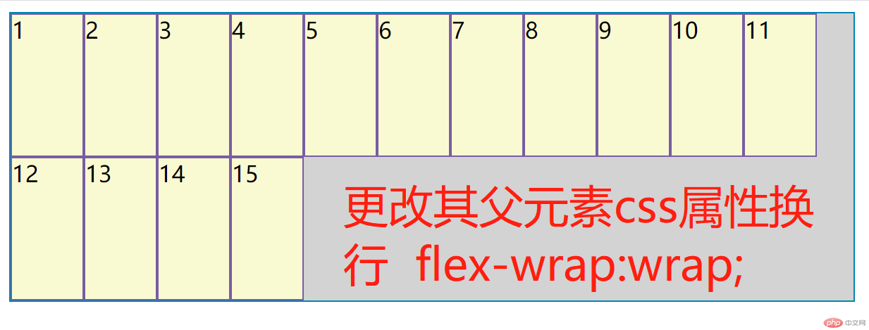
- 子元素换行,默认父元素
css属性flex-wrap:nowrap;不换行,更改其为flex-wrap:wrap;就可以换行,如图;
3、主轴方向和是否换行的简写
css 属性 flex-flow: row wrap; 第一个位置的 row是设置主轴方向就是默认水平, 第二个位置wrap是设置是否换行,这个就是允许换行;
4、设置子元素在主轴的对齐方式
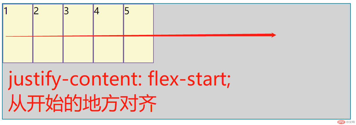
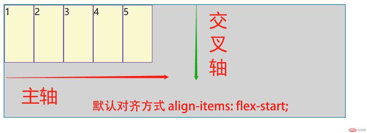
- 默认对齐方式默认为从主轴开始的地方排列其父元素
css属性为justify-content: flex-start;,如图;
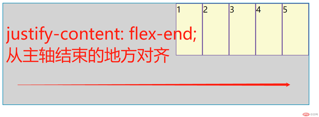
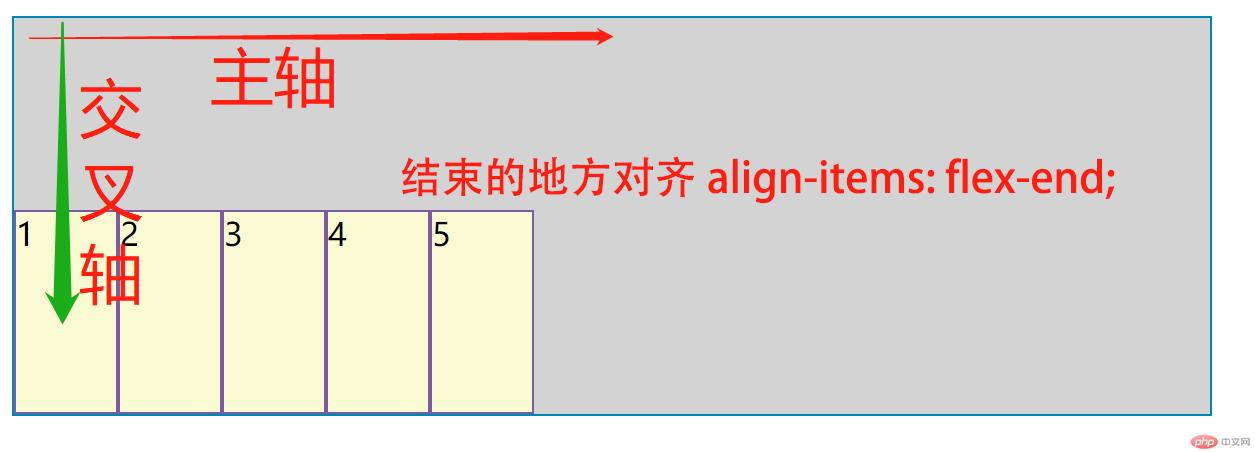
- 更改其父元素
css 属性为 justify-content: flex-end;就可以从主轴结束的地方排列,如图;
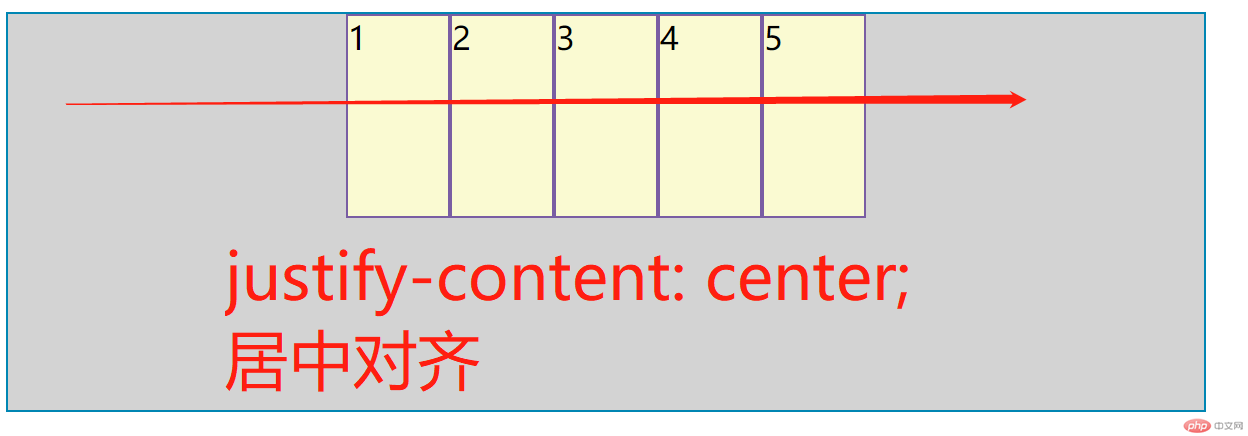
- 更改其父元素
css 属性为 justify-content: center; 就可以居中对齐,如图;
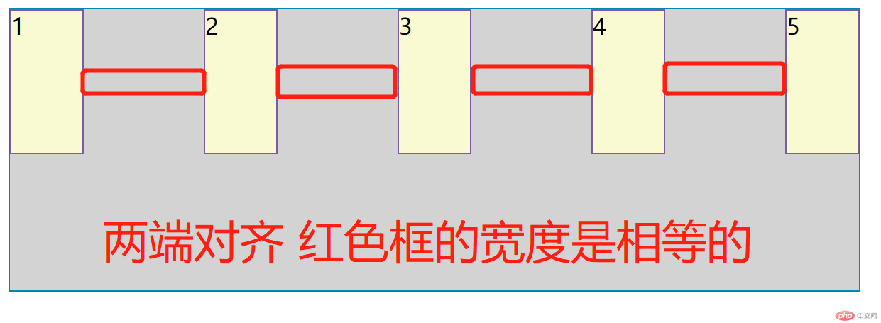
- 更改其父元素
css 属性为 justify-content: space-between;就可以两端对齐,如图;
- 更改其父元素
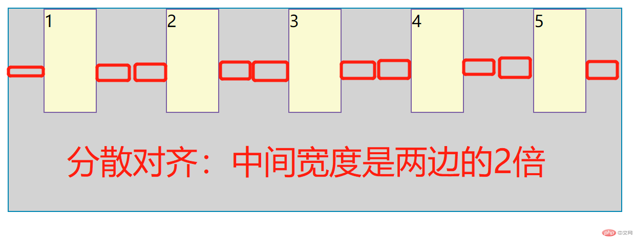
css 属性为 justify-content: space-around;就可以分散对齐,我自己称为手拉手模式,如图;
- 更改其父元素
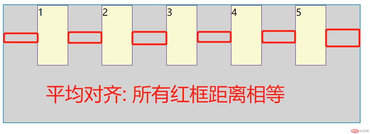
css 属性为 justify-content: space-evenly;就可以平均对齐,我自己成为手搭肩模式,如图;
5、子元素在交叉轴上的对齐方式
- 默认在交叉轴对齐方式
css属性为align-items: flex-start;从开始的方向对齐,如图;
- 更改其父元素
css属性为align-items: flex-end;从结束的方向对齐,如图;
- 更改其父元素
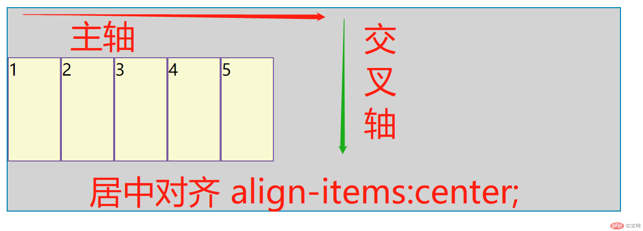
css属性为align-items: center;居中对齐,如图;
6、设置多行子元素在交叉轴的对齐方式
- 交叉轴对齐方式
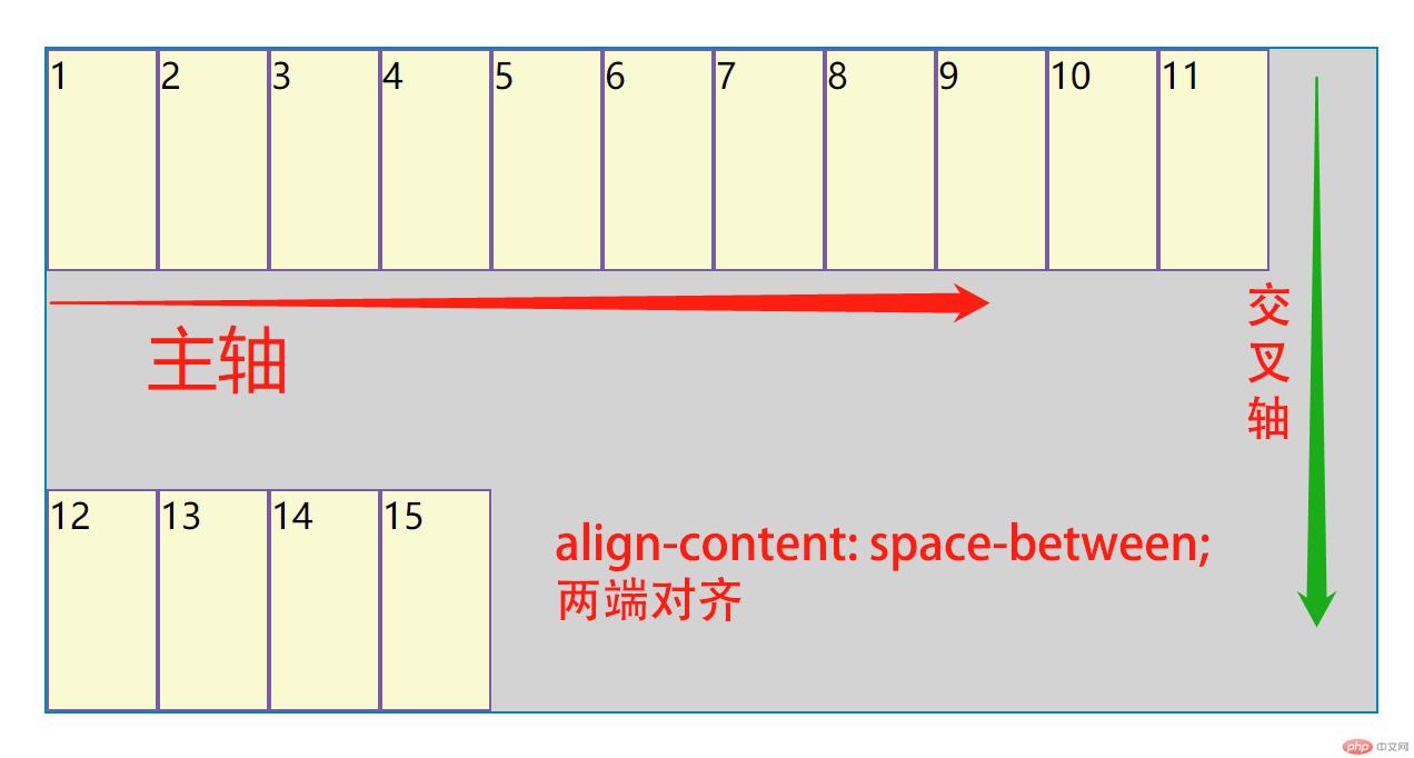
css属性为align-content: space-between;从在交叉轴两端对齐,如图;
- 交叉轴对齐方式
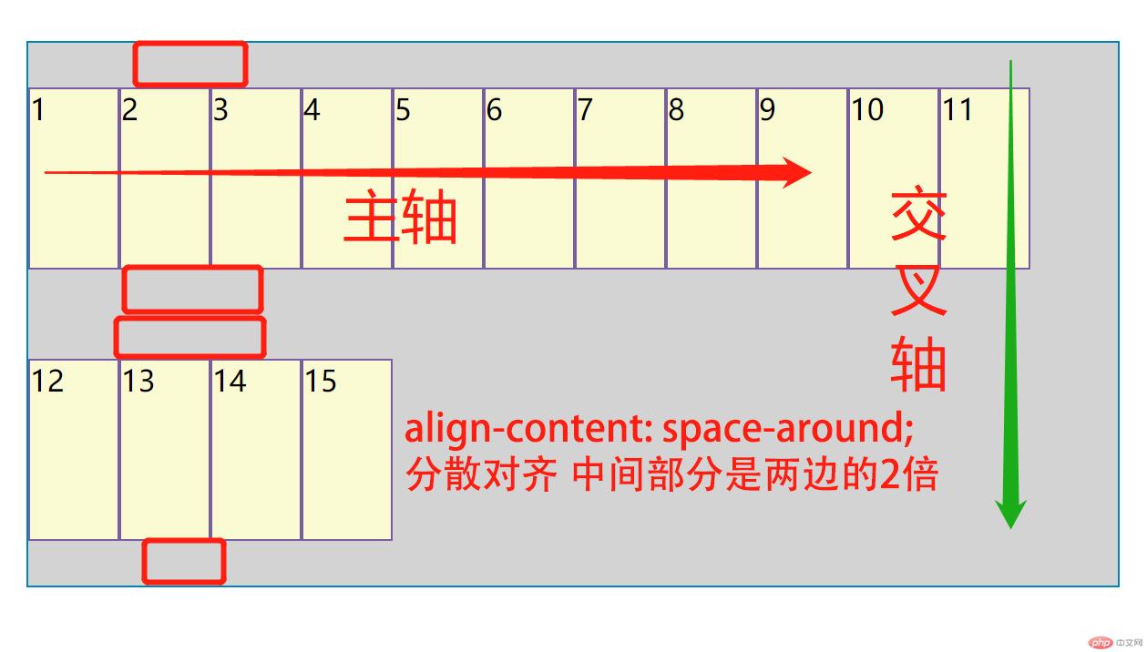
css属性为align-content: space-around;从在交叉轴分散,如图;
- 交叉轴对齐方式
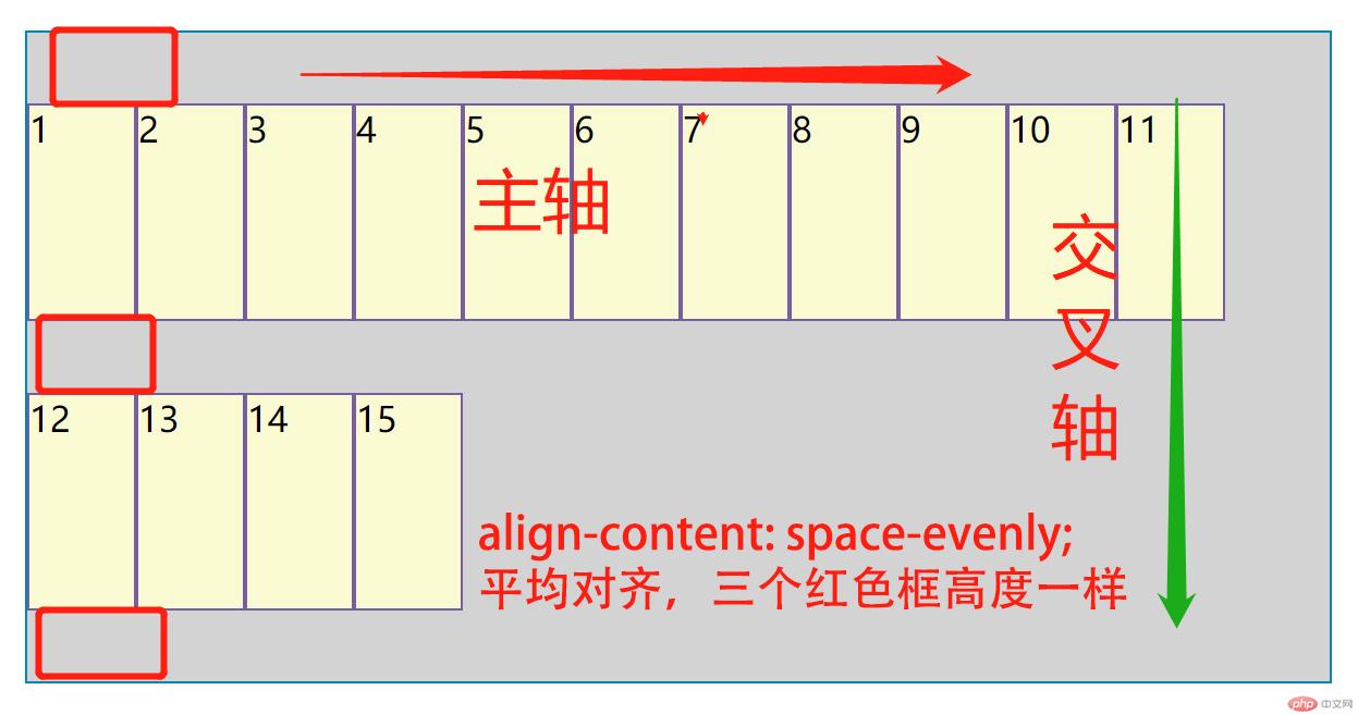
css属性为align-content: space-evenly;从在交叉轴平均对齐,如图;
附: html代码
<!DOCTYPE html><html lang="en"><head> <meta charset="UTF-8"> <title>flex布局-元素定位篇</title> <style> *{ margin: 0; padding: 0; } .container { margin:50px; border: 1px solid #0086b3; box-sizing: border-box; background: lightgrey; display: flex; width: 600px; height: 300px; /*flex-direction: column;*/ flex-wrap: wrap; /*justify-content: flex-end;*/ /*justify-content: center;*/ /*justify-content: space-between;*/ /*justify-content: space-around;*/ /*justify-content: space-evenly;*/ /*align-items: flex-start;*/ /*align-items: flex-end;*/ /*align-items: center;*/ /*align-content: space-between;*/ /*align-content: space-around;*/ /*align-content: space-evenly;*/ } .item{ border: 1px solid #795da3; box-sizing: border-box; background: lightgoldenrodyellow; width: 50px; height: 100px; } </style></head><body><div class="container"> <div class="item">1</div> <div class="item">2</div> <div class="item">3</div> <div class="item">4</div> <div class="item">5</div> <div class="item">6</div> <div class="item">7</div> <div class="item">8</div> <div class="item">9</div> <div class="item">10</div> <div class="item">11</div> <div class="item">12</div> <div class="item">13</div> <div class="item">14</div> <div class="item">15</div></div></body></html>
在使用flex简单应用中,感觉比浮动和定位要智能很多,也减少很多代码长度,避免很多不要的麻烦,在整体布局中能很多的做到同一性,人为的纠错过程中也能减少寻找错误的时间,总的来说还是比较方便,flex 只是父子两个级别,组成一个个小的模块,也使布局更简单化。还是值得期待的!
手写版笔记,请忽略我这难看的字吧!
