


这篇文章主要介绍了关于css3实现求婚小动画,有着一定的参考价值,现在分享给大家,有需要的朋友可以参考一下
昨天在微信公众号中看到这一篇文章,瞬间觉得css太强大了,只要你想做,everything is possible!
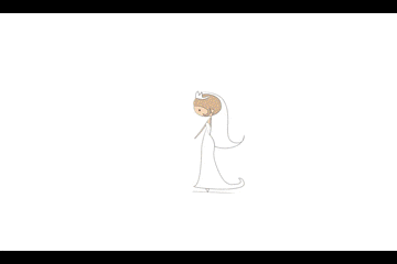
首先放张效果图
然后一步步分析一下:
首先是刚出现的新郎的动画
.w-m img{
	margin-right: 0;
	float: right;
	margin-top: 60px;
	animation: toWoman 0.5s ease .5s both;
}
@keyframes toWoman{
	0%{
		opacity: 0;
		transform: translate(-200px);
	}
	100%{
		opacity: 1;
		transform: translate(0);
	}
}
里面用到的知识点:
animation:是一个简写属性,用于设置六个动画属性
animation-name 规定需要绑定到选择器的 keyframe 名称
animation-duration 规定完成动画所花费的时间,以秒或毫秒计
animation-timing-function 规定动画的速度曲线
animation-delay 规定在动画开始之前的延迟
animation-iteration-count 规定动画应该播放的次数
animation-direction 规定是否应该轮流反向播放动画
keyframes:让开发者通过指定动画中特定时间点必须展现的关键帧样式(或者说停留点)来控制CSS动画的中间环节。这让开发者能够控制动画中的更多细节而不是全部让浏览器自动处理
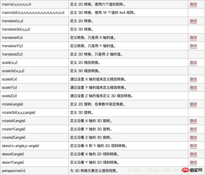
transform 向元素应用 2D 或 3D 转换。该属性允许我们对元素进行旋转、缩放、移动或倾斜
然后是那朵花的css
.w-f{
    position: absolute;
    z-index: 20;
    left: 50%;
    margin-left: -30px;
    margin-top: 75px;
}
.w-f img{
	width: 60px;
	animation: show 0.4s ease 1s both;
}

@keyframes show{
	0%{
		opacity: 0;
		transform: scale(0.1,0.1);
	}
	100%{
		opacity: 1;
		transform: scale(1,1);
	}
}
文字部分的css
.w-t-m{
	position: absolute;
	left: 50%;
	z-index: 10;
	line-height: 80px;
	color: #ff720a;
	letter-spacing: 5px;
	opacity: 0;
	animation: titleBloom 1s linear 1s both;
	font-size: 26px;
    margin-left: -125px;
}
@keyframes titleBloom{
	0% {
	    transform: translate(-50px);
	}
	100% {
		opacity: 1;
	    transform: translate(0);
	}
}
文字边烟花的效果
.w-t img{
	opacity: 0;
    animation: bloom 2s ease 1.2s infinite;
}
.w-t img.boom2{
	float: right;
	animation: bloom 2s ease 1.5s infinite;
}
.w-t img.boom3{
	position: absolute;
	margin-top: 40px;
	animation: bloom 2s ease 1.4s infinite;
}
@keyframes bloom{
	0% {
	    transform: scale(0,0);
	}
	100% {
		opacity: 1;
	    transform: scale(1,1);
	}
}
最后几束花的效果
.w-fls{
	width: 820px;
	margin: 0 auto;
}
.w-fls img{
	height: 120px;
	z-index: 400;
	animation: showFlows 0.4s ease 2.3s both;
}
@keyframes showFlows{
	0%{
		opacity: 0;
		transform: translate(0,200px);
	}
	100%{
		opacity: 1;
		transform: translate(0);
	}
}
.w-2{
	margin-top: -130px;
	padding-left: 100px;
}
.w-2 img{
	animation: showFlows 0.4s ease 2.7s both;
}
写到这里,觉得前端开发原来是这么有趣的一件事哈~
相关推荐:
以上是css3实现求婚小动画的详细内容。更多信息请关注PHP中文网其他相关文章!

 光标的下一个CSS样式Apr 23, 2025 am 11:04 AM
具有CSS的自定义光标很棒,但是我们可以将JavaScript提升到一个新的水平。使用JavaScript,我们可以在光标状态之间过渡,将动态文本放置在光标中,应用复杂的动画并应用过滤器。
 世界碰撞:使用样式查询的钥匙帧碰撞检测Apr 23, 2025 am 10:42 AM
互动CSS动画和元素相互启动的元素在2025年似乎更合理。虽然不需要在CSS中实施乒乓球,但CSS的灵活性和力量的增加,可以怀疑Lee&Aver Lee&Aver Lee有一天将是一场
 使用CSS背景过滤器进行UI效果Apr 23, 2025 am 10:20 AM
有关利用CSS背景滤波器属性来样式用户界面的提示和技巧。您将学习如何在多个元素之间进行背景过滤器,并将它们与其他CSS图形效果集成在一起以创建精心设计的设计。
 微笑吗?Apr 23, 2025 am 09:57 AM
好吧,事实证明,SVG的内置动画功能从未按计划进行弃用。当然,CSS和JavaScript具有承载负载的能力,但是很高兴知道Smil并没有像以前那样死在水中
 '漂亮”在情人眼中Apr 23, 2025 am 09:40 AM
是的,让#039;跳上文字包装:Safari Technology Preview In Pretty Landing!但是请注意,它与在铬浏览器中的工作方式不同。
 CSS-tricks编年史XLIIIApr 23, 2025 am 09:35 AM
此CSS-tricks更新了,重点介绍了年鉴,最近的播客出现,新的CSS计数器指南以及增加了几位新作者,这些新作者贡献了有价值的内容。
 tailwind的@Apply功能比听起来更好Apr 23, 2025 am 09:23 AM
在大多数情况下,人们展示了@Apply的@Apply功能,其中包括Tailwind的单个property实用程序之一(会改变单个CSS声明)。当以这种方式展示时,@Apply听起来似乎很有希望。如此明显


热AI工具

Undresser.AI Undress
人工智能驱动的应用程序,用于创建逼真的裸体照片

AI Clothes Remover
用于从照片中去除衣服的在线人工智能工具。

Undress AI Tool
免费脱衣服图片

Clothoff.io
AI脱衣机

Video Face Swap
使用我们完全免费的人工智能换脸工具轻松在任何视频中换脸!

热门文章
热工具

Dreamweaver CS6
视觉化网页开发工具

螳螂BT
Mantis是一个易于部署的基于Web的缺陷跟踪工具,用于帮助产品缺陷跟踪。它需要PHP、MySQL和一个Web服务器。请查看我们的演示和托管服务。

SublimeText3 Mac版
神级代码编辑软件(SublimeText3)

VSCode Windows 64位 下载
微软推出的免费、功能强大的一款IDE编辑器

SublimeText3汉化版
中文版,非常好用

