(推薦教學:CSS影片教學)
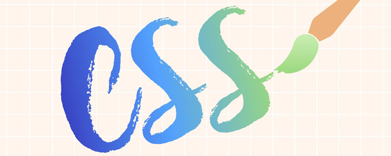
在web前端開發過程中,UI設計師常會設計一些帶有漸層文字的設計圖,以前我們只能用png的圖片來代替文字,今天可以實現使用純CSS實現漸變文字了。以下就介紹3中實作方式供大家參考!
基礎樣式:
.gradient-text {
	text-align: left;
	text-indent: 30px;
	line-height: 50px;
	font-size: 40px;
	font-weight: bolder;
	position: relative;
}第一種方法,使用background-cli、 text-fill-color:
.gradient-text-one{
    background-image:-webkit-linear-gradient(bottom,red,#fd8403,yellow);
    -webkit-background-clip:text;
    -webkit-text-fill-color:transparent;
}
說明:
#background: -webkit-linear-gradient(...) 為文字元素提供漸層背景。
webkit-text-fill-color: transparent 使用透明顏色填滿文字。
webkit-background-clip: text 用文字剪輯背景,用漸層背景作為顏色填滿文字。
第二種方法,使用mask-image:
.gradient-text-two {
	color: red;
}

.gradient-text-two[data-content]::after {
	content: attr(data-content);
	display: block;
	position: absolute;
	color: yellow;
	left: 0;
	top: 0;
	z-index: 2;
	-webkit-mask-image: -webkit-gradient(linear, 0 0, 0 bottom,
	                       from(yellow), to(rgba(0, 0, 255, 0)));
}
說明:
mask-image 和background-image 一樣,不只可以取值是圖片路徑,也可以是漸層色。
第三種方法,使用linearGradient、fill:##
.gradient-text-three{
    fill:url(#SVGID_1_);
    font-size:40px;
    font-weight:bolder;
}
<svg viewBoxs="0 0 500 300" class="svgBox">
<defs>
<linearGradient id="SVGID_1_" gradientUnits="userSpaceOnUse" x1="0" y1="10" x2="0" y2="50">
<stop offset="0" style="stop-color:yellow"/>
<stop offset="0.5" style="stop-color:#fd8403"/>
<stop offset="1" style="stop-color:red"/>
</linearGradient>
</defs>
<text text-anchor="middle" class="gradient-text-three" x="110px" y="30%">花信年华</text>
</svg>
#說明:
在SVG中,有兩種主要的漸變型別:
放射性漸層(radialGradient)
SVG中的漸層不僅可以用來填滿圖形元素,還可以填入文字元素
dom範例:
<!DOCTYPE html>
<html>
<head>
<meta charset="utf-8">
<meta name="viewport" content="width=device-width, user-scalable=no,
initial-scale=1.0, maximum-scale=1.0, minimum-scale=1.0">
<title>CSS3渐变字体</title>
<link rel="stylesheet" href="https://cdn.bootcss.com/bootstrap/3.3.7/css/bootstrap.min.css">
<script src="https://cdn.bootcss.com/jquery/2.1.1/jquery.min.js"></script>
<script src="https://cdn.bootcss.com/bootstrap/3.3.7/js/bootstrap.min.js"></script>
<style type="text/css">
*{margin:0;padding:0;}
body,html{width:100%;height:100%;}
.wrapper{width:80%;margin:0 auto;margin-top:30px;}
.gradient-text{text-align: left;text-indent:30px;line-height: 50px;font-size:40px;
font-weight:bolder; position: relative; }
.gradient-text-one{
background-image:-webkit-linear-gradient(bottom,red,#fd8403,yellow);
-webkit-background-clip:text;
-webkit-text-fill-color:transparent;
}
.gradient-text-two{
color:red;
}
.gradient-text-two[data-content]::after{
content:attr(data-content);
display: block;
position:absolute;
color:yellow;
left:0;
top:0;
z-index:2;
-webkit-mask-image:-webkit-gradient(linear, 0 0, 0 bottom, from(yellow),
to(rgba(0, 0, 255, 0)));
}
.gradient-text-three{
fill:url(#SVGID_1_);
font-size:40px;
font-weight:bolder;
}
</style>
</head>
<body>
<section class="wrapper">
<div class="panel panel-info">
<div class="panel-heading">
<h3 class="panel-title">方法1. background-clip + text-fill-color</h3>
</div>
<div class="panel-body">
<h3 class="gradient-text gradient-text-one">花样年华</h3>
</div>
</div>
<div class="panel panel-warning">
<div class="panel-heading">
<h3 class="panel-title">方法2. mask-image</h3>
</div>
<div class="panel-body">
<h3 class="gradient-text gradient-text-two" data-content="豆蔻年华">豆蔻年华</h3>
</div>
</div>
<div class="panel panel-danger">
<div class="panel-heading">
<h3 class="panel-title">方法3. svg linearGradient</h3>
</div>
<div class="panel-body">
<svg viewBoxs="0 0 500 300" class="svgBox">
    <defs>
        <linearGradient id="SVGID_1_" gradientUnits="userSpaceOnUse" x1="0" y1="10" x2="0" y2="50">
            <stop  offset="0" style="stop-color:yellow"/>
            <stop  offset="0.5" style="stop-color:#fd8403"/>
            <stop  offset="1" style="stop-color:red"/>
        </linearGradient>
    </defs>
    <text text-anchor="middle" class="gradient-text-three" x="110px" y="30%">花信年华</text>
</svg>
</div>
</div>
</section>
</body>
</html>效果:
############更多程式相關知識,請造訪:###程式設計入門###! ! ###
以上是css實現文字顏色漸層的幾種方法的詳細內容。更多資訊請關注PHP中文網其他相關文章!