
關於CSS製作的三角形和圓形小按鈕的代碼

- 不言原創
- 2018-06-25 17:09:032169瀏覽
這篇文章主要介紹了一波CSS製作的三角形和圓形小按鈕示例,都採用了灰色的常見按鈕樣式設計,需要的朋友可以參考下
參考了天貓、微博等網站的做法,用純html和css實現,效果還是不錯的。
以下是成果,相容主流瀏覽器,包括ie6。 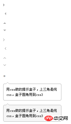
<!DOCTYPE html PUBLIC "-//W3C//DTD XHTML 1.0 Strict//EN"             "http://www.w3.org/TR/xhtml1/DTD/xhtml1-strict.dtd">
<html xmlns="http://www.w3.org/1999/xhtml">
<head>
<meta http-equiv="Content-Type" content="text/html; charset=utf-8" />
<meta http-equiv="Content-Language" content="zh-CN" />
<meta name="Keywords" content="" />
<meta name="Description" content="" />
<title></title>
</head>
<style type="text/css">
*{margin:0; padding:0; list-style:none; font:normal 12px/150% 宋体; }
body{ padding:20px; }
.arrow{ margin-bottom:20px;  }
/* css三角形 */
.arrow,.arrow s { position:relative;  display:block; font-size: 0; line-            height: 0; width: 0; height: 0; border-color:transparent; border-style:dashed; border-width:5px; }
.arrowR,.arrowR s{ border-left-color:#aaa; border-left-style:solid; }
.arrowR s{ border-left-color:#fff; position:absolute; left:-7px; top:-5px; }
.arrowR:hover{ border-left-color:#f60;  }
.arrowL,.arrowL s{ border-right-color:#aaa; border-right-style:solid; }
.arrowL s{ border-right-color:#fff; position:absolute; rightright:-7px; top:-5px; }
.arrowL:hover{ border-right-color:#f60;  }
.arrowT,.arrowT s{ border-bottom-color:#aaa; border-bottom-style:solid; }
.arrowT s{ border-bottom-color:#fff; position:absolute; left:-5px; top:-3px; }
.arrowT:hover{ border-bottom-color:#f60;  }
.arrowB,.arrowB s{ border-top-color:#aaa; border-top-style:solid; }
.arrowB s{ border-top-color:#fff; position:absolute; left:-5px; bottombottom:-3px; }
.arrowB:hover{ border-top-color:#f60;  }
/* css圆形 */
.circle{ line-height:100%; overflow:hidden;  font-    family:Tahoma,Helvetica; font-size:18px; color:#aaa;  }
.circle:hover{ color:#f60;  }
/* 提示盒子 */
.tipBox{ width:200px; margin-top:10px;   }
.tipBox .hd{ height:5px;  position:relative;  }
.tipBox .hd .arrow{ position:absolute; top:-5px; left:10px; }
.tipBox .hd .arrow s{ top:-4px; }
.tipBox .bd{ border:1px solid #aaa; padding:10px;  -webkit-border-    radius:5px; -moz-border-radius:5px; border-radius:5px;  }
.tipBoxA .arrow s{ border-bottom-color:#f6f6f6;  }
.tipBoxA .bd{ background:#f6f6f6;  }
</style>
<body>
<a class="arrow arrowR"></a>
<a class="arrow arrowL"></a>
<a class="arrow arrowT"></a>
<a class="arrow arrowB"></a>
<a class="arrow arrowR"><s></s></a>
<a class="arrow arrowL"><s></s></a>
<a class="arrow arrowT"><s></s></a>
<a class="arrow arrowB"><s></s></a>
<a class="circle">?</a>
<p class="tipBox">
<p class="hd">
<s class="arrow arrowT"><s></s></s>
</p>
<p class="bd">
用css做的提示盒子,上三角是纯css,盒子圆角用到css3
</p>
</p>
<p class="tipBox tipBoxA">
<p class="hd">
<s class="arrow arrowT"><s></s></s>
</p>
<p class="bd">
用css做的提示盒子,上三角是纯css,盒子圆角用到css3
</p>
</p>
</body>
</html>
以上就是本文的全部內容,希望對大家的學習有所幫助,更多相關內容請關注PHP中文網!
相關推薦:
以上是關於CSS製作的三角形和圓形小按鈕的代碼的詳細內容。更多資訊請關注PHP中文網其他相關文章!
陳述:
本文內容由網友自願投稿,版權歸原作者所有。本站不承擔相應的法律責任。如發現涉嫌抄襲或侵權的內容,請聯絡admin@php.cn