
利用table實現版面的技巧
- php中世界最好的语言原創
- 2018-03-20 16:25:423579瀏覽
這次帶給大家利用table實現佈局的技巧,利用table實現佈局的注意事項有哪些,以下就是實戰案例,一起來看一下。
本文介紹了CSS 利用table實現五種常用佈局的方法範例,分享給大家,具體如下:
##佈局一:
效果: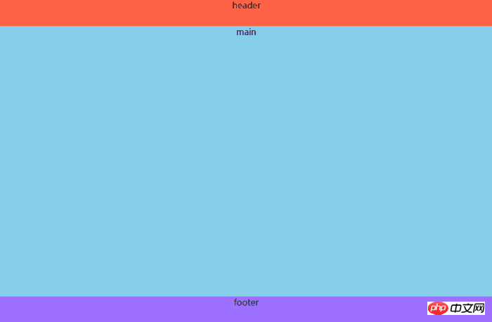
<p class="header">header</p> <p class="main">main</p> <p class="footer">footer</p>注意:p中要有內容,不然顯示不出來css:
body{
  margin:0;
  padding:0;
  width:100%;
  min-height:100vh;
  display:table;
  text-align:center;
}
.header,.main,.footer{
  display:table-row;
}
.header{
  height:50px;
  background:tomato;
}
.main{
  background:skyblue;
}
.footer{
  height:50px;
  background:#9d70ff;
}
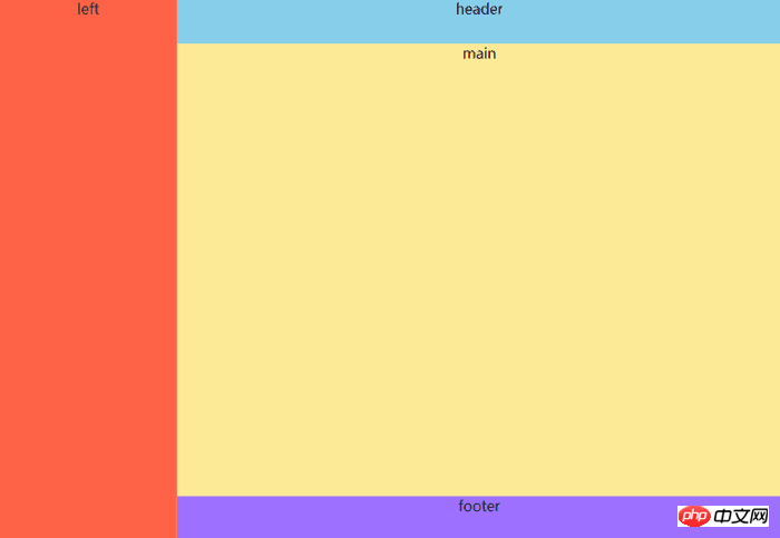
版面二:
效果: ##程式碼:
html:
<p class="header">header</p>
<p class="main">
  <p class="left">left</p>
  <p class="right">right</p>
</p>
<p class="footer">footer</p>
css:
body{
  margin:0;
  padding:0;
  width:100%;
  min-height:100vh;
  display:table;
  text-align:center;
}
.header,.main,.footer{
  display:table-row;
}
.header{
  height:50px;
  background:tomato;
}
.main{
  width:100%;
  display:table;
  height:calc(100vh - 100px);
}
.main .left{
  width:300px;
  display:table-cell;
  background:#fcea96;
}
.main .right{
  display:table-cell;
  background:skyblue;
}
.footer{
  height:50px;
  background:#9d70ff;
}
注意:.main的height屬性中的100px是header和footer的高度之和
#佈局三:效果:
 #程式碼:
#程式碼:
#html:
<p class="left">left</p>
<p class="right">
  <p class="header">header</p>
  <p class="main">main</p>
  <p class="footer">footer</p>
</p>
css:
body{
  margin:0;
  padding:0;
  min-height:100vh;
  display:table;
  text-align:center;
}
.left{
  display:table-cell;
  width:200px;
  background:tomato;
}
.right{
  display:table;
  width:calc(100vw - 200px);
  height:100vh;
}
.header,.main,.footer{
  display:table-row;
}
.header{
  height:50px;
  background:skyblue;
}
.main{
  background:#fcea96;
}
.footer{
  height:50px;
  background:#9d70ff;
}
佈局四(雙欄佈局,範例為左邊固定,右邊自適應):
效果:
##程式碼: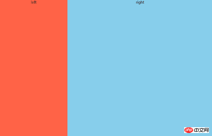
<p class="left">left</p>
<p class="right">right</p>
css:
body{
  margin:0;
  padding:0;
  width:100%;
  height:100vh;
  display:table;
  text-align:center;
}
.left,.right{
  display:table-cell;
}
.left{
  width:300px;
  background:tomato;
}
.right{
  background:skyblue;
}
佈局五(三欄佈局,範例為左固定,右邊固定,中間自適應):
效果:
程式碼:
<p class="left">left</p>
<p class="middle">middle</p>
<p class="right">right</p>
css:
body{
  margin:0;
  padding:0;
  width:100%;
  height:100vh;
  display:table;
  text-align:center;
}
.left,.middle,.right{
  display:table-cell;
}
.left{
  width:300px;
  background:tomato;
}
.middle{
  background:#ffe69e;
}
.right{
  width:200px;
  background:skyblue;
}
相信看了本文案例你已經掌握了方法,更多精彩請關注php中文網其它相關文章! 推薦閱讀:
css3的動畫序列animation
以上是利用table實現版面的技巧的詳細內容。更多資訊請關注PHP中文網其他相關文章!
陳述:
本文內容由網友自願投稿,版權歸原作者所有。本站不承擔相應的法律責任。如發現涉嫌抄襲或侵權的內容,請聯絡admin@php.cn