
用python繪製圖形的實例詳解

- PHP中文网原創
- 2017-06-20 15:55:325464瀏覽
1.環境
系統:windows10
python版本:python3.6.1
使用的函式庫:matplotlib,numpy
2.numpy函式庫產生隨機數幾種方法
import numpy as npnumpy.random
rand(d0, d1 , ..., dn) In [2]: x=np.random.rand(2,5)
In [3]: x
Out[3 ]:
array([[ 0.84286554, 0.50007593, 0.66500549, 0.97387807, 0.03993009],
0.21527461, 0.92692517, 0.2567891 ]])randn(d0, d1, ..., dn)查詢結果為標準常態分配
In [4]: x=np.random.randn(2, 5)
In [5]: x
Out[5]:
array([[-0.77195196, 0.26651203, -0.35045793, -0.0210377 , 0.89745793, -0.0210377 , 1.44852833 , -0.10858996, -1.65034606, -0.39793635]])randint(low,high,size) 產生low到high之間之間之間(半開區間[low, high)),size個資料In [6]: x=np.random.randint(1,8,4)In [7]: x Out[7]: array([4, 4, 2, 7])
random_integers(low,high,size) 產生low到high之間(閉區間[low, high)),size個資料In [10]: x=np.random.random_integers(2,10,5)In [11]: x Out[11]: array([7, 4, 5, 4, 2])
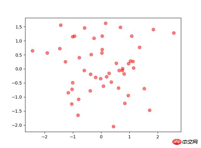
3.散佈圖
x x轴
y y轴
s   圆点面积
c   颜色
marker  圆点形状
alpha   圆点透明度                #其他图也类似这种配置
N=50# height=np.random.randint(150,180,20)# weight=np.random.randint(80,150,20)
x=np.random.randn(N)
y=np.random.randn(N)
plt.scatter(x,y,s=50,c='r',marker='o',alpha=0.5)
plt.show()
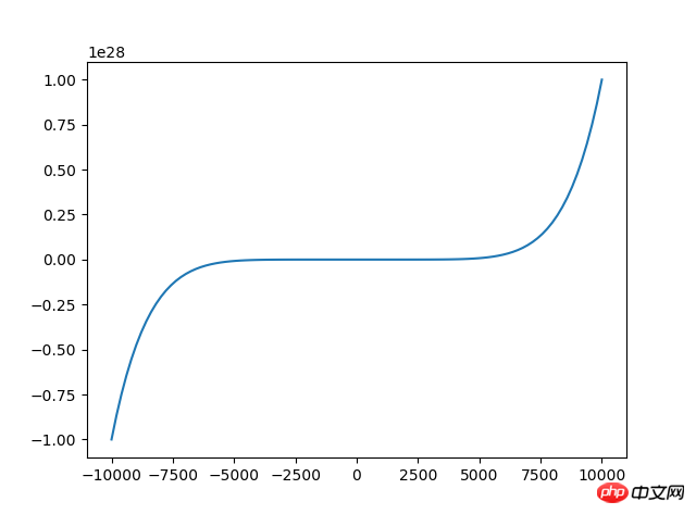
#4.折線圖
<code class="language-python hljs"># 来源:百度网盘搜索 <br/>x=np.linspace(<span class="hljs-number">-10000,<span class="hljs-number">10000,<span class="hljs-number">100) <span class="hljs-comment">#将-10到10等区间分成100份
y=x**<span class="hljs-number">2+x**<span class="hljs-number">3+x**<span class="hljs-number">7
plt.plot(x,y)
plt.show()</span></span></span></span></span></span></span></code>
折線圖使用plot函數
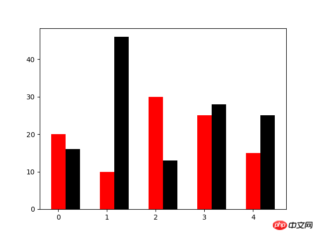
#5.長條圖
N=5
y=[20,10,30,25,15]
y1=np.random.randint(10,50,5)
x=np.random.randint(10,1000,N)
index=np.arange(N)
plt.bar(left=index,height=y,color='red',width=0.3)
plt.bar(left=index+0.3,height=y1,color='black',width=0.3)
plt.show()
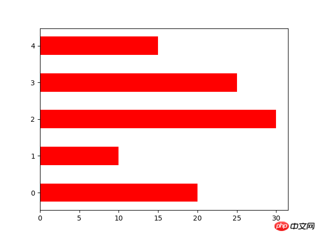
orientation設定橫向長條圖
N=5
y=[20,10,30,25,15]
y1=np.random.randint(10,50,5)
x=np.random.randint(10,1000,N)
index=np.arange(N)# plt.bar(left=index,height=y,color='red',width=0.3)# plt.bar(left=index+0.3,height=y1,color='black',width=0.3)#plt.barh() 加了h就是横向的条形图,不用设置orientation
plt.bar(left=0,bottom=index,width=y,color='red',height=0.5,orientation='horizontal')
plt.show()
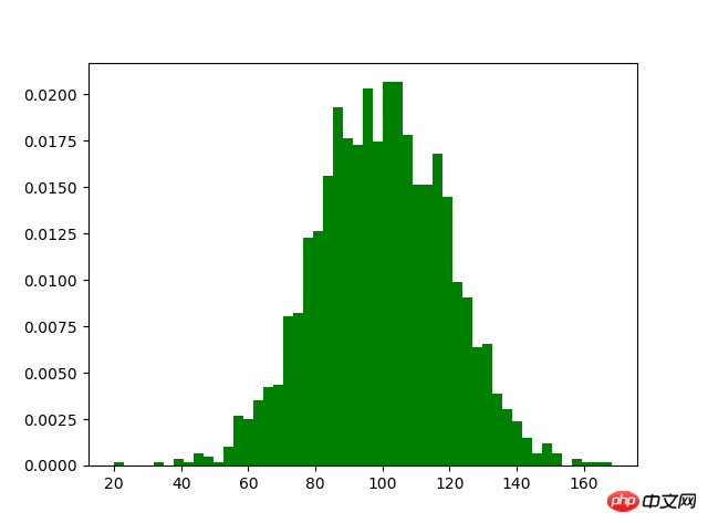
#6.直方圖
m1=100
sigma=20
x=m1+sigma*np.random.randn(2000)
plt.hist(x,bins=50,color="green",normed=True)
plt.show()
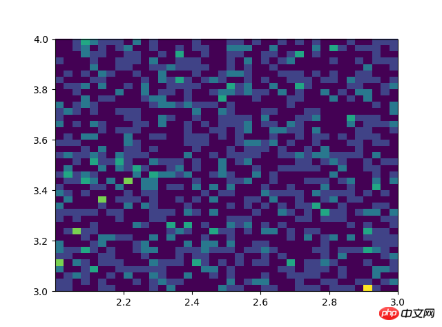
# #双变量的直方图# #颜色越深频率越高# #研究双变量的联合分布#双变量的直方图#颜色越深频率越高#研究双变量的联合分布 x=np.random.rand(1000)+2 y=np.random.rand(1000)+3 plt.hist2d(x,y,bins=40) plt.show()
7.餅狀圖
#设置x,y轴比例为1:1,从而达到一个正的圆
#labels标签参数,x是对应的数据列表,autopct显示每一个区域占的比例,explode突出显示某一块,shadow阴影
labes=['A','B','C','D']
fracs=[15,30,45,10]
explode=[0,0.1,0.05,0]#设置x,y轴比例为1:1,从而达到一个正的圆
plt.axes(aspect=1)#labels标签参数,x是对应的数据列表,autopct显示每一个区域占的比例,explode突出显示某一块,shadow阴影
plt.pie(x=fracs,labels=labes,autopct="%.0f%%",explode=explode,shadow=True)
plt.show()

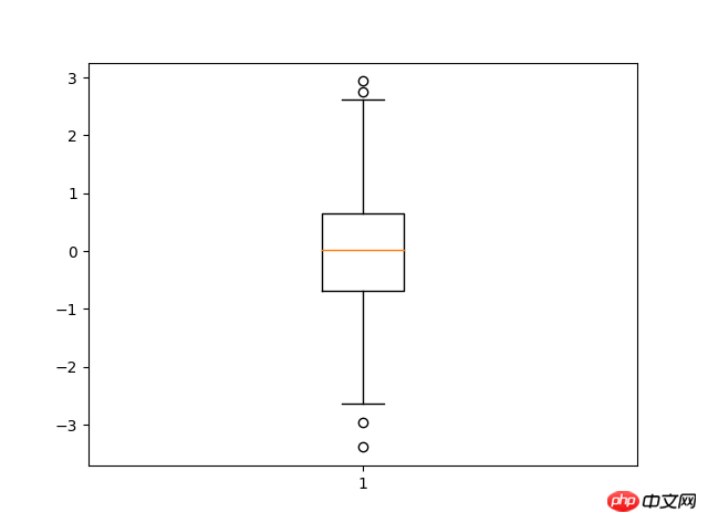
#8.箱型圖
import matplotlib.pyplot as pltimport numpy as npdata=np.random.normal(loc=0,scale=1,size=1000)#sym 点的形状,whis虚线的长度plt.boxplot(data,sym="o",whis=1.5)plt.show()
#sym 点的形状,whis虚线的长度
#
以上是用python繪製圖形的實例詳解的詳細內容。更多資訊請關注PHP中文網其他相關文章!
陳述:
本文內容由網友自願投稿,版權歸原作者所有。本站不承擔相應的法律責任。如發現涉嫌抄襲或侵權的內容,請聯絡admin@php.cn