
使用新的 CSS 函數優化 CSS 基於時間的動畫

- 王林原創
- 2024-08-21 06:49:12474瀏覽
作者:Emmanuel Odioko✏️
長期以來,對數學函數的有限支援使得創建基於時間的 CSS 動畫變得更具挑戰性。傳統動畫依賴關鍵影格和持續時間,缺乏基於複雜運算的基於時間的更新的靈活性。隨著 mod()、round() 和三角函數等 CSS 函數的引入,開發人員現在可以探索如何掌握 CSS 中基於時間的動畫。
開始之前需要了解的事情
要充分利用這篇關於使用新 CSS 函數在 CSS 中實現基於時間的動畫的內容,您應該對 CSS 動畫和過渡有很好的了解。您應該能夠知道如何使用@keyframes 創建動畫並控制它們的時間。您還應該對 JavaScript 有基本的了解,更專注於操作 DOM 元素和回應使用者事件的能力。
最後,了解新的CSS 函數(如calc()),並準備好探索新興功能(如mod())、三角函數(包括sin() 和cos() 以及round())將打下良好的基礎。
讀完本文後,您將了解傳統上如何使用 JavaScript 在 HTML 畫布上實現動畫,以及它們與較新的 CSS 函數的比較。我們將了解使用 mod()、round() 和三角函數相對於傳統 CSS 關鍵影格的易用性。
什麼是 CSS 基於時間的動畫?
基於時間的動畫並不新鮮-它們已經存在十多年了。有些使用起來很複雜,有些則不然。您知道那些以數學計算為主的 CSS 檔案嗎?基於時間的動畫就是其中的一部分。
顧名思義,這些動畫與時間密切相關,元素的屬性,如位置、大小、顏色、不透明度等,都會隨著時間而變化。 CSS 基於時間的動畫可產生平滑的過渡,增強 Web 應用程式的感覺並提供更好的使用者體驗。
基於時間的 CSS 動畫主要由定義的開始和結束時間軸以及插值點組成。這裡的插值是指隨著動畫的進行,在給定的持續時間內計算動畫開始和結束之間的中間值。插值的原因是為了提供從初始狀態到最終狀態的平滑過渡。
基於時間的動畫是透過 CSS 變數和一些數學函數的組合來實現的。這種統一性使開發人員能夠創建隨時間變化的動畫,並產生關鍵影格動畫只能夢想的更靈活的動畫。讓我們來分解一下關鍵概念及其運作方式。
分解基於時間的動畫
在本節中,我們將把創建基於時間的動畫的一般結構分解為關鍵組件。
初始狀態
初始狀態定義了動畫開始之前元素的起始屬性。這可以是指定的位置、大小、顏色、不透明度等。範例如下:
.box {
  opacity: 0;
  transform: translateY(-20px);
}
在上面的程式碼中,我們有一個帶有類別 box 的元素的初始狀態,它定義了它的不透明度和變換屬性。
動畫觸發器指定啟動動畫的事件。常見觸發器包括使用者互動(例如點擊或懸停)、頁面載入事件或應用程式中的特定條件(例如使用者完成操作)。
動畫的屬性包括動畫時長、定時函數、延遲、迭代次數、方向和填滿模式。動畫可能具有部分或全部這些屬性。下面顯示了帶有懸停選擇器的觸發器範例:
.box:hover {
  animation: fadeIn 1s ease-in-out forwards;
}
這顯示了新增的動畫 fadeIn,當帶有類別框的元素懸停並持續一秒鐘時會觸發該動畫。也指定了動畫行為和時間。閱讀本文以獲取有關動畫和過渡計時函數的更多資訊。
插補點
如前所述,這些是動畫在時間軸上各點的中間狀態。每個關鍵影格指定元素在特定時刻的屬性,允許初始狀態和最終狀態之間的逐漸過渡。一個插值點的範例實作是 CSS keyframes 屬性:
@keyframes fadeIn {
  0% {
    opacity: 0;
    transform: translateY(-20px);
  }
  100% {
    opacity: 1;
    transform: translateY(0);
  }
}
上面的範例使用關鍵影格來定義動畫進度的 0% 和 100% 時淡入動畫的屬性。
Common uses of time-based animations
Time-based animation has become increasingly essential in web applications as it helps with better user experience. The usage of these animations ranges from subtle micro-interactions to significant site transitions, giving web apps a more dynamic feel. Below are common use cases of these animations.
Micro-interactions
Micro-interactions are small, often subtle, and reusable animations that occur in response to user actions. These brief animations provide feedback. You may have come across animations such as pop-up warnings, loading spinners indicating ongoing processes, or a button indicating a click action. All of these are micro-interactions and consist of time-based animations.  Image source: https://userpilot.com/blog/micro-interaction-examples/[/caption]
In the image above, we have a submit button which shows a loader and a tick when the user clicks on it. The essence of these micro interactions is to commit to the user the process of the submission and the success of the operation.
Transitions
Site transitions are used to indicate state or page changes on a web application to create a fluid user experience using effects such as fading, sliding, or scaling elements. With time-based animations, these transitions are possible. Common transition effect applications are toggling navigation and side menus, parallax animations, opening and closing of modals, etc.
Image source: https://medium.com/@9cv9official/create-a-beautiful-hover-triggered-expandable-sidebar-with-simple-html-css-and-javascript-9f5f80a908d1[/caption] Image source: https://medium.com/@9cv9official/create-a-beautiful-hover-triggered-expandable-sidebar-with-simple-html-css-and-javascript-9f5f80a908d1
In the GIF above, there is a sidebar which uses a transition animation to expand the sidebar on a mouse hover event.
Exploring new CSS functions
Let’s get into the new mathematical CSS functions mod(), round(), and the trigonometric functions sin(), cos() and tan() while discussing each in detail.
Mod () function
Like the JavaScript modulo operator %, this function returns the remainder after an arithmetic modulus operation has been carried out on two operands. In essence, the modulus is the leftover value after the dividend is divided by the other operand, the divisor, and no more division can occur. In JavaScript, using the modulo operator will take the following form:10%4.
This operation would leave behind a Modulus of 2 as 10 is only divisible by the divisor 4 twice, leaving behind a remainder of 2. Similarly, the CSS Mod function would perform the same function with the following syntax instead: mod(10, 4).
It is also important to note that the modulus takes the sign of the divisor. As such, the result of mod(10, -4) would be -2 instead.
Mod() parameters and syntax
The mod() function primarily accepts two sets of parameters mod(dividend, divisor) which are essentially two comma-separated values. These operands must be of the same dimension for them to be valid and can take a variety of values as parameters thereby improving the range of its application. Operands passed to mod() can be numbers, percentages, or dimensions.
Mod() can also take in the unit of its operands (e.g. px, rem, vh, deg) and can also handle mathematical calculations as dividend or divisor. Below are some examples showing the use of this CSS function:
/* using <numbers> without units */
scale: mod(18, 7); /* result is 4 */

/* <percentage> and <dimension>  with units  */
height: mod(100vh, 30vh); /* result is 10vh */
width: mod(500px, 200px); /* result is 100px */
transform: rotate(mod(90deg, 20deg)); /* result is 10deg */

/* negative <percentage> and <dimension>  with units  */
height: mod(18rem, -4rem); /* result is 2rem */
rotate: mod (180deg, -100deg); /* result is 80deg */

/* working with calculations */
width: mod(40px*2, 15px); /* result is 5px */
transform: scale(mod(2*3, 1.8)); /* result is 0.6 */
rotate: mod(10turn, 8turn/2); /* result is 2turn */
The code block above shows different applications of the mod() in CSS styles.
While the examples shown use known values, time-based functions are expected to be used with CSS variables which are dynamic and make it possible for the styles to change values depending on the variable passed to the function. The outcome of the operation is then dependent on the calculation using the specified variables, and can produce a wider range of outcomes compared to when hardcoded values are used.
Below you’ll find the general syntax for all possibilities of mod() as illustrated by MDN:
<mod()> =
  mod( <calc-sum> , <calc-sum> )

<calc-sum> =
  <calc-product> [ [ '+' | '-' ] <calc-product> ]*

<calc-product> =
  <calc-value> [ [ '*' | '/' ] <calc-value> ]*

<calc-value> =
  <number>        |
  <dimension>     |
  <percentage>    |
  <calc-keyword>  |
  ( <calc-sum> )

<calc-keyword> =
  e          |
  pi         |
  infinity   |
  -infinity  |
  NaN
In the syntax above, calc-sum represents the operands of the modulus operation. The syntax also shows the types of values calc-sum can contain and the possibility of negative and positive values. Furthermore, the syntax above also shows the possible calc-keywords e, pi, infinity, -infinity, and NaN.
round() function
The CSS round() function value is based on a specified rounding strategy. Note that strategy refers to the pattern of rounding the value such as rounding up or down, rounding to zero, rounding to the nearest occurrence of a number, etc..
round() parameters and syntax
The syntax for applying the CSS round() is given below:
round(<rounding-strategy>, valueToRound, roundingInterval)
Here's a breakdown of the CSS round() function into smaller bits and highlights of the functions of each keyword and the possible values they can take.
rounding-strategy
The rounding strategy is the type of technique that would be used to round a specified value. This is optional (defaults to nearest if unspecified), and can be one of the following:
- up — rounds value up to the nearest integer multiple of the specified roundingInterval. This operation is similar to JavaScript’s Math.ceil() method and will produce a more positive result if the value is negative
- down — rounds valueToRound down to the nearest integer multiple of the specified roundingInterval. This is similar to JavaScript’s Math.floor() method and will produce a more negative result if the value is negative
- nearest — rounds the valueToRound to the nearest integer multiple of roundingInterval. The result obtained may be higher or lower than the value, depending on how close it is to a multiple of the roundingInterval
- to-zero — rounds the value to the nearest integer multiple of roundingInterval closer to/towards zero and is equivalent to JavaScript’s trunc() method
valueToRound
This is the value we intend to round using the function, and it can be a
roundingInterval
The rounding interval refers to the interval a value is rounded with a reference to. This entry can be a
Below is an example illustrating the use of the CSS round() function:
<!DOCTYPE html>
<html lang="en">
<head>
  <meta charset="UTF-8">
  <meta name="viewport" content="width=device-width, initial-scale=1.0">
  <title>Document</title>
  <style>
    body{
      display: flex;
      justify-content: center;
      align-items: center;
      height: 100vh;
      margin: 0;
    }

    /* using the round() function */
    .ball {
      width: 100px;
      height: 100px;
      background-color: red;
      color: white;
      text-align: center;
      line-height: 100px;
      margin: 10px;
    }
    .ball-1{
        border-radius: round(down, 70%, var(--rounding-interval)); /*rounded down to the interval of 50% */
    }

    .ball-2{
        border-radius: round(up, 70%, var(--rounding-interval2)); /* rounded up to interval of 100% */
    }

    .ball-3{
        border-radius: round(nearest, 15%, var(--rounding-interval3)); /* rounded to the nearest interval 25% */
    }

  </style>
</head>
<body>
    <!-- rounded containers -->
  <div class="ball ball-1" style="--rounding-interval:50%;">rounded 50%</div>
  <div class="ball ball-2" style="--rounding-interval2:100%;"> rounded 100%</div>
  <div class="ball ball-3" style="--rounding-interval3:25%;"> rounded 25%</div>
</body>
</html>
In this example, we used round() and CSS variables to round values to a specified roundingInterval in the style of each element. Below is the outcome of this example: 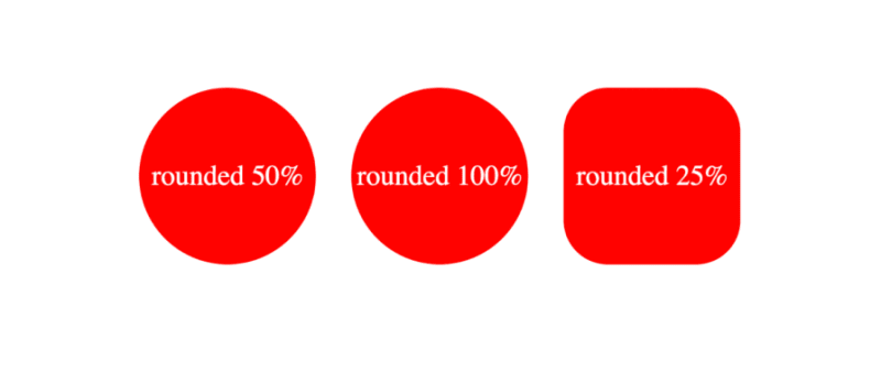 The formal syntax of the CSS round() function according to MDN docs is given by the following:
<round()> =
  round( <rounding-strategy>? , <calc-sum> , <calc-sum>? )

<rounding-strategy> =
  nearest  |
  up       |
  down     |
  to-zero

<calc-sum> =
  <calc-product> [ [ '+' | '-' ] <calc-product> ]*

<calc-product> =
  <calc-value> [ [ '*' | '/' ] <calc-value> ]*

<calc-value> =
  <number>        |
  <dimension>     |
  <percentage>    |
  <calc-keyword>  |
  ( <calc-sum> )

<calc-keyword> =
  e          |
  pi         |
  infinity   |
  -infinity  |
  NaN
In the syntax above, rounding-strategy is the intended rounding pattern and calc-sum represents the operands. The formula also shows the possible entries for rounding-strategy and calc-sum. Finally, it outlines the possible calc-keywords e, pi, infinity, -infinity, and NaN.
Trigonometric functions
The CSS trigonometric functions perform the same operations as in mathematics, as such, the sin() function returns the sine of a number as a value between the range of -1 and 1, cos() returns the cosine of a value, and tan() returns the tangent of a specified value.
Arguments passed to these functions must be either a number or an angle, and they will be treated as radians. Units such as deg and turn represent angle and can be used with arguments here.
Example applications of these functions are shown below:
scale: sin(45deg); /* result is 0.7071067811865475 */
rotate: cos(30deg); /* result is 0.8660254037844387 */
height: calc(50px * tan(30deg)); /* result is 28.86751345948129px */
All trigonometric CSS functions bear similarity, taking in only a single parameter that is resolved to an angle.
Parameters and syntax of sin()
Sin() takes in only one parameter which must be a number or angle, or a mathematical expression that resolves to either of them. The syntax of sin() is as follows: \
sin(angle)
The formal syntax of sin() is shown below: \
<sin()> =
  sin( <calc-sum> )

<calc-sum> =
  <calc-product> [ [ '+' | '-' ] <calc-product> ]*

<calc-product> =
  <calc-value> [ [ '*' | '/' ] <calc-value> ]*

<calc-value> =
  <number>        |
  <dimension>     |
  <percentage>    |
  <calc-keyword>  |
  ( <calc-sum> )

<calc-keyword> =
  e          |
  pi         |
  infinity   |
  -infinity  |
  NaN
The syntax above shows the possible values for calc-sum and calc-keyword.
Parameters and syntax of cos()
The parameter of cos() is either a number, an angle, or contains a single calculation that must resolve to either type.
As such, the syntax for cos() is the following:
cos(angle)
The formal syntax of all possibilities of cos() is below:
<cos()> =
  cos( <calc-sum> )

<calc-sum> =
  <calc-product> [ [ '+' | '-' ] <calc-product> ]*

<calc-product> =
  <calc-value> [ [ '*' | '/' ] <calc-value> ]*

<calc-value> =
  <number>        |
  <dimension>     |
  <percentage>    |
  <calc-keyword>  |
  ( <calc-sum> )

<calc-keyword> =
  e          |
  pi         |
  infinity   |
  -infinity  |
  NaN
Where calc-sum is the parameter, calc-value is the allowed types of parameters, and calc-keywords are possible units that can be added to the mathematical expression.
Parameters and syntax of tan()
The tan() function also takes a number, an angle, or a single calculation that must resolve to either type, similar to the other trigonometric functions. The syntax of tan() is given by the following:
tan(angle)
The formal syntax of this function is shown below:
<tan()> =
  tan( <calc-sum> )

<calc-sum> =
  <calc-product> [ [ '+' | '-' ] <calc-product> ]*

<calc-product> =
  <calc-value> [ [ '*' | '/' ] <calc-value> ]*

<calc-value> =
  <number>        |
  <dimension>     |
  <percentage>    |
  <calc-keyword>  |
  ( <calc-sum> )

<calc-keyword> =
  e          |
  pi         |
  infinity   |
  -infinity  |
  NaN
This syntax shows all possible values of calc-sum, the operand, and the calc-keyword.
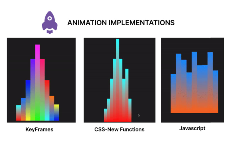
Comparing timing animations between CSS functions and keyframes
In this section, we will create an animation using CSS functions, keyframes for an alternative, and JavaScript for a second alternative. In the end, we will compare the code and contrast the approaches to determine the benefits of usingCSS functions in creating CSS animations over other options.
Creating animation with CSS functions
Let's start by creating our music beat bar animation using CSS functions. This animation focuses on animating multiple bars, changing the property of the height and background colors using values generated with CSS functions:
<!DOCTYPE html>
<html lang="en">

<head>
  <meta charset="UTF-8">
  <meta name="viewport" content="width=device-width, initial-scale=1.0">
  <title>Beats Bar Animation with CSS Functions</title>
  <style>
    :root {
      /* change the value of --t infinitely */
      animation: animate-time 1000ms linear infinite;
    }

    @keyframes animate-time {
      from {
        --t: 0;
      }

      to {
        --t: 100000;
      }
    }

    body {
      display: flex;
      justify-content: center;
      align-items: center;
      height: 100vh;
      background-color: #222;
      margin: 0;
    }

    .container {
      height: 500px;
      width: 250px;
      position: relative;
      display: flex;
      gap: 10px;
    }

    .bar {
      position: absolute;
      bottom: 0;
      width: 20px;
      height: 20px;
      --frequency: 1;
      --time: calc(var(--t) / 1000 / var(--frequency));
      --rounded-time: round(nearest, var(--time));
      /* Adjust frequency of animation */
      --amplitude: 30px;
      /* base height */
      --base-height: 20px;
      /* Transition for smooth height change */
      transition: height 0.5s ease-in-out, background 1s ease-in-out;
      /* Calculate dynamic hue using mod and round */
      --hue: mod(round(nearest, calc(var(--time) * 10)), 360);
      --alpha: calc(0.5 + 0.5 * cos(calc(var(--time) * 1turn)));
      /* Apply dynamic linear gradient background */
      background: linear-gradient(to top,
          hsla(var(--hue), 100%, 50%, var(--alpha)),
          hsla(calc(var(--hue) + 180), 100%, 50%, var(--alpha)));
    }

    .bar1 {
      /* Calculate height based on rounded time */
      height: calc(var(--base-height) + var(--amplitude) * var(--rounded-time)/46 * var(--index-a));
      margin-left: 10px;
    }

    .bar2 {
      /* Calculate height based on rounded time */
      height: calc(var(--base-height) + var(--amplitude) * var(--rounded-time)/46 * var(--index-b));
      margin-left: 30px;
    }

    .bar3 {
      /* Calculate height based on rounded time */
      height: calc(var(--base-height) + var(--amplitude) * var(--rounded-time)/46 * var(--index-c));
      margin-left: 50px;
    }

    .bar4 {
      /* Calculate height based on rounded time */
      height: calc(var(--base-height) + var(--amplitude) * var(--rounded-time)/46 * var(--index-d));
      margin-left: 70px;
    }

    .bar5 {
      /* Calculate height based on rounded time */
      height: calc(var(--base-height) + var(--amplitude) * var(--rounded-time)/46 * var(--index-e));
      margin-left: 90px;
    }

    .bar6 {
      /* Calculate height based on rounded time */
      height: calc(var(--base-height) + var(--amplitude) * var(--rounded-time)/46 * var(--index-f));
      margin-left: 110px;
    }

    .bar7 {
      /* Calculate height based on rounded time */
      height: calc(var(--base-height) + var(--amplitude) * var(--rounded-time)/46 * var(--index-g));
      margin-left: 130px;
    }

    .bar8 {
      /* Calculate height based on rounded time */
      height: calc(var(--base-height) + var(--amplitude) * var(--rounded-time)/46 * var(--index-h));
      margin-left: 150px;
    }

    .bar9 {
      /* Calculate height based on rounded time */
      height: calc(var(--base-height) + var(--amplitude) * var(--rounded-time)/46 * var(--index-i));
      margin-left: 170px;
    }
  </style>
</head>

<body>
  <div class="container">
    <div class="bar bar1" style="--index-a: 1;"></div>
    <div class="bar bar2" style="--index-b: 2;"></div>
    <div class="bar bar3" style="--index-c: 4;"></div>
    <div class="bar bar4" style="--index-d: 6;"></div>
    <div class="bar bar5" style="--index-e: 8;"></div>
    <div class="bar bar6" style="--index-f: 6;"></div>
    <div class="bar bar7" style="--index-g: 4;"></div>
    <div class="bar bar8" style="--index-h: 5;"></div>
    <div class="bar bar9" style="--index-i: 2;"></div>
  </div>
</body>

</html>
Here’s a breakdown of the code block above:
- Created a root animation to change the value of a variable --t infinitely
- Styled the body and container class
- Created the initial state for the bar class and declared some variables we would use in our animation. Here we also created a transition property and used round() and mod() CSS functions to generate dynamic values for the background colors of the bars
- Next, we applied a height transition to each of the bars, depending on the values obtained from the variables
- Finally, we have the HTML element structure
The code above produces the following animation: 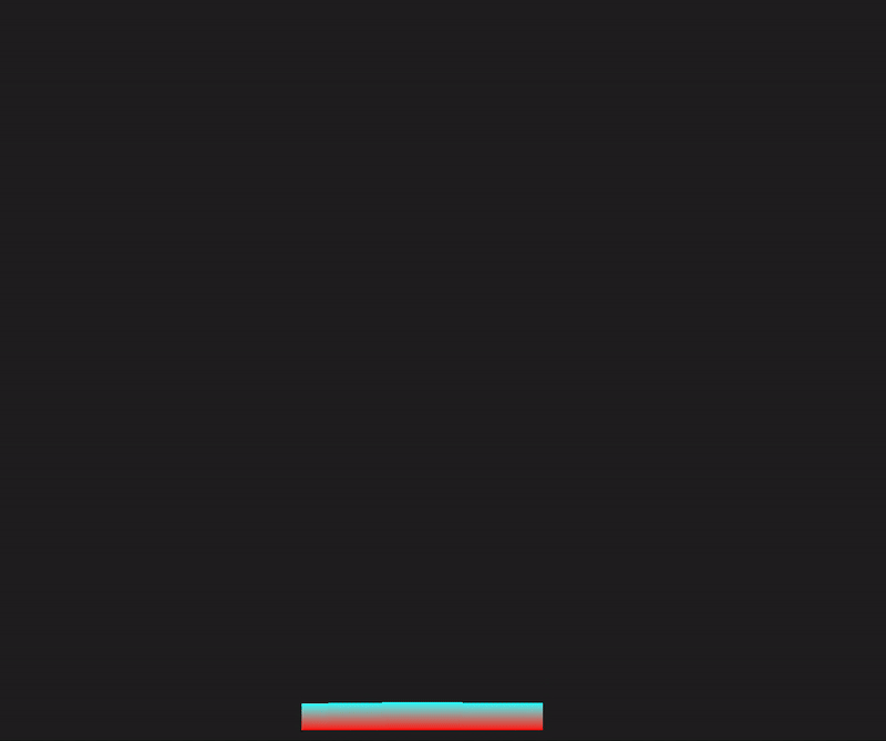
Recreating the animation with CSS keyframes
In this section, we will rebuild the sound bar animation, but we’ll use animations and CSS keyframes instead:
<!DOCTYPE html>
<html lang="en">

<head>
  <meta charset="UTF-8">
  <meta name="viewport" content="width=device-width, initial-scale=1.0">
  <title>Beats Bar Animation with CSS Keyframes</title>
  <style>
    body {
      display: flex;
      justify-content: center;
      align-items: center;
      height: 100vh;
      background-color: #222;
      margin: 0;
    }

    .container {
      height: 500px;
      width: 250px;
      position: relative;
      display: flex;
      gap: 10px;
    }

    .bar {
      position: absolute;
      bottom: 0;
      width: 20px;
      height: 20px;
      --amplitude: 30px;
      --base-height: 20px;
      --frequency: 1;
      transition: height 0.5s ease-in-out;
      animation: bounce 1s infinite;
    }

    @keyframes bounce {

      0%,
      100% {
        height: calc(var(--base-height) + var(--amplitude) * 0.5);
      }

      50% {
        height: calc(var(--base-height) + var(--amplitude));
      }
    }

    .bar1 {
      animation: bounce1 1s infinite, colorChange1 2s infinite;
      margin-left: 10px;
    }

    .bar2 {
      animation: bounce2 1s infinite, colorChange2 2s infinite;
      margin-left: 30px;
    }

    .bar3 {
      animation: bounce3 1s infinite, colorChange3 2s infinite;
      margin-left: 50px;
    }

    .bar4 {
      animation: bounce4 1s infinite, colorChange4 2s infinite;
      margin-left: 70px;
    }

    .bar5 {
      animation: bounce5 1s infinite, colorChange5 2s infinite;
      margin-left: 90px;
    }

    .bar6 {
      animation: bounce6 1s infinite, colorChange6 2s infinite;
      margin-left: 110px;
    }

    .bar7 {
      animation: bounce7 1s infinite, colorChange7 2s infinite;
      margin-left: 130px;
    }

    .bar8 {
      animation: bounce8 1s infinite, colorChange8 2s infinite;
      margin-left: 150px;
    }

    .bar9 {
      animation: bounce9 1s infinite, colorChange9 2s infinite;
      margin-left: 170px;
    }

    @keyframes colorChange1 {

      0%,
      100% {
        background: linear-gradient(to top, hsla(0, 100%, 50%, 1), hsla(180, 100%, 50%, 1));
      }

      50% {
        background: linear-gradient(to top, hsla(180, 100%, 50%, 1), hsla(360, 100%, 50%, 1));
      }
    }

    @keyframes colorChange2 {

      0%,
      100% {
        background: linear-gradient(to top, hsla(30, 100%, 50%, 1), hsla(210, 100%, 50%, 1));
      }

      50% {
        background: linear-gradient(to top, hsla(210, 100%, 50%, 1), hsla(390, 100%, 50%, 1));
      }
    }

    @keyframes colorChange3 {

      0%,
      100% {
        background: linear-gradient(to top, hsla(60, 100%, 50%, 1), hsla(240, 100%, 50%, 1));
      }

      50% {
        background: linear-gradient(to top, hsla(240, 100%, 50%, 1), hsla(420, 100%, 50%, 1));
      }
    }

    @keyframes colorChange4 {

      0%,
      100% {
        background: linear-gradient(to top, hsla(90, 100%, 50%, 1), hsla(270, 100%, 50%, 1));
      }

      50% {
        background: linear-gradient(to top, hsla(270, 100%, 50%, 1), hsla(450, 100%, 50%, 1));
      }
    }

    @keyframes colorChange5 {

      0%,
      100% {
        background: linear-gradient(to top, hsla(120, 100%, 50%, 1), hsla(300, 100%, 50%, 1));
      }

      50% {
        background: linear-gradient(to top, hsla(300, 100%, 50%, 1), hsla(480, 100%, 50%, 1));
      }
    }

    @keyframes colorChange6 {

      0%,
      100% {
        background: linear-gradient(to top, hsla(150, 100%, 50%, 1), hsla(330, 100%, 50%, 1));
      }

      50% {
        background: linear-gradient(to top, hsla(330, 100%, 50%, 1), hsla(510, 100%, 50%, 1));
      }
    }

    @keyframes colorChange7 {

      0%,
      100% {
        background: linear-gradient(to top, hsla(180, 100%, 50%, 1), hsla(360, 100%, 50%, 1));
      }

      50% {
        background: linear-gradient(to top, hsla(360, 100%, 50%, 1), hsla(540, 100%, 50%, 1));
      }
    }

    @keyframes colorChange8 {

      0%,
      100% {
        background: linear-gradient(to top, hsla(210, 100%, 50%, 1), hsla(390, 100%, 50%, 1));
      }

      50% {
        background: linear-gradient(to top, hsla(390, 100%, 50%, 1), hsla(570, 100%, 50%, 1));
      }
    }

    @keyframes colorChange9 {

      0%,
      100% {
        background: linear-gradient(to top, hsla(240, 100%, 50%, 1), hsla(420, 100%, 50%, 1));
      }

      50% {
        background: linear-gradient(to top, hsla(420, 100%, 50%, 1), hsla(600, 100%, 50%, 1));
      }
    }

    @keyframes bounce1 {

      0%,
      100% {
        height: calc(var(--base-height) + var(--amplitude) * 0.5);
      }

      50% {
        height: calc(var(--base-height) + var(--amplitude) * 1.5);
      }
    }

    @keyframes bounce2 {

      0%,
      100% {
        height: calc(var(--base-height) + var(--amplitude) * 1.5);
      }

      50% {
        height: calc(var(--base-height) + var(--amplitude) * 2.5);
      }
    }

    @keyframes bounce3 {

      0%,
      100% {
        height: calc(var(--base-height) + var(--amplitude) * 2.5);
      }

      50% {
        height: calc(var(--base-height) + var(--amplitude) * 5);
      }
    }

    @keyframes bounce4 {

      0%,
      100% {
        height: calc(var(--base-height) + var(--amplitude) * 4.5);
      }

      50% {
        height: calc(var(--base-height) + var(--amplitude) * 8);
      }
    }

    @keyframes bounce5 {

      0%,
      100% {
        height: calc(var(--base-height) + var(--amplitude) * 6.5);
      }

      50% {
        height: calc(var(--base-height) + var(--amplitude) * 10);
      }
    }

    @keyframes bounce6 {

      0%,
      100% {
        height: calc(var(--base-height) + var(--amplitude) * 4.5);
      }

      50% {
        height: calc(var(--base-height) + var(--amplitude) * 8);
      }
    }

    @keyframes bounce7 {

      0%,
      100% {
        height: calc(var(--base-height) + var(--amplitude) * 2.5);
      }

      50% {
        height: calc(var(--base-height) + var(--amplitude) * 5);
      }
    }

    @keyframes bounce8 {

      0%,
      100% {
        height: calc(var(--base-height) + var(--amplitude) * 1.4);
      }

      50% {
        height: calc(var(--base-height) + var(--amplitude) * 2.8);
      }
    }

    @keyframes bounce9 {

      0%,
      100% {
        height: calc(var(--base-height) + var(--amplitude) * 0.5);
      }

      50% {
        height: calc(var(--base-height) + var(--amplitude) * 1.6);
      }
    }
  </style>
</head>

<body>
  <div class="container">
    <div class="bar bar1"></div>
    <div class="bar bar2"></div>
    <div class="bar bar3"></div>
    <div class="bar bar4"></div>
    <div class="bar bar5"></div>
    <div class="bar bar6"></div>
    <div class="bar bar7"></div>
    <div class="bar bar8"></div>
    <div class="bar bar9"></div>
  </div>
</body>

</html>
In the code above, we have styles for the body, container, and bar elements. We added an initial fallback animation state bounce and defined the animation properties with keyframes. Furthermore, we had to create separate keyframes animations for each bar’s height and background color change. The output of this animation is shown below: 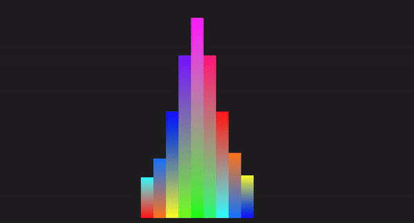
Creating the animation with JavaScript
Here, we will demonstrate how we can work with HTML, CSS, and JavaScript to recreate the animation in the previous section:
<!DOCTYPE html>
<html lang="en">

<head>
  <meta charset="UTF-8">
  <meta name="viewport" content="width=device-width, initial-scale=1.0">
  <title>Beats Bar Animation with JavaScript</title>
  <style>
    body {
      display: flex;
      justify-content: center;
      align-items: center;
      height: 100vh;
      background-color: #222;
      margin: 0;
    }

    .container {
      display: flex;
      gap: 0;
      position: relative;
    }

    .bar {
      width: 20px;
      position: absolute;
      bottom: 0;
      transition: height 0.1s ease-in-out, background 0.1s ease-in-out;
    }

    .bar1 {
      left: 0;
    }

    .bar2 {
      left: 20px;
    }

    .bar3 {
      left: 40px;
    }

    .bar4 {
      left: 60px;
    }

    .bar5 {
      left: 80px;
    }

    .bar6 {
      left: 100px;
    }

    .bar7 {
      left: 120px;
    }

    .bar8 {
      left: 140px;
    }

    .bar9 {
      left: 160px;
    }
  </style>
</head>

<body>
  <div class="container">
    <div class="bar bar1" data-index="1"></div>
    <div class="bar bar2" data-index="2"></div>
    <div class="bar bar3" data-index="3"></div>
    <div class="bar bar4" data-index="4"></div>
    <div class="bar bar5" data-index="5"></div>
    <div class="bar bar6" data-index="6"></div>
    <div class="bar bar7" data-index="7"></div>
    <div class="bar bar8" data-index="8"></div>
    <div class="bar bar9" data-index="9"></div>
  </div>

  <script>
    const bars = document.querySelectorAll('.bar');
    const baseHeight = 100; // Base height of bars
    const amplitude = 150; // Amplitude of height changes
    const frequency = 2; // Frequency of the animation
    const animationSpeed = 0.1; // Speed of the animation

    function animateBars() {
      const currentTime = Date.now() / 1000; // Get the current time in seconds we will use this as a flux value

      bars.forEach((bar, index) => {
        // Calculate the height of the bar based on the current time
        const timeOffset = index * frequency;
        const height = baseHeight + amplitude * Math.abs(Math.sin(currentTime * frequency + timeOffset));
        bar.style.height = `${height}px`;

        const hue = (currentTime * 50) % 360; // Dynamic hue based on time
        const alpha = 1; // alpha of 1 to avoid transparency at any point
        // Set the background color of the bar using a linear gradient
        bar.style.background = `linear-gradient(to top, hsla(${hue}, 100%, 50%, ${alpha}), hsla(${(hue + 180) % 360}, 100%, 50%, ${alpha}))`;
      });

      requestAnimationFrame(animateBars);
    }

    function initializeBars() {
      // Set the initial height and color of the bars
      bars.forEach((bar, index) => {
        const initialHeight = baseHeight + amplitude * Math.abs(Math.sin(index * frequency));
        bar.style.height = `${initialHeight}px`;

        const initialHue = (index * 50) % 360; // Initial hue based on index
        const initialAlpha = 1; // Set initial alpha to 1 to avoid transparency
        bar.style.background = `linear-gradient(to top, hsla(${initialHue}, 100%, 50%, ${initialAlpha}), hsla(${(initialHue + 180) % 360}, 100%, 50%, ${initialAlpha}))`;
      });
    }

    // Initialize the bars with their initial heights and colors
    initializeBars();

    // Start the animation
    animateBars();
  </script>
</body>

</html>
In the code above, we styled the elements with CSS and created the HTML structure. We used JavaScript to select all elements with the class bar and also declared the variables. Next, we used a set of mathematical calculations to offset the bar height property and apply visual changes to the background gradient. The result is shown in the GIF below: 
Code comparison
Let’s compare these different methods using certain technical aspects:
| Technical aspect | CSS functions | Keyframes | JavaScript |
|---|---|---|---|
| Code length | Generally shorter, making use of variables and functions | Can be lengthy depending on the number of keyframes and the interpolation points defined | The length depends on factors such as the elements to be manipulated, the logic, and properties to be applied. |
| Ease of implementation | Simple for dynamic, repetitive patterns | Simple for predefined animations | Complex logic handling and interaction |
| Performance | High performance, offloaded to the GPU, and less CPU-intensive | High performance, offloaded to the GPU, less CPU intensive | Can be less performant, dependent on the JavaScript engine and the amount of JavaScript to be executed on the web |
| Control | Dynamic and flexible | Static, predefined frames | Highly dynamic and interactive |
| Maintenance | Easy to maintain, concise syntax | Easy to maintain but can get verbose | Can become complex and harder to maintain, and make changes to the logic |
| Animation types | Best for simple, repetitive, mathematical animations | Great for detailed, multi-step animations | Best for interactive and responsive animations |
| Reusability | High reusability with CSS variables since mathematical functions can create different values for the same variable | Moderate, requires duplication for different animations | High reusability with functions and logic |
| Browser compatibility | `Mod()` and `Round()` are not compatible with Opera and Samsung browsers, the rest are fine | Keyframes have been around for a while, so it will be compatible for time-based animations | JavaScript is compatible with all browsers for time-based animations |
從上面可以看出,與其他實作相比,用於動畫的 CSS 函數在簡單性、程式碼可重複使用性、控制和效能方面表現出色。
結論
在本文中,我們介紹了基於時間的動畫,範圍從 mod() 到 round(),然後是三角函數。
我們也將這些函數與關鍵影格和Javascript 進行了比較,我們發現基於時間的動畫的成長主要來自於其簡單性、增強的可重用性和效能最佳化,因為與複雜的動畫相比,它們是輕量級的並且不太可能影響效能動畫。
這反過來又有助於提升使用者體驗。繼續探索這些功能,並繼續編碼! !
您的前端是否佔用了使用者的 CPU?
隨著 Web 前端變得越來越複雜,資源貪婪的功能對瀏覽器的要求越來越高。如果您有興趣監控和追蹤生產中所有使用者的客戶端 CPU 使用情況、記憶體使用情況等,請嘗試 LogRocket。
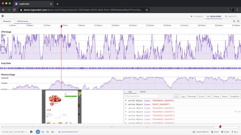
LogRocket 就像是網路和行動應用程式的 DVR,記錄網路應用程式、行動應用程式或網站中發生的所有情況。您無需猜測問題發生的原因,而是可以匯總和報告關鍵前端效能指標、重播用戶會話以及應用程式狀態、記錄網路請求並自動顯示所有錯誤。
現代化偵錯 Web 和行動應用程式的方式 - 開始免費監控。
以上是使用新的 CSS 函數優化 CSS 基於時間的動畫的詳細內容。更多資訊請關注PHP中文網其他相關文章!