
使用 CSS @starting-style 動畫對話框和彈出框元素

- WBOYWBOYWBOYWBOYWBOYWBOYWBOYWBOYWBOYWBOYWBOYWBOYWB原創
- 2024-07-31 02:28:13857瀏覽
作者:Rahul Chhodde✏️
本機對話框和彈出框元素在現代前端 Web 開發中擁有自己明確定義的角色。眾所周知,對話方塊元素可以與使用者通訊並收集他們的輸入,而彈出視窗更適合向使用者提供低優先順序的輔助資訊。
在上一篇關於對話方塊與彈出視窗的文章中,我們討論了這兩個元素都有其專用的 JavaScript API,使我們能夠充分利用這兩個元素。
在為這些元素添加動畫和互動性時,JavaScript 函式庫比 CSS 更受青睞。此類元素通常需要最少的動畫,並且僅使用龐大的動畫庫來添加一些簡單的效果可能會顯著增加應用程式上不必要的負載。
為了解決這個問題,本文將協助您使用純 CSS 技術將動畫效果編碼到對話方塊和彈出視窗中。我們將介紹 CSS 關鍵影格和新引入的 @starting-style at-rule,這兩者都可用於創建具有改進性能的微妙動畫。
動畫覆蓋元素的問題
對話方塊和彈出視窗是覆蓋元素,這表示它們在瀏覽器渲染的最頂層進行操作。如前所述,這些元素也依賴專用 API 來管理其顯示和/或模式。
讓我們看看使用傳統 CSS 轉換技術製作對話方塊和彈出視窗動畫時面臨的挑戰。
對顯示屬性的依賴
CSS 通常不允許您將離散屬性(如顯示)從一個值轉換為另一個值。這意味著用於建立過渡的標準不透明度 0 到 100% 的方法也不起作用,因為顯示屬性不允許在值切換之間存在延遲以完成過渡。
如果您檢查對話框和彈出框元素的計算顯示屬性,您會注意到瀏覽器如何聰明地管理它,而無需我們做任何額外的工作,除了使用相應元素的API 提供的方法之外: 
注意:由於某種原因,DevTools 中彈出框元素的計算顯示不會自動更新。您必須選擇不同的節點,然後重新選擇彈出視窗節點才能查看更新的值。
如上所示,對話方塊和彈出方塊元素在螢幕上的可見性由瀏覽器內部使用 CSS 顯示屬性來處理。
以下示範說明了對話方塊和彈出方塊元素對顯示屬性的依賴性如何使標準 CSS 轉換方法對它們無效:
查看 CodePen 上的 Rahul (@_rahul) 的筆不透明度/可見性過渡不適用於對話框和彈出視窗。
在專注於不透明度和變換來創建過渡之前,我們應該先考慮顯示屬性,它控制關聯元素在螢幕上的顯示方式。
渲染前缺乏初始樣式
overlay 元素的另一個問題是缺乏初始樣式,這對於確保動態添加到 DOM 的元素的正確過渡或透過 display 屬性動態控制其可見性至關重要。
假設我們的元素在網頁上呈現時應該要淡入。在這種情況下,我們需要將元素的初始不透明度設為零,然後在頁面上完全呈現後將其轉換為 100%。我們通常可用的唯一初始狀態是元素的當前狀態,如果提供零的不透明度,將使元素在螢幕上消失。
為了將其轉變為功能效果,我們可以使用 JavaScript 添加程式延遲、類別切換或 CSS 關鍵影格動畫來模擬類似過渡的效果。
在接下來的部分中,我們將探討如何解決顯示屬性無法支援過渡以及渲染前缺乏初始元素樣式的問題。
過渡離散 CSS 屬性
如上所述,對話框和彈出框元素依賴 display 屬性來保證其在螢幕上的可見性,這使得它們幾乎不可能使用 CSS 過渡來製作動畫。
顯示屬性具有離散性質,這表示它在值之間突然變化。例如,它可能從區塊更改為無,而不考慮轉換持續時間中定義的延遲。這是因為這些值之間不存在邏輯中間狀態,正如我們在接受不透明度、寬度、高度等附加價值的屬性中所看到的那樣。
為了使離散屬性與CSS過渡相容,引入了一個名為transition-behavior的新過渡屬性,它允許您使過渡以某種方式表現,特別是對於沒有數位形式的附加值的離散元素,像素或百分比。
允許離散行為不是在值之間平滑轉換,而是推遲從一個離散值到另一個離散值的更改,直到指定的轉換持續時間過去:
.dynamic-display {
  transition: opacity 0.5s, translate ..., display 0.5s allow-discrete;
  ...
}
在上面的程式碼片段中,允許離散行為確保顯示值將等待半秒(如轉換持續時間指定),而不是突然切換。
切換離散值的延遲允許具有附加價值的其他屬性的轉換有足夠的時間來完成其工作:
查看 Rahul (@_rahul) 在 CodePen 上實施的 Pen 允許離散轉換行為。
透過允許離散過渡行為,我們現在了解如何將退出過渡添加到動態管理渲染或顯示的元素中。但是,如果沒有預先渲染樣式,入口轉換將無法運作。接下來的幾節將探討一些添加入口過渡的技術。
使用 CSS 關鍵影格動畫對話框和彈出窗口
到目前為止,我們已經學習瞭如何將退出轉換合併到動態新增和管理的元素中,現在我們將相同的技術應用於對話方塊和彈出視窗。
讓我們先聲明進入和退出動畫,並檢查 CSS 關鍵影格如何有效地為任何元素添加某種過渡入口點,無論其顯示如何。
使用 CSS 關鍵影格新增進入動畫
使用 CSS 關鍵影格來模仿元素的起始樣式很簡單。我們將從添加元素的進入和退出動畫以及對話方塊元素的背景開始。
讓我們加入一些 CSS 關鍵影格來為元素創造微妙的淡入和淡出動畫。請注意,我們需要分別定義元素及其各自背景(偽元素)的關鍵影格:
/* Keyframes for dialog and popover elements */
@keyframes fadeIn {
  from { opacity: 0 }
  to { opacity: 1 }
}
@keyframes fadeOut {
  from { opacity: 1 }
  to { opacity: 0 }
}

/* Keyframes for the backdrop pseudo-element */
@keyframes backdropFadeIn {
  from { background: hsl(0 0% 0% / 0%) }
  to { background: hsl(0 0% 0% / 50%) }
}
@keyframes backdropFadeOut {
  from { background: hsl(0 0% 0% / 50%) }
  to { background: hsl(0 0% 0% / 0%) }
}
我們現在可以在元素的不同部分使用上述動畫關鍵影格。我們也可以使用 [open] 屬性和 :popover-open 偽類別來定位對話方塊和彈出視窗的開啟狀態,如以下程式碼片段所示:
.my-dialog {
  animation: fadeOut 0.5s forwards;
  &::backdrop {
    animation: backdropFadeOut 0.5s forwards;
  }
  &[open] {
    animation: fadeIn 0.5s forwards;
    &::backdrop {
      animation: backdropFadeIn 0.5s forwards;
    }
  }
}

.my-popover {
  animation: fadeOut 0.5s forwards;
  &:popover-open {
    animation: fadeIn 0.5s forwards;
  }
}
如果我們組合上述程式碼片段並在對話框和彈出框元素中使用它們,結果將類似於下面共享的演示。這種技術對於進入動畫來說非常有用,但它完全跳過了退出動畫部分:
查看 CodePen 上 Rahul (@_rahul) 的 Pen HTML5 對話方塊和帶有 CSS 關鍵影格的彈出視窗輸入動畫。
如果您關注微交互,您會注意到打開對話框時淡入進入動畫效果很好,但在關閉或取消對話框時,淡出退出動畫似乎不起作用。讓我們在下一節中了解原因。
在對話方塊和彈出視窗中新增退出動畫
退出動畫在上面的演示中不起作用的原因是由於彈出視窗和對話框 API 導致元素的計算顯示發生突然變化。我們之前討論了過渡行為屬性如何幫助我們管理離散的 CSS 屬性和過渡。讓我們嘗試在這種情況下使用過渡行為屬性,看看它是否可以解決問題。
查看 CodePen 上 Rahul (@_rahul) 的 Pen HTML5 對話框以及帶有 CSS 關鍵幀的彈出視窗進入和退出動畫。
幸運的是,向顯示和覆蓋屬性添加允許離散行為已經解決了退出動畫問題。進入和退出動畫現在都可以正常工作。
在生產中,這種方法最終會產生更大的程式碼,每個動畫聲明區塊都有兩到三個特定於供應商的變體。我們在這裡實現的效果並不太複雜,如果沒有對話框和彈出框元素,可以使用 CSS 過渡來實現。
CSS 關鍵影格最適合建立關鍵影格動畫,但它們不提供預渲染最佳化,儘管它們看起來似乎如此。然而,透過新引入的@starting-style at-rule,我們可以在不使用CSS關鍵影格動畫的情況下實現基於過渡的效果。
CSS中的@starting-style at-rule是什麼?
之前我們討論了依賴 DOM 的元素如何需要一個初始樣式過渡的起點,而這正是新的 @starting-style CSS at-rule 所提供的。
@starting-style at-rule 是 CSS Transition Level 2 功能,用於宣告過渡元素上屬性的起始值,從第一次樣式更新開始。
The following syntax allows you to specify a starting point for the styles of a given element from which the transition will pick up and operate. The properties included within the selectors of this at-rule should be the ones that will be involved in the associated transitions:
@starting-style {
  .selector {
    opacity: 0;
    ...
  }
}
Try re-rendering the element dynamically in the below demo by pressing the trigger button, and see how straightforward it is to create an entry point for the transitions with @starting-style before the associated elements are rendered:
See the Pen HTML5 Dialog and popover entry & exit animations w/ CSS keyframes by Rahul (@_rahul) on CodePen.
The @starting-style feature is expected to gain solid support across major web browsers, and currently, it is well-supported on Chromium and Webkit-based browsers. See the latest support here.
Dialog and popover transitions using @starting-style
Following the pattern above, we can add subtle animations to dialog and popover elements using the allow-discrete transition behavior and @starting-style.
Before moving ahead, let’s first ensure that we use the allow-discrete behavior for the transition of display and overlay properties. This can be done explicitly by defining the transition-behavior property inside the selectors, or you can combine it in the transition property alongside other transitions as shown below:
.my-dialog,
.my-popover {
  transition: opacity 0.5s, translate 0.5s,
              overlay 0.5s allow-discrete,
              display 0.5s allow-discrete;
  &::backdrop {
    transition: background 0.5s,
                overlay 0.5s allow-discrete,
                display 0.5s allow-discrete;
  }
}
To handle the initial styles for the open state, we should add a @starting-style block and add the properties that are responsible for our transition effect. You don't need to include the display and overlay properties here, as those are already managed by the dialog and popover APIs behind the scenes:
@starting-style {
  .my-dialog[open],
  .my-popover:popover-open {
    opacity: 0;
    transform: translateY(-1em);
  }

  .my-dialog[open]::backdrop {
    background-color: hsl(0 0 0 / 0%);
  }
}
With dialogs and popovers, we have the API advantage to ourselves, which means we can use certain attributes and pseudo-classes like dialog[open] and :popover-open to target the open states:
.my-dialog[open],
.my-popover:popover-open {
  opacity: 1;
  transform: translateY(0);
}

.my-dialog[open]::backdrop {
  background-color: hsl(0 0 0 / 10%);
}
Lastly, you can give the original elements styles that correspond to a closing transition, which is basically the closing state. In other words, keep the dialog element faded out and slid up by default:
.my-dialog,
.my-popover {
  opacity: 0;
  translate: 0 -1em;
}

.my-dialog {
  &::backdrop {
    background-color: transparent;
  }
}
The following demo reflects the outcomes of applying allow-discrete behavior to transitions, defining initial styles with @starting-style, and styling for both open and closed states. Now both the entry and exit animations work smoothly with our dialog and popover elements, and we used less code compared to CSS keyframes:
See the Pen HTML5 Dialog and popover entry & exit animations w/ @starting-style by Rahul (@_rahul) on CodePen.
If you want to remember this sequence of states we covered when constructing the above example, refer to the below graphic which visually illustrates the changes and communication between states: 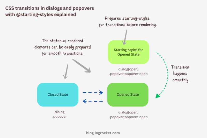
Advanced dialog animations with @starting-style
Let’s take it one step further by implementing different animations for dialog elements. The baseline remains the same: only the properties related to transformations and transitions will change.
Rotating-in-out dialogs
The idea behind creating a stylish rotating dialog box involves playing with the opacity and a couple of CSS transformation properties:
.my-dialog {
  transition: opacity 0.5s, translate 0.5s, rotate 0.5s,
              overlay 0.5s allow-discrete,
              display 0.5s allow-discrete;
}
The starting styles for the open state of the dialog include the following:
- Zero percent opacity to make it initially transparent
- A translation of -50 percent along the x-axis to shift the dialog from the center to the left
- A translation of -100 percent along the y-axis to move the dialog outside the visible viewport
- A rotation of -180 degrees to prepare it for positive rotation when opened
Here’s the code:
@starting-style {
  .my-dialog[open] {
    opacity: 0;
    translate: -50% -100%;
    rotate: -180deg;
  }
}
The closed state resembles the starting styles but with altered translations and rotations to reflect an opposite movement when exiting the dialog element:
.my-dialog {
  /* Previous styles */
  opacity: 0;
  translate: 50% 100%;
  rotate: 180deg;
}
The dialog element in the open state has 100 percent opacity, no translation on either axis, and no rotation, effectively positioning it at the center of the screen:
.my-dialog[open] {
  opacity: 1;
  translate: 0 0;
  rotate: 0deg;
}
The final output looks something like below:
See the Pen HTML5 Dialog and popover rotating animation by Rahul (@_rahul) on CodePen.
Bouncing in-out dialogs
To create a bouncing effect without using CSS keyframe animations, we can utilize a Bezier curve as the transition-timing function for the transformation and opacity transitions of our dialog. We’ll use the scale transformation for this effect.
Feel free to experiment with different x1, y1, x2, and y2 values for the Bezier curve, and implement them in your animation projects:
.my-dialog {
  transition: opacity 0.4s cubic-bezier(0.4, 1.6, 0.4, 0.8),
              scale 0.4s cubic-bezier(0.4, 1.6, 0.4, 0.8),
              overlay 0.4s allow-discrete,
              display 0.4s allow-discrete;
}
Now we can easily determine the starting styles and the open and closed states. The initial styles for the open and closed states will be the same — the dialog box will be scaled down to zero and completely transparent.
In the open state, the dialog box will have 100 percent opacity and be scaled to one. The rest of the transition effects will be handled by the Bezier curve-powered transitions:
@starting-style {
  .my-dialog[open] {
    opacity: 0;
    scale: 0;
  }
}

.my-dialog {
  opacity: 0;
  scale: 0;

  &[open] {
    opacity: 1;
    scale: 1;
  }
}
Here’s how this looks in action:
See the Pen HTML5 Dialog and popover bouncing animation by Rahul (@_rahul) on CodePen.
Sliding and bouncing dialogs
We will use the same Bezier curve in this animation to keep things simple, but the effect will be different compared to the previous one. The idea is to translate the dialogue along the y-axis instead of scaling it, as we did with the last effect:
.my-dialog {
  transition:
    opacity 0.5s cubic-bezier(0.4, 1.6, 0.4, 0.8),
    translate 0.5s cubic-bezier(0.4, 1.6, 0.4, 0.8),
    overlay 0.5s allow-discrete,
    display 0.5s allow-discrete;
}
The idea is to keep the dialog way up the viewport on the y-axis initially. Then, we will transform the dialog to zero when it is opened and finally translate it down the axis:
@starting-style {
  .my-dialog[open] {
    opacity: 0;
    translate: 0 -200%;
  }
}

.my-dialog {
  opacity: 0;
  translate: 0 200%;

  &[open] {
    opacity: 1;
    translate: 0 0;
  }
}
Instead of applying a 100 percent positive or negative translation, I doubled it to create the impression of urgency in the dialog box. See it in action below:
See the Pen HTML5 Dialog and popover slide-up-down bouncing animation by Rahul (@_rahul) on CodePen.
Subtle popover animations with @starting-style
The above effects suit the dialog elements well, but they won’t look great with the popover elements. This section is dedicated to some nice popover animation effects, which make the popover look like popovers and nothing more.
Rising-sinking popover
This effect resembles the popover effect we created initially. In that example, the popover appeared from the top and slide-fading down the y-axis, which isn’t what you’d expect from a popup in the bottom-right corner of the viewport.
Let’s rectify that by adding the same translation on the y-axis for the starting styles and the close state. Everything else remains unchanged:
See the Pen Rising up and down popover animation by Rahul (@_rahul) on CodePen.
Growing and shrinking popover
The process of creating a growing and shrinking effect is simple and involves the use of scale transformation with a twist.
By setting the transformation origin to the absolute bottom-right, we can ensure that the popover expands from the right, aligning with its current position at the bottom-right.
See the Pen Growing and shrinking popover animation by Rahul (@_rahul) on CodePen.
The toast popover
This technique is commonly used to create animations for notification toasts. To achieve this effect, you simply need to translate the popover element 100 percent to the right, putting it out of the viewport. Then, in the open state, you can translate it back to zero to complete the effect.
See the Pen Slide in out from right popover animation by Rahul (@_rahul) on CodePen.
Conclusion
We learned about incorporating CSS transition-based animations in dialog and popover elements using pure CSS. We discussed the complexities and issues of traditional transitioning with overlay elements, and then we addressed these problems one by one using CSS keyframes and, more importantly, the @starting-style at-rule, which is specially developed for transitions.
However, the @starting-style feature is fairly new and not yet available globally. Consequently, using CSS keyframes and the Web Animation API is an option that makes sense in production and provides more granular control over adding animation effects.
Having said that, I recommend the @starting-style approach once it gets adopted widely to keep things simple and lightweight with CSS transition applications.
Is your frontend hogging your users' CPU?
As web frontends get increasingly complex, resource-greedy features demand more and more from the browser. If you’re interested in monitoring and tracking client-side CPU usage, memory usage, and more for all of your users in production, try LogRocket.

LogRocket is like a DVR for web and mobile apps, recording everything that happens in your web app, mobile app, or website. Instead of guessing why problems happen, you can aggregate and report on key frontend performance metrics, replay user sessions along with application state, log network requests, and automatically surface all errors.
Modernize how you debug web and mobile apps — start monitoring for free.
以上是使用 CSS @starting-style 動畫對話框和彈出框元素的詳細內容。更多資訊請關注PHP中文網其他相關文章!