
我初学移动端开发,目前知道devicePixelRatio=物理像素 / 逻辑像素,还有就是CSS中1px的大小是并不固定的相对单位,是随着设备变化的。
有个问题请教大家:
iPhone5的devicePixelRatio是2,而且iP5横向物理像素是640,那么:
2 = 640(物理像素)/ x(逻辑像素),可以得出逻辑像素是320。2个物理像素,是1px(CSS的1px)。
有一张设计图宽度是640px,我想让显示到iP5上。
我用img标签引入图片,在CSS中设置 width:320px; height:266px;然后在head标签中加上:
<meta name="viewport" content="width=device-width,user-scalable=no,initial-scale=1.0">
F12,在chrome中模拟,结果出现横向滚动条,需要拖动才完整浏览,请问这是为什么?谢谢!
代码:
<!DOCTYPE html>
<html>
<head>
<meta charset="utf-8">
<meta name="viewport" content="width=device-width,user-scalable=no,initial-scale=1.0">
<title>初始缩放</title>
<style>
*{margin: 0; padding: 0;}
p{width: 320px; height: 134px;
}
</style>
</head>
<body>
    <p>
        <img src="640.jpg">
    </p>
</body>
</html>
截图: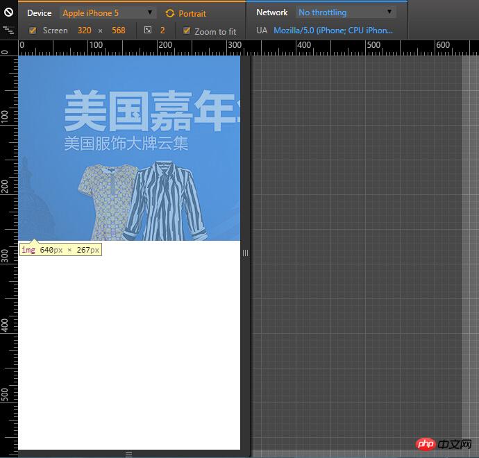

怪我咯2017-04-17 13:30:44
You defined the width on p, you should define the width of img
img {
  width: 320px;
}

天蓬老师2017-04-17 13:30:44
Have you watched it on your mobile phone?
Usually writing width: 100%; is enough. The height will automatically change according to the proportion

PHP中文网2017-04-17 13:30:44
On a device like Iphone, you can set the meta tag like this, <meta name="viewport" content="width=device-width,user-scalable=no,initial-scale=0.5">
For mobile terminal adaptation, you can read this article:
Using Flexible to implement the mobile Taobao H5 page Terminal Adaptation
巴扎黑2017-04-17 13:30:44
    <!DOCTYPE html>
    <html>
    <head>
    <meta charset="utf-8">
    <meta name="viewport" content="width=device-width,user-scalable=no,initial-scale=1.0">
    <title>初始缩放</title>
    <style>
    *{margin: 0; padding: 0;}
    p{width: 320px; height: 134px;
    p img{display:block;width:100%;height:auto}
    }
    </style>
    </head>
    <body>
        <p>
            <img src="640.jpg">
        </p>
    </body>
    </html>
Your page has a viewport, but aren’t the pictures still 640? You need to predefine the img; PS: If the page is 320, it is useless to make the picture 640; anyway, they are displayed in half pixels;

阿神2017-04-17 13:30:44
Set the width of your screen to 320, which means the physical pixels are 320, and converted to CSS pixels, it is 160px. And the width of your picture is cut to 320px, which is twice the screen width. Just set the picture width to 160px or set the screen width to 640.
It is recommended to read Mr. Zhan’s [Mobile Adaptation] series of articles, which are very detailed.
PHP中文网2017-04-17 13:30:44
The image width is 100%, which can solve a large part of the needs. I don’t understand this enough

迷茫2017-04-17 13:30:44
If you find it troublesome, just @2x the picture. It won’t be a big problem if you double the size and double the size. If the requirements are strict, it is best to have three sets of pictures.

黄舟2017-04-17 13:30:44
Set a style
.fullwidth{
width:100%;}
Just add whatever width you want to be 100%... The above example should be added to the picture