
我初学移动端开发,目前知道devicePixelRatio=物理像素 / 逻辑像素,还有就是CSS中1px的大小是并不固定的相对单位,是随着设备变化的。
有个问题请教大家:
iPhone5的devicePixelRatio是2,而且iP5横向物理像素是640,那么:
2 = 640(物理像素)/ x(逻辑像素),可以得出逻辑像素是320。2个物理像素,是1px(CSS的1px)。
有一张设计图宽度是640px,我想让显示到iP5上。
我用img标签引入图片,在CSS中设置 width:320px; height:266px;然后在head标签中加上:
<meta name="viewport" content="width=device-width,user-scalable=no,initial-scale=1.0">
F12,在chrome中模拟,结果出现横向滚动条,需要拖动才完整浏览,请问这是为什么?谢谢!
代码:
<!DOCTYPE html>
<html>
<head>
<meta charset="utf-8">
<meta name="viewport" content="width=device-width,user-scalable=no,initial-scale=1.0">
<title>初始缩放</title>
<style>
*{margin: 0; padding: 0;}
p{width: 320px; height: 134px;
}
</style>
</head>
<body>
    <p>
        <img src="640.jpg">
    </p>
</body>
</html>
截图: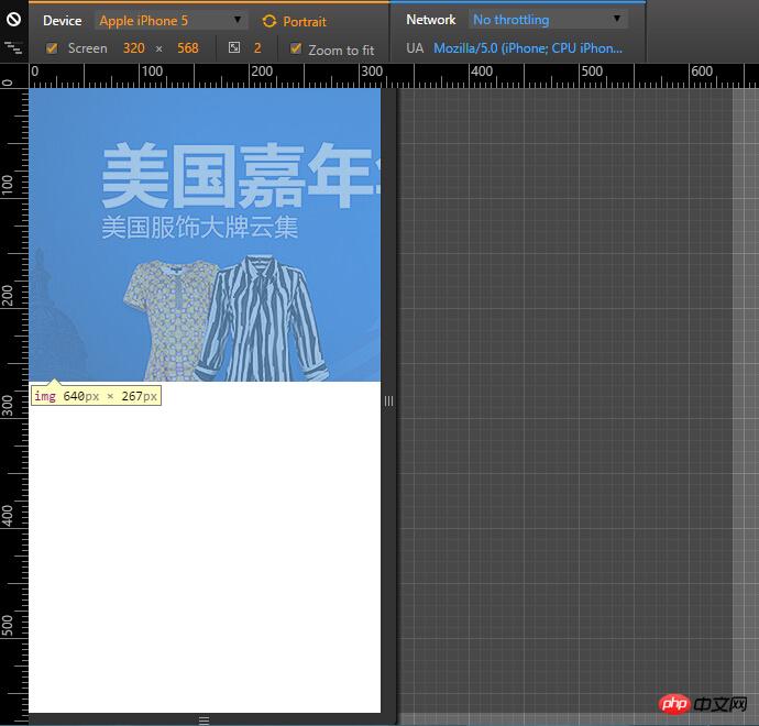

天蓬老师2017-04-17 13:30:44
Generally, the size of the picture is 1/2 of the design draft. If you want to be accurate, you need to make several sets

伊谢尔伦2017-04-17 13:30:44
The img width can be set to 100% and inherit the width value of the parent container. In addition, in mobile development, REM values are often used for responsive development.