
要求结构是
<ul>
    <li></li>
    <li></li>
    <li></li>
    <li></li>
    ...
</ul>
顺序如图所示
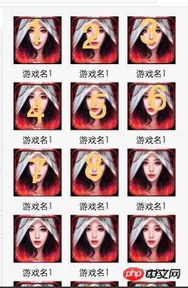
更新我希望每个图片之间横隔的距离是相等的,图片4个箭头处的宽度是相等的
如图

怪我咯2017-04-17 13:02:12
Use box-sizing: border-box
and padding
and then set the width to 33.33%
This is the simplest method
怪我咯2017-04-17 13:02:12

Each picture block floats left, width 30%, left margin 2.5%:
100%=(2.5%+30%)+(2.5%+ 30%)+(2.5%+30%)+2.5%
<!DOCTYPE html>
<html>
<head>
<meta charset="utf-8">
<meta name="viewport" content="width=device-width,initial-scale=1,maximum-scale=1,user-scalable=0">
<title>三列图片等宽布局</title>
<style>
* {
    margin: 0;
    padding: 0;
}
img {
    display: block;
    width: 30%;
    margin: 2.5% 0 0 2.5%;
    float: left;
}
</style>
</head>
<body>
<p>
<img src="byd.jpg" /><img src="byd.jpg" /><img src="byd.jpg" />
<img src="byd.jpg" /><img src="byd.jpg" /><img src="byd.jpg" />
<img src="byd.jpg" /><img src="byd.jpg" /><img src="byd.jpg" />
</p>
</body>
</html>
The simple and practical percentage layout is still very suitable for mobile WAP page layout:
min-width:320px;
max-width:420px;
width:100%;
overflow-x: hidden;
margin: 0 auto;
The minimum width is 320px, the maximum width is 420px, and the width automatically adapts between 320px and 420px, which looks okay.
Only set the width in the <img> tag Attribute percentage values, such as width="40%", do not need to set the height attribute, so that the image can be scaled according to the original proportion.
The blocks in the container can also be laid out using percentages, such as 60% on the left and 40% on the right .
