
要求结构是
<ul>
    <li></li>
    <li></li>
    <li></li>
    <li></li>
    ...
</ul>
顺序如图所示
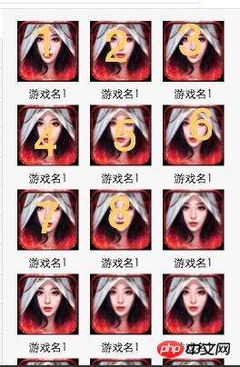
更新我希望每个图片之间横隔的距离是相等的,图片4个箭头处的宽度是相等的
如图

黄舟2017-04-17 13:02:12
html
<p>
    <ul>
        <li><img src="" alt=""></li>
        <li><img src="" alt=""></li>
        <li><img src="" alt=""></li>
        <li><img src="" alt=""></li>
        <li><img src="" alt=""></li>
        <li><img src="" alt=""></li>
        <li><img src="" alt=""></li>
        <li><img src="" alt=""></li>
        <li><img src="" alt=""></li>
        <li><img src="" alt=""></li>
        <li><img src="" alt=""></li>
        <li><img src="" alt=""></li>
        <li><img src="" alt=""></li>
        <li><img src="" alt=""></li>
        <li><img src="" alt=""></li>
        <li><img src="" alt=""></li>
        <li><img src="" alt=""></li>
        <li><img src="" alt=""></li>
        <li><img src="" alt=""></li>
        <li><img src="" alt=""></li>
    </ul>
</p>
css
*{
    -webkit-box-sizing: border-box;
    box-sizing: border-box;
}
p{
    width: 500px;
}
ul{
    margin: 0;
    padding: 3%; // x
    list-style: none;
    background: yellow;
}
ul:after{
    content: '';
    display:block;
    clear: both;
}
li{
    padding:0 3.0927835051546393%; // x*100/(100-x); x值越大,误差越大。当x=3,宽度为500,误差在0.5px之内;
    margin: 4px 0;
    text-align: center;
    font-size: 0;
    float: left;
    width: 33.3333%;
}

img{
    background: red;
    height: 100px;
    width: 100%;
    /* max-width: 100%; */
}
If you use flex, it should be easy to implement.
https://jsfiddle.net/scroller/bwsc7aac/

迷茫2017-04-17 13:02:12
1. Float
float:left;
width:33.333333%;
2. Flex
is used less and the compatibility is not clear. Please refer to:
http://www.ruanyifeng.com/blog/2015/07/flex-grammar.html?utm_source= tuicool

大家讲道理2017-04-17 13:02:12
<!DOCTYPE html>
<html>
    <head>
        <meta charset="utf-8" />
        <title>demo</title>
        <style type="text/css">
            *{
                padding: 0px;
                margin: 0px;
            }
            ul {
                list-style: none;
                width: 380px;
                height: 500px;
                margin: 100px auto;
                background: red;
            }
            ul li {
                float: left;
                margin: 20px 0 0 20px;
                width: 100px;
                height: 100px;
            }
        </style>
    </head>
    <body>
        <ul>
            <li>
                <img src="./images/c1.jpg" width="100" height="100">
            </li>
            <li>
                <img src="./images/c1.jpg" width="100" height="100">
            </li>
            <li>
                <img src="./images/c1.jpg" width="100" height="100">
            </li>
            <li>
                <img src="./images/c1.jpg" width="100" height="100">
            </li>
            <li>
                <img src="./images/c1.jpg" width="100" height="100">
            </li>
            <li>
                <img src="./images/c1.jpg" width="100" height="100">
            </li>
            <li>
                <img src="./images/c1.jpg" width="100" height="100">
            </li>
            <li>
                <img src="./images/c1.jpg" width="100" height="100">
            </li>
        </ul>
    </body>
</html>
The effect demo in the picture, if you want to see the three-column layout of equal heights, you can take a look at the blog I wrote: http://blog.csdn.net/zp1996323/article/details/49558015


阿神2017-04-17 13:02:12
ul{
    margin-left:20px;
    list-style:none;
    width:230px;
}
ul li{
    float:left;
    margin:20px 20px 0 0;
    width:50px;
}阿神2017-04-17 13:02:12
. . . So helpless, each li has width: 30%, margin-right: 2.5%,
ul: padding-left: 2.5%
大家讲道理2017-04-17 13:02:12
<ul>
  <li></li>
  <li></li>
  <li></li>
  <li></li>
</ul>

/* css */
ul {
  width: 920px;
  padding: 10px;
}

li {
  width: 210px; //210+padding左右边距的20 = 230px; 920÷230= 4
  height: 90px;
  padding: 10px;
}
As above, the width of the four li's is exactly the width of the ul. The left and right padding between the li's: 10px, plus the outer ul padding: 10px;
The top, bottom, left, and right distances of each li are 20, and the effect is as follows.
The same is true for 3-column layout. The combined width of 3 li is equal to the width of ul, li{ padding:20}, then ul should also add padding: 20, and you get this layout
迷茫2017-04-17 13:02:12
Set the width of each 3 li and the width of the middle and both sides of the li between a line to add up to 100% of the entire screen width
大家讲道理2017-04-17 13:02:12
First post an example that can be satisfied in modern browsers
<!DOCTYPE html>
<html>
<head>
  <style>
  .list-container {
    padding: 15px;
    background: red;
  }
  .list-container:after{
    content: ' ';
    display: table;
    clear: both;
  }
  .list-container li {
    display: block;
    float: left;
    box-sizing: border-box;
    padding: 15px;
    list-style: none;
    width: 33.33%;
    background:blue;
  }
  .list-container li img{
    width: 100%;
  }
  </style>
</head>
<body>
  <ul class="list-container">
      <li>
        <img src="http://pic.sucaibar.com/pic/201305/20/5f259ab481.jpg" />
      </li>
      <li>
        <img src="http://pic.sucaibar.com/pic/201305/20/5f259ab481.jpg" />
      </li>
      <li>
        <img src="http://pic.sucaibar.com/pic/201305/20/5f259ab481.jpg" />
      </li>
      <li>
        <img src="http://pic.sucaibar.com/pic/201305/20/5f259ab481.jpg" />
      </li>
      <li>
        <img src="http://pic.sucaibar.com/pic/201305/20/5f259ab481.jpg" />
      </li>
      <li>
        <img src="http://pic.sucaibar.com/pic/201305/20/5f259ab481.jpg" />
      </li>
      <li>
        <img src="http://pic.sucaibar.com/pic/201305/20/5f259ab481.jpg" />
      </li>
      <li>
        <img src="http://pic.sucaibar.com/pic/201305/20/5f259ab481.jpg" />
      </li>
      <li>
        <img src="http://pic.sucaibar.com/pic/201305/20/5f259ab481.jpg" />
      </li>
  </ul>

</body>
</html>
There are several points to note in order to achieve this:
The father container .list-container must have the same padding as the son
Dad and son’s box-sizing: border-box; remember to set
Img images should be equal in height and width to fit. In this example, I set the width to 100% to ensure that it will not exceed the outside. The height will be automatic.
Remember to clear the li after it floats. (The clear:both part of list-container.)
There are many frameworks for doing similar things without any worries. For example bootstrap
ps: If the height and width of your picture are uncontrollable. But if you want to display the same height, you can use a transparent image with controllable height and width as img src and then set the real push content as the background for img. Remember to set the background-size of the background to cover. (This will crop your image) or contain (if you set this, you need to give a background-color to prevent the image from entering the visual margin.), and then add background-repeat: no-repeat; background- position: center;