RatingBar (star rating bar)
Introduction to this section:
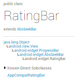
The SeekBar in the previous section was not very easy. The RatingBar (star rating bar) we learned in this section is also very simple. I believe it will be used somewhere precious, Anyone who has bought something should be familiar with this. When you receive a package from a seller, there will often be a small piece of paper inside, telling you how much you will get in return for a five-star review. When rating, you can use our star rating bar~ Let’s take a look at the official documentation first Official document: RatingBar We can see that this thing has the same class structure as SeekBar and is also a subclass of ProgressBar:
That is to say He also uses the related properties of ProgressBar. Next, let’s explore the unique properties of RatingBar!
1. Basic usage of RatingBar:
Let’s first take a look at what the 5.0 native SeekBar looks like:

——Related attributes:
android:isIndicator: Whether it is used as an indicator, the user cannot change it, the default is false
android:numStars: How many stars to display, must be an integer
android:rating: Default rating value, must be a floating point number
android:stepSize: The value of each increase in the rating , must be a floating point number
In addition to the above, there are two styles for us to choose from, but they are not recommended because both styles are ugly...
They are:
style="?android:attr/ratingBarStyleSmall"
style="?android:attr/ratingBarStyleIndicator"
——Event handling: Just set the OnRatingBarChangeListener event for RatingBar, and then rewrite the onRatingChanged() method!
The implementation code is as follows:
private RatingBar rb_normal;
@Override
protected void onCreate(Bundle savedInstanceState) {
super.onCreate(savedInstanceState);
setContentView(R.layout.activity_main);
rb_normal = (RatingBar) findViewById(R.id.rb_normal);
rb_normal.setOnRatingBarChangeListener(new RatingBar.OnRatingBarChangeListener() {
@Override
public void onRatingChanged(RatingBar ratingBar, float rating, boolean fromUser) {
Toast.makeText(MainActivity.this, "rating:" + String.valueOf(rating),
Toast.LENGTH_LONG).show();
}
});
}
}
2. Customization link:
Hey, we often don’t use stars as the scoring criteria, let’s change it~ Change the star to something else, such as a smiley face, two materials:


Next, write a layer-list file like the previous SeekBar:
ratingbar_full.xml:
<layer -list xmlns:android="http://schemas.android.com/apk/res/android">
<item android:id="@android:id/background"
android:drawable= "@mipmap/ic_rating_off1" />
; <item android:id="@android:id/secondaryProgress"
; android:drawable="@mipmap/ic_rating_off1" />
; <item android :id="@android:id/progress"
android:drawable="@mipmap/ic_rating_on1" />
</layer-list>
Then in style. Customize the RatingBar Style in xml and add this in style.xml:
< ;item name="android:maxHeight">24dip</item>
</style>
android:layout_width="wrap_content"
android:layout_height="wrap_content" />
Running rendering:

Okay, the effect is not bad. As for the spacing problem, you need to adjust the picture Sit down and work on it, just leave some space on the left and right of the picture when you need to cut it~!
Summary of this section:
Okay, that’s it for the use of RatingBar. It’s actually very similar to the previous SeekBar. It’s pretty easy~ Well, thank you~


