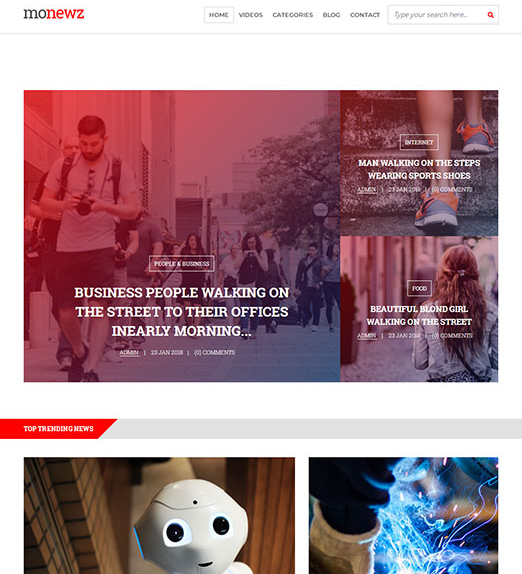
New media website responsive template
All resources on this site are contributed by netizens or reprinted by major download sites. Please check the integrity of the software yourself! All resources on this site are for learning reference only. Please do not use them for commercial purposes. Otherwise, you will be responsible for all consequences! If there is any infringement, please contact us to delete it. Contact information: admin@php.cn
Related Article
 Website front-end static page html template_html/css_WEB-ITnose
24Jun2016
Website front-end static page html template
 Learn the front-end template engine jade (1)_html/css_WEB-ITnose
24Jun2016
Learn the front-end template engine jade (1)
 How Can I Optimize Media Queries for a Responsive Website?
28Dec2024
Optimizing Media Queries for Responsive WebsitesCreating a responsive website that seamlessly adapts to various screen widths is essential in...
 Laravel and the Full Stack: Front and Back Together
18Apr2025
Laravel realizes full-stack development through the Blade template engine, EloquentORM, Artisan tools and LaravelMix: 1. Blade simplifies front-end development; 2. Eloquent simplifies database operations; 3. Artisan improves development efficiency; 4. LaravelMix manages front-end resources.
 javascript - Comparison of angular and php template engines
06Jul2016
A PC-side web site uses Java as the backend. Should the front-end use PHP to call the API and then output it from the template engine, or should it be dynamically called by a front-end framework like AngularJS?
 What are the optimal CSS media query breakpoints for responsive website design?
28Nov2024
Understanding Common CSS Media Query BreakpointsWhen developing responsive websites, media queries play a crucial role in adapting the layout to...
 How Can I Optimize Media Queries and Breakpoints for Responsive Website Design?
17Dec2024
Optimizing Media Queries for Breakpoints on Responsive WebsitesChoosing appropriate breakpoints for media queries is crucial for optimizing the...
 Frontend with Laravel: Exploring the Possibilities
20Apr2025
Laravel can be used for front-end development. 1) Use the Blade template engine to generate HTML. 2) Integrate Vite to manage front-end resources. 3) Build SPA, PWA or static website. 4) Combine routing, middleware and EloquentORM to create a complete web application.


Hot Tools


