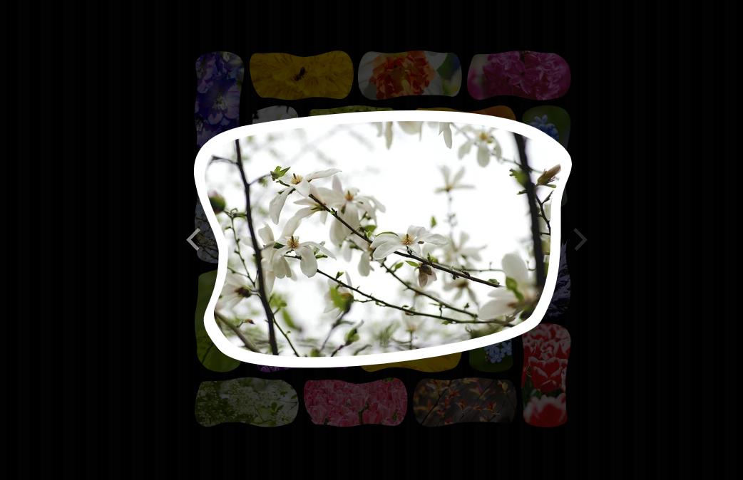
css grid layout image responsive zoom effects
All resources on this site are contributed by netizens or reprinted by major download sites. Please check the integrity of the software yourself! All resources on this site are for learning reference only. Please do not use them for commercial purposes. Otherwise, you will be responsible for all consequences! If there is any infringement, please contact us to delete it. Contact information: admin@php.cn
Related Article
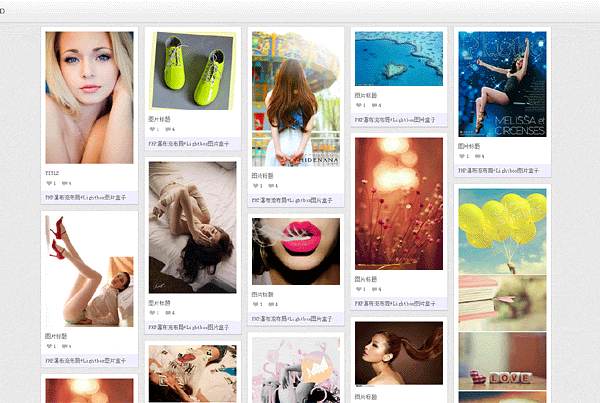 jquery waterfall flow LightBox picture box special effects
06Jul2016
jquery waterfall flow LightBox picture box special effects
 Easy and Responsive Modern CSS Grid Layout
10Feb2025
Core points CSS Grid is a powerful layout system that allows the creation of grid structures in CSS, not in HTML. Most modern browsers support it, except for IE11, which supports older versions. This article demonstrates how to create a responsive modern CSS Grid layout, step by step add CSS Grid and provide fallback code for older browsers. This includes technology to center elements, span projects, and adjust the layout of small equipment. CSS Grid provides utilities such as grid-column and grid-row to locate grid projects, as well as justify-items, alig
 How Can I Create a Responsive Square Grid Layout Using CSS Grid?
20Dec2024
Creating a Square Grid Layout with CSS GridCreating a layout of squares, with four squares in each row, can be achieved using CSS Grid. To ensure...
 Responsive Grid Magazine Layout in Just 20 Lines of CSS
09Apr2025
I was recently working on a modern take of the blogroll. The idea was to offer readers a selection of latest posts from those blogs in a magazine-style
 How Can I Create a Responsive Square Grid Layout Using Only CSS Grid?
21Dec2024
CSS Grid-Based Square LayoutThis question explores the creation of a CSS grid layout consisting of squares that maintain their dimensions...
 Using Modern CSS to Build a Responsive Image Grid
22Feb2025
This article explores techniques for mastering the spacing between columns in responsive grid layouts, using a responsive image gallery as a practical example. For further insights into responsive layouts, view our screencast: Creating Multiple Colum
 CSS3 Practical Development: Teach you step by step how to develop mouse-over picture animation effects (Part 2)_html/css_WEB-ITnose
24Jun2016
CSS3 practical development: teach you step-by-step how to develop mouse-over picture animation special effects (Part 2)
 How to Build Responsive Squares in a Grid Layout Using CSS Grid and Flexbox?
26Nov2024
How to Create a Grid Layout with Responsive SquaresIn this article, we'll discuss how to create a grid layout with responsive squares using...


Hot Tools
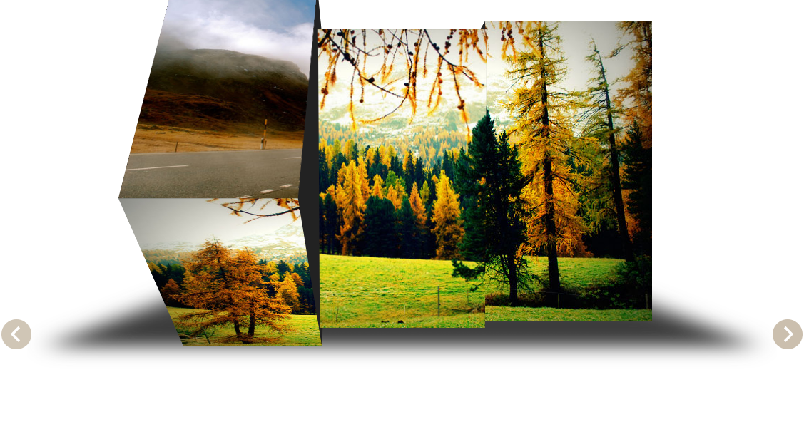
jQuery 3D picture slider carousel effect
3D image Slider carousel effect based on jQuery

Pure CSS to achieve cool switching animations when the mouse passes through pictures
Pure CSS enables cool switching animation code downloads when the mouse passes through pictures.
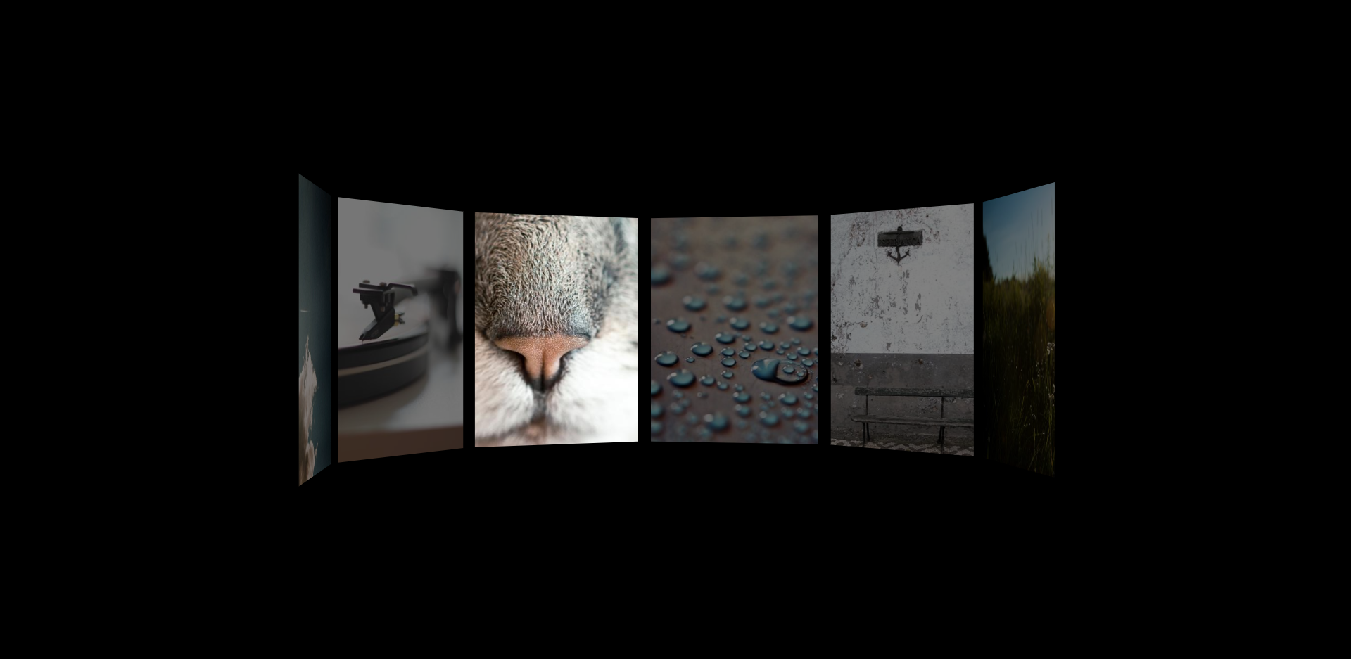
HTML5 image carousel plug-in with parallax effect
An HTML5 picture carousel plug-in with parallax effect, which can control pictures with the mouse and produce a cool visual difference effect when the picture carousel is scrolled.

B site header image interactive mouse hover depth of field focus effect
An interactive mouse-over depth-of-field focus effect web page special effect for the B site header image.
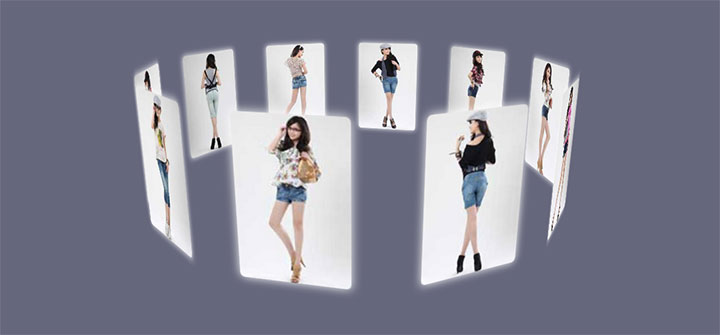
Cool jQuery 3D picture wall effects that can be dragged and rotated
A cool jQuery 3D picture wall effect that can be dragged and rotated. The pictures are surrounded to form a circular picture wall, and each picture has glow and reflection effects. It is a very beautiful picture display effect.


