

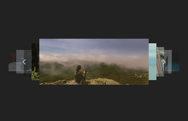
Make a simple responsive slideshow

This site introduces many jQuery slideshow plug-ins. They are all excellent and powerful, and are suitable for use on medium and large pages. But if your page is very simple and you just want a simple and pure slideshow effect, these plug-ins may be a little bloated. Today we will write a simple responsive slideshow without any plug-ins.
All resources on this site are contributed by netizens or reprinted by major download sites. Please check the integrity of the software yourself! All resources on this site are for learning reference only. Please do not use them for commercial purposes. Otherwise, you will be responsible for all consequences! If there is any infringement, please contact us to delete it. Contact information: admin@php.cn
Related Article
 Make a Simple JavaScript Slideshow without jQuery
18Feb2025
Key Takeaways This tutorial provides a step-by-step guide to creating a simple JavaScript slideshow without the use of external libraries such as jQuery, which can improve page performance due to less code and allows the slideshow to be used anywh
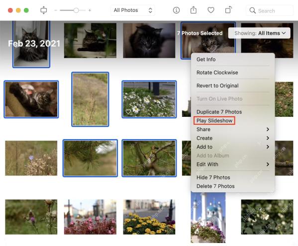 Simple Ways to Make a Slideshow on a Mac
07May2025
Slideshow making is a joyous activity that can release your inner artist. And when it comes to artistry, your Mac is your trusted partner. You can make slideshows on a Mac using Apple Photos, Preview, iMovie, or third-party apps.This
 How to make a slideshow on Mac
25Mar2025
Slideshows are a great option when you want to review or showcase something, be it photos from your recent trip or appreciating all the coworkers at your company. Macs provide us with a few user-friendly ways of creating slideshows and presentat
 How to Make a Simple Image Slider With HTML, CSS and jQuery
21Feb2025
Image carousels, image sliders, no matter why you call them, this mode is so visible on the internet that almost every website has one. If you are a web developer, you may end up with building one yourself. With this in mind, let's see how to build a simple picture slider using HTML, CSS, and jQuery. HTML structure First, we create a container element that has the class name container. The container contains our pictures. The picture is wrapped with a div tag so that the slide can be converted to a link, or content other than the picture can be used as the slide. The first container div has some inline styles to ensure that the first image in the slider is visible when the page loads. return
 Building a Simple Responsive Layout with Flexbox for Beginners
24Oct2024
Creating a responsive layout is a crucial skill in web development today. With more users accessing websites from various devices, understanding how to make your layout adapt seamlessly to different screen sizes is essential. In this article, we will
 How Can I Make Images Responsive Within a Paragraph Tag?
29Nov2024
Making an Image Responsive: A Simple SolutionIn web development, it's essential for images to adjust seamlessly to different screen sizes and...
 How to Make a Fullscreen Responsive Background Image in CSS?
13Nov2024
Achieving a Fullscreen Responsive Background Image Using CSSIn your quest to set an image as a fullscreen background for your webpage, you've...
 Crumpet ? A very simple responsive front-end development framework_html/css_WEB-ITnose
24Jun2016
Crumpet ? A very simple responsive front-end development framework


Hot Tools
Lightweight 3D carousel image automatic switching jQuery plug-in
Lightweight 3D carousel image automatic switching jQuery plug-in

Supports responsive mobile jQuery image carousel plug-in unslider
Supports responsive mobile phone side jQuery image carousel plug-in unslider, a very powerful jQuery plug-in that supports responsive mobile side, supports function callbacks, and supports left and right button switching. You can customize whether to use responsive fluid:true/false and whether to display dots. Switch dots: true/false, whether to support keyboard switching keys: true/false, and it is very simple to use.

Full screen adaptive blinds animation switching js code
Full screen adaptive blinds animation switching js code

jQuery blinds style image switching code
The jQuery shutter style image switching code is a code based on shutter.js to create a variety of image carousel switching effects.

js left category menu image carousel code
The js left category menu image carousel code is a code suitable for home screen page product images and navigation menu layout style codes for various malls.