html css layout product function display effect

Commonly used product functions on the website are displayed with mouse hover highlighting and icon rotation.
All resources on this site are contributed by netizens or reprinted by major download sites. Please check the integrity of the software yourself! All resources on this site are for learning reference only. Please do not use them for commercial purposes. Otherwise, you will be responsible for all consequences! If there is any infringement, please contact us to delete it. Contact information: admin@php.cn
Related Article
 html calls JavaScript function, but no display effect? _html/css_WEB-ITnose
24Jun2016
html calls JavaScript function, but no display effect?
 CSS3 and SVG cool mouse click button effects_html/css_WEB-ITnose
24Jun2016
CSS3 and SVG cool mouse click button effects
 Share ten CSS3 mouse over text animation effects_html/css_WEB-ITnose
24Jun2016
Share ten CSS3 mouse over text animation effects
 30 CSS3-implemented mouse passing picture display description effects_html/css_WEB-ITnose
24Jun2016
30 CSS3-implemented mouse passing picture display description effects
 Mouse animation display details based on css3_html/css_WEB-ITnose
24Jun2016
Mouse animation based on css3 to display detailed effects
 DIV CSS implements dynamic effects of regional mouse events_html/css_WEB-ITnose
24Jun2016
DIV CSS implements dynamic effects of regional mouse events
 CSS3 mouse slides over animated line border special effects
06Jul2016
CSS3 mouse slides over animated line border special effects
 9 CSS3 blend modes for mouse-over picture title effects_html/css_WEB-ITnose
24Jun2016
9 CSS3 blend modes for mouse-over picture title effects


Hot Tools

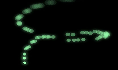
Canvas follows mouse cursor animation special effects
The Canvas following mouse cursor animation special effects include 10 different effects of mouse passing following and display animation effects.

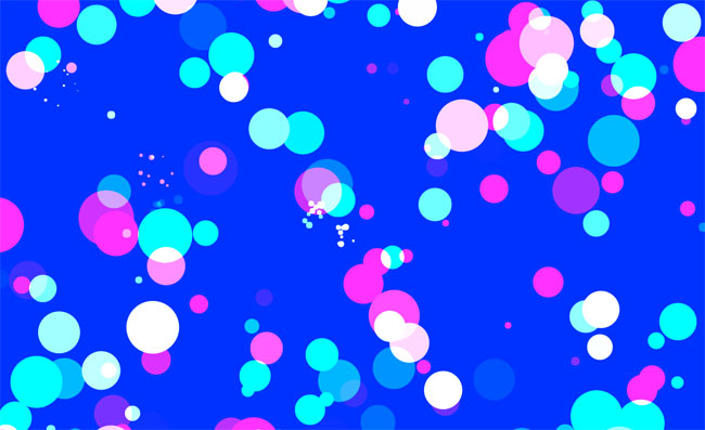
HTML5 Canvas bubble hover mouse effect
HTML5 Canvas bubble hover mouse effect

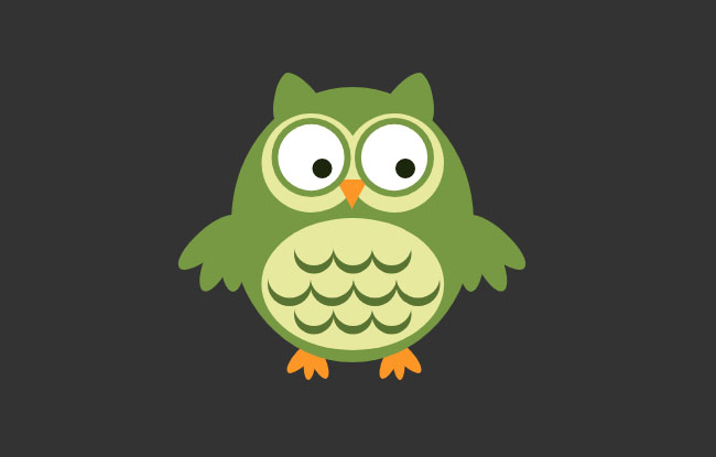
js+css3 owl eyes follow the mouse pointer to rotate animation special effects
js+css3 owl eyes follow the mouse pointer to rotate animation special effects

jquery hover event navigation bar effect
jquery hover event navigation bar effect

js mouse click and drag to generate small icon special effects
js mouse click and drag to generate small icon special effects is a purple background style mouse left click and right click to generate small icon animation special effects.


