CSS3 image 3D three-dimensional flip effect
All resources on this site are contributed by netizens or reprinted by major download sites. Please check the integrity of the software yourself! All resources on this site are for learning reference only. Please do not use them for commercial purposes. Otherwise, you will be responsible for all consequences! If there is any infringement, please contact us to delete it. Contact information: admin@php.cn
Related Article
 CSS3 image 3D flip effect (webpage effect updated daily)_html/css_WEB-ITnose
24Jun2016
CSS3 image 3D flip effect (webpage effect updated daily)
 css3 three-dimensional animated menu flip up and down_html/css_WEB-ITnose
24Jun2016
CSS3 three-dimensional animated menu flips up and down
 jquery waterfall flow LightBox picture box special effects
06Jul2016
jquery waterfall flow LightBox picture box special effects
 CSS3 Practical Development: Teach you step by step how to develop mouse-over picture animation effects (Part 2)_html/css_WEB-ITnose
24Jun2016
CSS3 practical development: teach you step-by-step how to develop mouse-over picture animation special effects (Part 2)
 61 web page special effects, very fashionable and with good visual effects_html/css_WEB-ITnose
24Jun2016
61 web page special effects that are very fashionable and have great visual effects
 Animated loading effects implemented in pure css3_html/css_WEB-ITnose
24Jun2016
Animation loading special effects implemented in pure css3


Hot Tools
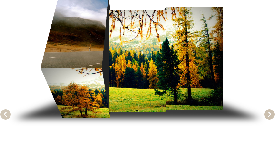
jQuery 3D picture slider carousel effect
3D image Slider carousel effect based on jQuery

Pure CSS to achieve cool switching animations when the mouse passes through pictures
Pure CSS enables cool switching animation code downloads when the mouse passes through pictures.
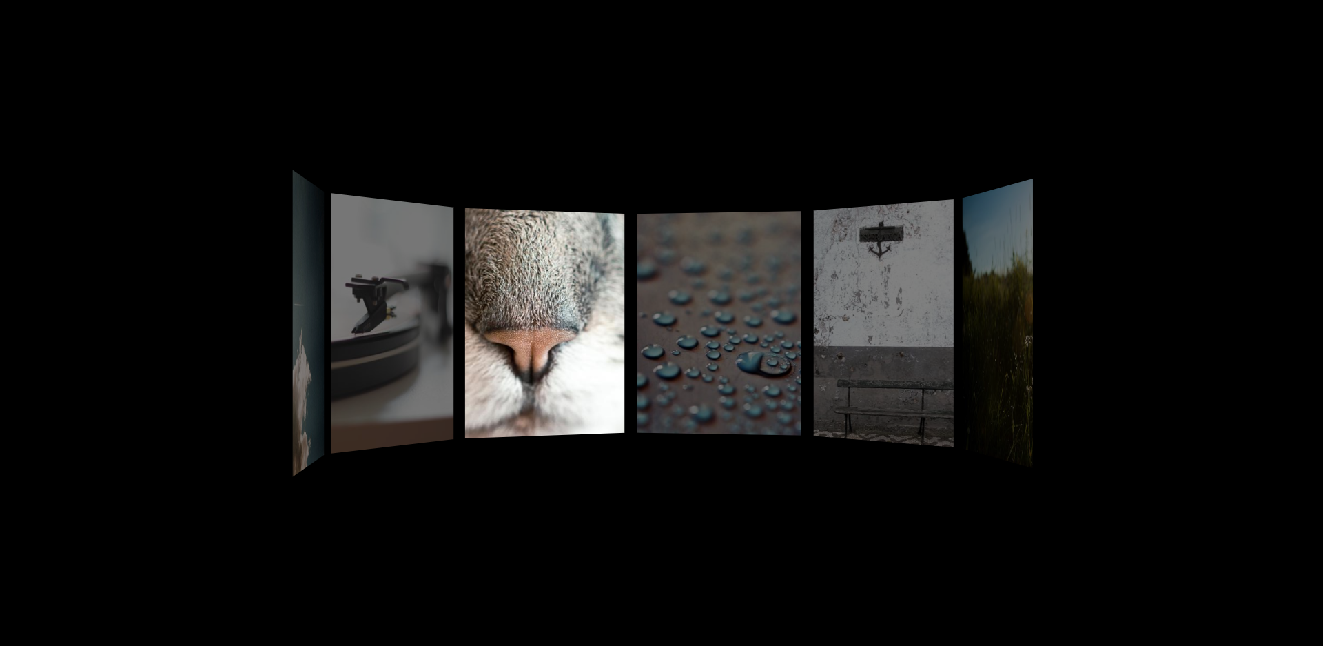
HTML5 image carousel plug-in with parallax effect
An HTML5 picture carousel plug-in with parallax effect, which can control pictures with the mouse and produce a cool visual difference effect when the picture carousel is scrolled.

B site header image interactive mouse hover depth of field focus effect
An interactive mouse-over depth-of-field focus effect web page special effect for the B site header image.
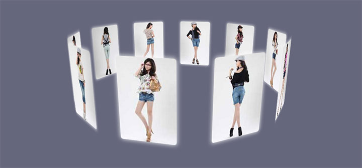
Cool jQuery 3D picture wall effects that can be dragged and rotated
A cool jQuery 3D picture wall effect that can be dragged and rotated. The pictures are surrounded to form a circular picture wall, and each picture has glow and reflection effects. It is a very beautiful picture display effect.


