CSS3 둥근 모서리
CSS3 둥근 모서리
CSS3 border-radius 속성을 사용하면 모든 요소에 대해 "둥근 모서리"를 만들 수 있습니다.
CSS3 Rounded Corner Maker
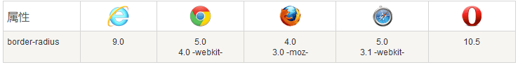
브라우저 지원
표의 숫자는 이 속성을 지원하는 첫 번째 브라우저의 버전 번호를 나타냅니다.
-webkit- 또는 -moz- 앞의 숫자는 해당 접두사를 지원하는 첫 번째 버전을 나타냅니다.
CSS3 border-radius 속성
CSS3 border-radius 속성을 사용하면 모든 요소에 대해 "둥근 모서리"를 만들 수 있습니다.
다음은 세 가지 예입니다.
1. 배경색이 있는 요소의 둥근 모서리를 지정합니다.
2. 테두리가 있는 요소의 둥근 모서리를 지정합니다.
3. 이미지:
코드는 다음과 같습니다.
Example
<!DOCTYPE html>
<html>
<head>
<meta charset="utf-8">
<title>php 中文网</title>
<style>
#rcorners1 {
    border-radius: 25px;
    background: #8AC007;
    padding: 20px;
    width: 200px;
    height: 150px;
}

#rcorners2 {
    border-radius: 25px;
    border: 2px solid #8AC007;
    padding: 20px;
    width: 200px;
    height: 150px;
}

#rcorners3 {
    border-radius: 25px;
    background: url(/images/paper.gif);
    background-position: left top;
    background-repeat: repeat;
    padding: 20px;
    width: 200px;
    height: 150px;
}
</style>
</head>
<body>

<p> border-radius 属性允许向元素添加圆角。</p>
<p>指定背景颜色元素的圆角:</p>
<p id="rcorners1">圆角</p>
<p>指定边框元素的圆角:</p>
<p id="rcorners2">圆角</p>
<p>指定背景图片元素的圆角:</p>
<p id="rcorners3">圆角</p>

</body>
</html>
예제 실행»
온라인 예제를 보려면 "예제 실행" 버튼을 클릭하세요
CSS3 border-radius - 각 둥근 모서리 지정
border-radius 속성에 하나의 값만 지정하면 4개의 필렛이 생성됩니다.
그러나 네 모서리를 하나씩 지정하려면 다음 규칙을 사용할 수 있습니다.
4개 값: 첫 번째 값은 왼쪽 위 모서리, 두 번째 값은 오른쪽 위 모서리입니다. , 세 번째 값은 오른쪽 아래 모서리, 네 번째 값은 왼쪽 아래 모서리입니다.
세 가지 값: 첫 번째 값은 왼쪽 위 모서리, 두 번째 값은 오른쪽 위 모서리와 왼쪽 아래 모서리, 세 번째 값은 오른쪽 아래 모서리입니다.
두 값: 첫 번째 값은 왼쪽 상단 모서리와 오른쪽 하단 모서리이고, 두 번째 값은 오른쪽 상단 모서리와 왼쪽 하단 모서리입니다.
하나의 값: 네 개의 둥근 모서리는 동일한 값을 갖습니다.
다음은 세 가지 예입니다. :
1. 4개 값 - border-radius: 15px 50px 30px 5px:
2. 3개 값- border-radius: 15px 50px 30px:
3 2개 값- border-radius: 15px 50px:
다음은 소스 코드입니다.
예제
<!DOCTYPE html>
<html>
<head>
<meta charset="utf-8">
<title>php 中文网</title>
<style>
#rcorners4 {
    border-radius: 15px 50px 30px 5px;
    background: #8AC007;
    padding: 20px;
    width: 200px;
    height: 150px;
}

#rcorners5 {
    border-radius: 15px 50px 30px;
    background: #8AC007;
    padding: 20px;
    width: 200px;
    height: 150px;
}

#rcorners6 {
    border-radius: 15px 50px;
    background: #8AC007;
    padding: 20px;
    width: 200px;
    height: 150px;
}
</style>
</head>
<body>

<p>四个值 - border-radius: 15px 50px 30px 5px:</p>
<p id="rcorners4"></p>

<p>三个值 - border-radius: 15px 50px 30px:</p>
<p id="rcorners5"></p>

<p>两个值 - border-radius: 15px 50px:</p>
<p id="rcorners6"></p>

</body>
</html>
예제 실행»
온라인 예제를 보려면 "예제 실행" 버튼을 클릭하세요
타원형 모서리를 만들 수도 있습니다.
Instance
<!DOCTYPE html>
<html>
<head>
<meta charset="utf-8">
<title>php 中文网</title>
<style>
#rcorners7 {
    border-radius: 50px/15px;
    background: #8AC007;
    padding: 20px;
    width: 200px;
    height: 150px;
}
#rcorners8 {
    border-radius: 15px/50px;
    background: #8AC007;
    padding: 20px;
    width: 200px;
    height: 150px;
}

#rcorners9 {
    border-radius: 50%;
    background: #8AC007;
    padding: 20px;
    width: 200px;
    height: 150px;
}
</style>
</head>
<body>

<p>椭圆边框 - border-radius: 50px/15px:</p>
<p id="rcorners7"></p>

<p> 椭圆边框 - border-radius: 15px/50px:</p>
<p id="rcorners8"></p>

<p>椭圆边框 - border-radius: 50%:</p>
<p id="rcorners9"></p>

</body>
</html>
예제 실행»
온라인 예제를 보려면 "예제 실행" 버튼을 클릭하세요
CSS3 둥근 모서리 속성
| 属性 | 描述 |
|---|---|
| border-radius | 所有四个边角 border-*-*-radius 属性的缩写 |
| border-top-left-radius | 定义了左上角的弧度 |
| border-top-right-radius | 定义了右上角的弧度 |
| border-bottom-right-radius | 定义了右下角的弧度 |
| border-bottom-left-radius | 定义了左下角的弧度 |


