
ホームページ >ウェブフロントエンド >フロントエンドQ&A >CSS3アニメーションで円を回転させる方法
CSS3アニメーションで円を回転させる方法

- 藏色散人オリジナル
- 2023-02-01 10:54:302586ブラウズ
CSS3 アニメーションで円を回転させる方法: 1. 新しい HTML サンプル ファイルを作成し、div を "188263384bc4c0decce28aa87ab1847116b28748ea4df4d9c2150843fecfba68" として定義します。 2. アニメーションを通じて属性 さまざまな効果の境界線を設定し、回転を実行します。 コードは、「animation: Circle 2s Infinite Linear; @keyframes Circle {0% {transform:rotate(0deg);}」です。
このチュートリアルの動作環境: Windows 10 システム、CSS3 バージョン、DELL G3 コンピューター
円を回転させる方法css3アニメーション?
#CSS3 リング回転エフェクト
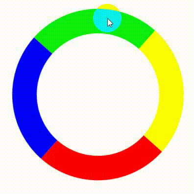
#1. CSS3 リング回転エフェクト 1原則: さまざまな効果を持つ境界線を設定し、回転させます
#
<div class="demo"></div><style>
    .demo {
        width: 250px;
        height: 250px;
        border: 50px solid red;
        border-left-color: blue;
        border-right-color: yellow;
        border-top-color: #04f105;
        margin: 100px;
        border-radius: 50%;
        animation: circle 2s infinite linear;
    }
    @keyframes circle {
        0% {
            transform: rotate(0deg);
        }

        100% {
            transform: rotate(-360deg);
        }
    }</style>
#原則: 多層の境界線を使用して溝を下げ、回転を実行します#<div class="demoout">
<div class="demo"></div></div><style>
body {
background: black;
}
.demo {
width: 250px;
height: 250px;
border: 3px solid white;
border-left-color: blue;
border-right-color: yellow;
margin: 25px;
border-radius: 50%;
animation: circle 4s infinite ease;
background: white;
}
.demoout {
width: 300px;
height: 300px;
border: 3px solid white;
border-top-color: green;
border-bottom-color: red;
margin: 100px;
border-radius: 50%;
animation: circle 4s infinite linear;
background: white;
}
@-webkit-keyframes circle {
0% {
transform: rotate(0deg);
}
100% {
transform: rotate(-360deg);
}
}</style>
推奨される学習: 「
css ビデオ チュートリアル」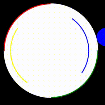
以上がCSS3アニメーションで円を回転させる方法の詳細内容です。詳細については、PHP 中国語 Web サイトの他の関連記事を参照してください。