
ホームページ >ウェブフロントエンド >CSSチュートリアル >CSS之Grid布局
CSS之Grid布局

- 零到壹度オリジナル
- 2018-03-24 10:46:421623ブラウズ
CSS Grid(网格) 布局(又称为 “Grid(网格)” ),是一个二维的基于网格的布局系统它的目标是完全改变我们基于网格的用户界面的布局方式。Flexbox 的出现很大程度上改善了我们的布局方式,但它的目的是为了解决更简单的一维布局,而不是复杂的二维布局(实际上 Flexbox 和 Grid 能结合在一起工作,而且配合得非常好)。Grid(网格) 布局是第一个专门为解决布局问题而创建的 CSS 模块。
Grid(网格) 属性目录
网格容器(Grid Container) 属性
display
<span style='font-family: 微软雅黑, "Microsoft YaHei";'>grid-template-columns</span>
<span style='font-family: 微软雅黑, "Microsoft YaHei";'>grid-template-rows</span>
<span style='font-family: 微软雅黑, "Microsoft YaHei";'>grid-template-areas</span>
<span style='font-family: 微软雅黑, "Microsoft YaHei";'>grid-template</span>
<span style='font-family: 微软雅黑, "Microsoft YaHei";'>grid-column-gap</span>
<span style='font-family: 微软雅黑, "Microsoft YaHei";'>grid-row-gap</span>
grid-gap
justify-items
align-items
justify-content
align-content
<span style='font-family: 微软雅黑, "Microsoft YaHei";'>grid-auto-columns</span>
<span style='font-family: 微软雅黑, "Microsoft YaHei";'>grid-auto-rows</span>
<span style='font-family: 微软雅黑, "Microsoft YaHei";'>grid-auto-flow</span>
<span style='font-family: 微软雅黑, "Microsoft YaHei";'>grid</span>
网格项(Grid Items) 属性
grid-column-start
grid-column-end
grid-row-start
grid-row-end
grid-column
grid-row
<span style='font-family: 微软雅黑, "Microsoft YaHei";'>grid-area</span>
justify-self
align-self
父元素 网格容器(Grid Container) 属性
display
将元素定义为网格容器,并为其内容建立新的 网格格式上下文。
值:
grid :生成一个块级网格
inline-grid :生成一个内联网格
subgrid :如果你的网格容器本身是另一个网格的网格项(即嵌套网格),你可以使用这个属性来表示
你希望它的行/列的大小继承自它的父级网格容器,而不是自己指定的。
如果你想要设置为网格容器元素本身已经是网格项(嵌套网格布局),用这个属性指明这个容器内部的网格项的行列尺寸直接继承其父级的网格容器属性。
CSS 代码:
.container {
display: grid | inline-grid | subgrid;
}
注意:在 网格容器(Grid Container) 上使用<span style='font-family: 微软雅黑, "Microsoft YaHei";'>column</span>,<span style='font-family: 微软雅黑, "Microsoft YaHei";'>float</span>,<span style='font-family: 微软雅黑, "Microsoft YaHei";'>clear</span>, <span style='font-family: 微软雅黑, "Microsoft YaHei";'>vertical-align</span> 不会产生任何效果。
回到目录
grid-template-columns / grid-template-rows
使用空格分隔的值列表,用来定义网格的列和行。这些值表示 网格轨道(Grid Track) 大小,它们之间的空格表示网格线。
值:
– <span style='font-family: 微软雅黑, "Microsoft YaHei";'>fr</span> 单位)
–
CSS 代码:
.container {
grid-template-columns: <track-size> ... | <line-name> <track-size> ...;
grid-template-rows: <track-size> ... | <line-name> <track-size> ...;
}
示例:
当你在 网格轨道(Grid Track) 值之间留出空格时,网格线会自动分配数字名称:
CSS 代码:
.container{
grid-template-columns: 40px 50px auto 50px 40px;
grid-template-rows: 25% 100px auto;
}

但是你可以明确的指定网格线(Grid Line)名称,即
CSS 代码:
.container {
grid-template-columns: [first] 40px [line2] 50px [line3] auto [col4-start] 50px [five] 40px [end];
grid-template-rows: [row1-start] 25% [row1-end] 100px [third-line] auto [last-line];
}

请注意,一条网格线(Grid Line)可以有多个名称。例如,这里的第二条 行网格线(row grid lines) 将有两个名字:row1-end 和row2-start :
CSS 代码:
.container{
grid-template-rows: [row1-start] 25% [row1-end row2-start] 25% [row2-end];
}
如果你的定义包含多个重复值,则可以使用 <span style='font-family: 微软雅黑, "Microsoft YaHei";'>repeat()</span> 表示法来简化定义:
CSS 代码:
.container {
grid-template-columns: repeat(3, 20px [col-start]) 5%;
}
上面的代码等价于:
CSS 代码:
.container {
grid-template-columns: 20px [col-start] 20px [col-start] 20px [col-start] 5%;
}
<span style='font-family: 微软雅黑, "Microsoft YaHei";'>fr</span> 单元允许你用等分网格容器剩余可用空间来设置 网格轨道(Grid Track) 的大小 。例如,下面的代码会将每个网格项设置为网格容器宽度的三分之一:
CSS 代码:
.container {
grid-template-columns: 1fr 1fr 1fr;
}
剩余可用空间是除去所有非灵活网格项之后计算得到的。在这个例子中,可用空间总量减去 50px 后,再给 <span style='font-family: 微软雅黑, "Microsoft YaHei";'>fr</span> 单元的值3等分:
CSS 代码:
.container {
grid-template-columns: 1fr 50px 1fr 1fr;
}
回到目录
<span style='font-family: 微软雅黑, "Microsoft YaHei";'>grid-template-areas</span>
通过引用 <span style='font-family: 微软雅黑, "Microsoft YaHei";'>grid-area</span> 属性指定的 网格区域(Grid Area) 名称来定义网格模板。重复网格区域的名称导致内容跨越这些单元格。一个点号(<span style='font-family: 微软雅黑, "Microsoft YaHei";'>.</span>)代表一个空的网格单元。这个语法本身可视作网格的可视化结构。
值:
:由网格项的 <span style='font-family: 微软雅黑, "Microsoft YaHei";'>grid-area</span>指定的网格区域名称.(点号) :代表一个空的网格单元
none:不定义网格区域
CSS 代码:
.container {
grid-template-areas:
" | . | none | ..."
"...";
}
示例:
CSS 代码:
.item-a {
grid-area: header;
}
.item-b {
grid-area: main;
}
.item-c {
grid-area: sidebar;
}
.item-d {
grid-area: footer;
}
.container {
grid-template-columns: 50px 50px 50px 50px;
grid-template-rows: auto;
grid-template-areas:
"header header header header"
"main main . sidebar"
"footer footer footer footer";
}
上面的代码将创建一个 4 列 3 行的网格。整个顶行将由 header 区域 组成。中间一排将由两个 main 区域,一个是空单元格,一个 sidebar 区域组成。最后一行全是 footer 区域组成。

你的声明中的每一行都需要有相同数量的单元格。
你可以使用任意数量的相邻的 点<span style='font-family: 微软雅黑, "Microsoft YaHei";'>.</span> 来声明单个空单元格。 只要这些点<span style='font-family: 微软雅黑, "Microsoft YaHei";'>.</span>之间没有空隙隔开,他们就表示一个单一的单元格。
注意你 不是 用这个语法来命名网格线,只是命名网格区域。当你使用这种语法时,区域两端的网格线实际上是自动命名的。如果你的网格区域的名字是 foo,该区域的起始 行网格线 和起始 列网格线 的名称将是 foo-start,而最后一行 行网格线 和最后一列 列网格线 的名字是 foo-end。这意味着一些网格线可能有多个名字,如上例中最左边的网格线,它将有三个名称:header-start,main-start 和 footer-start 。
回到目录
<span style='font-family: 微软雅黑, "Microsoft YaHei";'>grid-template</span>
用于定义 <span style='font-family: 微软雅黑, "Microsoft YaHei";'>grid-template-rows</span> ,<span style='font-family: 微软雅黑, "Microsoft YaHei";'>grid-template-columns</span> ,<span style='font-family: 微软雅黑, "Microsoft YaHei";'>grid-template-areas</span> 缩写 (shorthand) 属性。
值:
none:将所有三个属性设置为其初始值
subgrid:将
<span style='font-family: 微软雅黑, "Microsoft YaHei";'>grid-template-rows</span>,<span style='font-family: 微软雅黑, "Microsoft YaHei";'>grid-template-columns</span>的值设为<span style='font-family: 微软雅黑, "Microsoft YaHei";'>subgrid</span>,<span style='font-family: 微软雅黑, "Microsoft YaHei";'>grid-template-areas</span>设为初始值/ :将<span style='font-family: 微软雅黑, "Microsoft YaHei";'>grid-template-columns</span>和<span style='font-family: 微软雅黑, "Microsoft YaHei";'>grid-template-rows</span>设置为相应地特定的值,并且设置<span style='font-family: 微软雅黑, "Microsoft YaHei";'>grid-template-areas</span>为<span style='font-family: 微软雅黑, "Microsoft YaHei";'>none</span>
CSS 代码:
.container {
grid-template: none | subgrid | <grid-template-rows> / <grid-template-columns>;
}
这个属性也接受一个更复杂但相当方便的语法来指定三个上诉属性。这里有一个例子:
CSS 代码:
.container {
grid-template:
[row1-start] "header header header" 25px [row1-end]
[row2-start] "footer footer footer" 25px [row2-end]
/ auto 50px auto;
}
等价于:
CSS 代码:
.container {
grid-template-rows: [row1-start] 25px [row1-end row2-start] 25px [row2-end];
grid-template-columns: auto 50px auto;
grid-template-areas:
"header header header"
"footer footer footer";
}
由于 <span style='font-family: 微软雅黑, "Microsoft YaHei";'>grid-template</span> 不会重置 隐式 网格属性(<span style='font-family: 微软雅黑, "Microsoft YaHei";'>grid-auto-columns</span>, <span style='font-family: 微软雅黑, "Microsoft YaHei";'>grid-auto-rows</span>, 和 <span style='font-family: 微软雅黑, "Microsoft YaHei";'>grid-auto-flow</span>),
这可能是你想在大多数情况下做的,建议使用 <span style='font-family: 微软雅黑, "Microsoft YaHei";'>grid</span> 属性而不是 <span style='font-family: 微软雅黑, "Microsoft YaHei";'>grid-template</span>。
回到目录
grid-column-gap / grid-row-gap
指定网格线(grid lines)的大小。你可以把它想象为设置列/行之间间距的宽度。
值:
:长度值
CSS 代码:
.container {
grid-column-gap: <line-size>;
grid-row-gap: <line-size>;
}
示例
CSS 代码:
.container {
grid-template-columns: 100px 50px 100px;
grid-template-rows: 80px auto 80px;
grid-column-gap: 10px;
grid-row-gap: 15px;
}
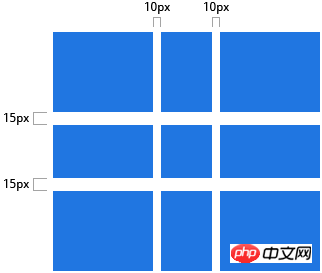
只能在 列/行 之间创建间距,网格外部边缘不会有这个间距。
回到目录
grid-gap
<span style='font-family: 微软雅黑, "Microsoft YaHei";'>grid-column-gap</span> 和 <span style='font-family: 微软雅黑, "Microsoft YaHei";'>grid-row-gap</span> 的缩写语法
值:
:长度值
CSS 代码:
.container {
grid-gap: <grid-row-gap> <grid-column-gap>;
}
示例:
CSS 代码:
.container{
grid-template-columns: 100px 50px 100px;
grid-template-rows: 80px auto 80px;
grid-gap: 10px 15px;
}
如果<span style='font-family: 微软雅黑, "Microsoft YaHei";'>grid-row-gap</span>没有定义,那么就会被设置为等同于 <span style='font-family: 微软雅黑, "Microsoft YaHei";'>grid-column-gap</span> 的值。例如下面的代码是等价的:
CSS 代码:
.container{
/* 设置 [`grid-column-gap`](http://www.css88.com/archives/8510#prop-grid-column-row-gap) 和 [`grid-row-gap`](http://www.css88.com/archives/8510#prop-grid-column-row-gap) */
grid-column-gap: 10px;
grid-column-gap: 10px;
/* 等价于 */
grid-gap: 10px 10px;
/* 等价于 */
grid-gap: 10px;
}
以上がCSS之Grid布局 の詳細内容です。詳細については、PHP 中国語 Web サイトの他の関連記事を参照してください。