
ホームページ >ウェブフロントエンド >CSSチュートリアル >CSS Web ページのレイアウトに関する簡単な説明
CSS Web ページのレイアウトに関する簡単な説明
- php中世界最好的语言オリジナル
- 2018-03-20 14:28:211864ブラウズ
今回は、CSS Web ページのレイアウトについて簡単に説明します。CSS Web ページのレイアウトに関する 注意事項 とは何ですか?実際の事例を見てみましょう。
1. 左側の固定レイアウトと右側のアダプティブレイアウトの 2 つの実装方法
レンダリングは次のとおりです:
大画面表示: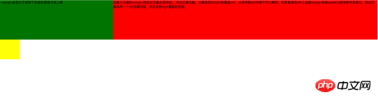
<style type="text/css">
.left{
float: left;
width: 100%;
height: 200px;
background-color: red;
}
.left-content{
margin-left: 30%;
}
.right{
float: left;
width: 30%;
margin-left: -100%;
height: 200px;
background-color: green;
}
.layout0{
clear: both;
width: 100px;
height: 100px;
background-color: yellow;
}
</style>
<body>
<p id="body">
<p class="left">
<p class="left-content">
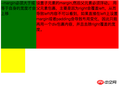
设置子元素的margin,然后父元素必须浮动。
用父元素包裹,主要是因为right会覆盖left,从而导致left内容不可以看到,如果直接在left上设置margin或者padding会导致布局变化,因此只能再用一个p包裹内容,并且去除right覆盖的宽度。
</p>
</p>
<p class="right">-margin必须大于或等于自身的宽度才会上移</p>
<p class="layout0"></p>
</p>
</body> 実装プロセス中に注意すべき点は次のとおりです: 1. アダプティブ コンテナはコンテナによってラップされる必要があります。そうしないと、コンテナ内のコンテンツが上書きされます。 2. 右コンテナを上に移動するには、そのコンテナの負のマージンがそれ自体の幅以上である必要があります。 3. 右コンテナの負のマージンがそれ自体の幅と等しい場合、負のマージンが -100% に等しい場合、左に揃えられます。 2 番目の方法では、フローティング レイアウトを使用して、左側の固定レイアウトと右側のアダプティブ レイアウトを実現します
メイン コードは次のとおりです:<style type="text/css">
.left{
float: left;
width: 200px;
height: 200px;
background-color: yellow;
}
.right{
padding-left: 200px;
height: 200px;
background-color: red;
}
@media (min-width: 650px) and (max-width: 1000px){
.left{
width: 150px;
}
.right{
margin-left: 150px;
}
}
@media (max-width: 640px){
.left{
width: 100px;
}
.right{
margin-left: 100px;
}
}
</style>
<body>
<p id="main">
<p class="left">左边固定宽度,右边自适应</p>
<p class="right"></p>
</p>
</body>実装プロセス中に注意すべき点は次のとおりです: 1.left を分離する必要があります。ドキュメントフローから、右に正常に表示されるだけです。
2.left は右側をカバーするだけなので、右側のコンテンツを完全に表示したい場合は、右側にpadding-left または margin-left を与える必要があります。
大画面表示: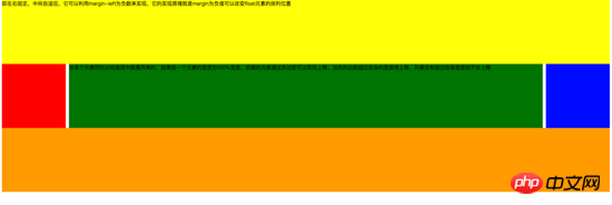
<style type="text/css">
#head{
height: 200px;
background-color: yellow;
}
#body{
width: 100%;
float: left;
}
.main{
background-color: green;
min-height: 200px;
margin: 0 210px;
}
.left{
float: left;
background-color: red;
width: 200px;
height: 200px;
margin-left: -100%;
}
.right{
float: right;
background-color: blue;
width: 200px;
height: 200px;
margin-left: -200px;
}
#footer{
clear: both;
height: 200px;
background-color: orange;
}
</style>
<body>
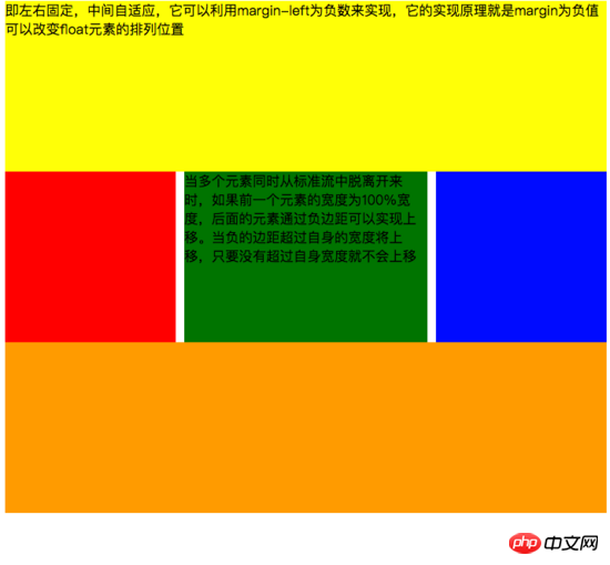
<p id="head">即左右固定,中间自适应,它可以利用margin-left为负数来实现,它的实现原理就是margin为负值可以改变float元素的排列位置</p>
<p id="body">
<p class="main">当多个元素同时从标准流中脱离开来时,如果前一个元素的宽度为100%宽度,后面的元素通过负边距可以实现上移。当负的边距超过自身的宽度将上移,只要没有超过自身宽度就不会上移</p>
</p>
<p class="left"></p>
<p class="right"></p>
<p id="footer"></p>
</body>実装プロセス中の注意: 1.左右のコンテナに配置されます。前面とコンテンツ p は親コンテナによってラップされる必要があります 2. 左右のコンテナは同じ方向にフロートします。 メインコードは次のとおりです:
<style type="text/css">
	#head{
		height: 200px;
		background-color: yellow;
	}
	#body{
		overflow: hidden;
	}
	.left{
		float: left;
		background-color: red;
		width: 200px;
		height: 200px;
	}
	.right{
		float: right;
		background-color: blue;
		width: 200px;
		height: 200px;
	}
	.main{
		background-color: green;
		height: 200px;
		margin: 0 210px;
	}
	#footer{
		clear: both;
		height: 200px;
		background-color: orange;
	}
</style>
<body>
	<p id="head">左右固定宽度并且向两边浮动,中间的p设置两边的margin</p>
	<p id="body">
		<p class="left"></p>
		<p class="right"></p>
		<p class="main">该方案有一个缺陷,在小屏幕情况下回导致right被挤下去,main没有了</p>
	</p>
	<p id="footer"></p>
</body>
実装プロセス中に注意が必要です: 1. このメソッドでは、中央の適応 p のみを左右のコンテナの後ろに配置する必要があります。 2. 左右の容器が両側に浮きます。 メインのコードは次のとおりです:
<!DOCTYPE html>
<html>
<meta charset="utf-8">
<head>
	<title>使用flex 实现“双飞翼布局”</title>
</head>
<style type="text/css">
	#main{
		display: flex;
		display: -webkit-flex;//谷歌浏览器加前缀
		flex-flow: row nowrap;
		justify-content: flex-start;
		align-items: center;
	}
	.left{
		flex: 0 0 auto;
		width:100px;
		height: 200px;
		background-color: red;
		word-wrap: break-word;
		overflow: hidden;
	}
	.main{
		flex: 1 1 auto;
		height: 200px;
		background-color: green;
	}
	.right{
		flex: 0 0 auto;
		width: 100px;
		height: 200px;
		background-color: yellow;
	}
</style>
<body>
	<p id="main">
		<p class="left">flex 语法我参照了阮一峰关于flex语法介绍 http://www.ruanyifeng.com/blog/2015/07/flex-grammar.html</p>
		<p class="main"></p>
		<p class="right"></p>
	</p>
</body>
</html>
フレックス レイアウトを理解していない場合は、記事の最後に移動し、リンクをクリックしてマスター Ruan Yifeng が作成したフレックス構文を参照してください
レイアウトの配置
ここでは CSS の位置決めに関する基本的な知識については説明しません (追記: 知らない場合は、w3c 公式 Web サイトにアクセスしてご自身で確認してください)。主に作業中に遭遇する落とし穴について説明します。他の人が私と同じ罠に陥らないように。 第一: 複数の固定を使用する場合、どの位置に基づいて配置する必要があるかに注意してください。親に変換属性がある場合、子要素の固定が、コンテナではなく親要素のコンテナに基づいて配置される可能性があるためです。体。効果は次のとおりです。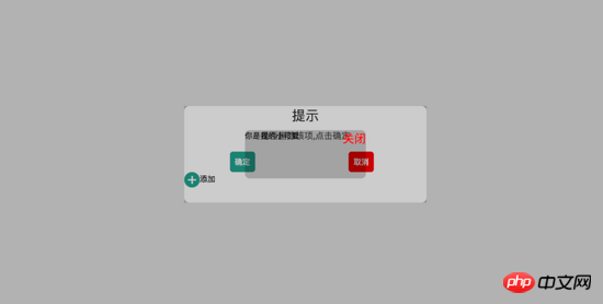
<!DOCTYPE html>
<html>
<head>
<title>关于position的定位的坑</title>
</head>
<style type="text/css">
body{
margin: 0;
padding: 0;
}
i{
font-style: normal;
cursor: pointer;
}
#delete-button{
position: absolute;
left: 45%;
top: 45%;
text-align: center;
vertical-align: middle;
height: 50px;
margin: auto;
cursor: pointer;
}
#delete-button > i{
display: inline-block;
width: 32px;
height: 32px;
border-radius: 16px;
background-color: orange;
color: red;
font-size: 32px;
vertical-align: middle;
line-height: 28px;
}
/*第一个模态框的样式*/
#layout{
display: none;
width: 100%;
height: 100%;
}
/*使用flex布局水平竖直居中*/
/*#layout-box{
position: fixed;
width: 100%;
height: 100%;
left: 0;
top: 0;
display: flex;
display: -webkit-flex;
flex-flow: column nowrap;
justify-content: center;
align-items: center;
background-color: rgba(0,0,0,0.3);
}*/
/*使用postion 和 transform 水平垂直居中*/
#layout-box{
position: fixed;
width: 100%;
height: 100%;
background-color: rgba(0,0,0,0.3);
}
.modal-dialog{
position: absolute;
left: 50%;
top: 50%;
width: 500px;
height: 200px;
border-radius: 10px;
transform: translate(-50%, -50%);
-webkit-transform: translate(-50%, -50%);
-moz-transform: translate(-50%, -50%);
-o-transform: translate(-50%, -50%);
background-color: #fff;
}
.dialog-title{
text-align: center;
color: #333;
font-size: 28px;
margin-bottom: 10px;
}
.dialog-content{
text-align: center;
color: #666;
font-size: 18px;
}
.dialog-button{
margin-top: 20px;
width: 100%;
color: #333;
}
.dialog-button >.button-box{
display: inline-block;
width: 48%;
text-align: center;
}
.button-box span{
display: inline-block;
padding: 10px;
color: #fff;
border-radius: 6px;
cursor: pointer;
}
#confirm{
background-color: #27ad9a;
}
#cancel{
background-color: red;
}
/*添加按钮的样式*/
#add-button > i{
display: inline-block;
width: 32px;
height: 32px;
border-radius: 16px;
background-color: #27ad9a;
color: #fff;
font-size: 32px;
vertical-align: middle;
line-height: 28px;
text-align: center;
}
#add-button{
display: inline-block;
cursor: pointer;
}
/*第二个模态框的样式*/
.layout2{
display: none;
position: fixed;
width: 100%;
height: 100%;
left: 0;
top: 0;
background-color: rgba(0,0,0,0.2);
}
.modal-dialog2{
position: fixed;
left: 50%;
top: 50%;
width: 50%;
height: 50%;
border-radius: 10px;
transform: translate(-50%, -50%);
-webkit-transform: translate(-50%, -50%);
-moz-transform: translate(-50%, -50%);
-o-transform: translate(-50%, -50%);
background-color: rgba(0,0,0,0.2);
}
.modal-dialog2 > span{
display: block;
}
.modal-text{
float: left;
}
#close{
color: red;
font-size: 24px;
float: right;
cursor: pointer;
}
</style>
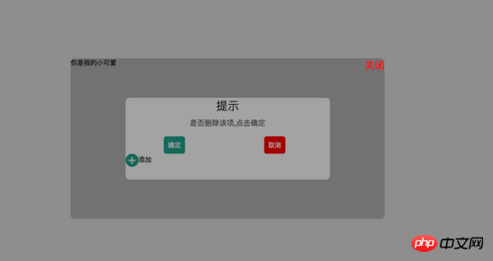
<body>
<p id="delete-button"><i>-</i>删除</p>
<p id="layout">
<p id="layout-box">
<p class="modal-dialog">
<p class="dialog-title">提示</p>
<p class="dialog-content">是否删除该项,点击确定</p>
<p class="dialog-button">
<p class="button-box">
<span id="confirm">确定</span>
</p>
<p class="button-box">
<span id="cancel">取消</span>
</p>
</p>
<p id="add-button"><i>+</i>添加</p>
<p class="layout2">
<p class="modal-dialog2">
<span class="modal-text">你是我的小可爱</span>
<span id="close">关闭</span>
</p>
</p>
</p>
</p>
</p>
</body>
<script type="text/javascript">
document.getElementById("delete-button").onclick= function(){
var layout = document.getElementById("layout")
layout.style.display = "block"
}
document.getElementById("confirm").onclick=function(){
var layout = document.getElementById("layout")
layout.style.display = "none"
}
document.getElementById("cancel").onclick=function(){
var layout = document.getElementById("layout")
layout.style.display = "none"
}
document.getElementById("add-button").onclick=function(){
var layout = document.getElementsByClassName("layout2")
layout[0].style.display = "block"
}
document.getElementById("close").onclick=function(){
var layout = document.getElementsByClassName("layout2")
layout[0].style.display = "none"
}
</script>
</html> 親コンテナのtransform属性を削除しようとすると、子コンテナが親コンテナに基づいて配置されず、本体に基づいて配置されていることがわかります。 width も、 body で指定された 50% の幅に基づきます。レンダリングは次のとおりです:
<!DOCTYPE html>
<html>
<head>
    <title>关于position的定位的坑</title>
</head>
<style type="text/css">
    body{
        margin: 0;
        padding: 0;
    }
    i{
        font-style: normal;
        cursor: pointer;
    }
    #delete-button{
        position: absolute;
        left: 45%;
        top: 45%;
        text-align: center;
        vertical-align: middle;
        height: 50px;
        margin: auto;
        cursor: pointer;
    }
    #delete-button > i{
        display: inline-block;
        width: 32px;
        height: 32px;
        border-radius: 16px;
        background-color: orange;
        color: red;
        font-size: 32px;
        vertical-align: middle;
        line-height: 28px;
    }
    /*第一个模态框的样式*/
    #layout{
        display: none;
        width: 100%;
        height: 100%;
    }
    /*使用flex布局水平竖直居中*/
    #layout-box{
        position: fixed;
        width: 100%;
        height: 100%;
        left: 0;
        top: 0;
        display: flex;
        display: -webkit-flex;
        flex-flow: column nowrap;
        justify-content: center;
        align-items: center;
        background-color: rgba(0,0,0,0.3);
    }
    /*使用postion 和 transform 水平垂直居中*/
    .modal-dialog{
        width: 500px;
        height: 200px;
        border-radius: 10px;
        background-color: #fff;
    }
    .dialog-title{
        text-align: center;
        color: #333;
        font-size: 28px;
        margin-bottom: 10px;
    }
    .dialog-content{
        text-align: center;
        color: #666;
        font-size: 18px;
    }
    .dialog-button{
        margin-top: 20px;
        width: 100%;
        color: #333;
    }
    .dialog-button >.button-box{
        display: inline-block;
        width: 48%;
        text-align: center;
    }
    .button-box span{
        display: inline-block;
        padding: 10px;
        color: #fff;
        border-radius: 6px;
        cursor: pointer;
    }
    #confirm{
        background-color: #27ad9a;
    }
    #cancel{
        background-color: red;
    }
    /*添加按钮的样式*/
    #add-button > i{
        display: inline-block;
        width: 32px;
        height: 32px;
        border-radius: 16px;
        background-color: #27ad9a;
        color: #fff;
        font-size: 32px;
        vertical-align: middle;
        line-height: 28px;
        text-align: center;
    }
    #add-button{
        display: inline-block;
        cursor: pointer;
    }
    /*第二个模态框的样式*/
    .layout2{
        display: none;
        position: fixed;
        width: 100%;
        height: 100%;
        left: 0;
        top: 0;
        background-color: rgba(0,0,0,0.2);
    }
    .modal-dialog2{
        position: fixed;
        left: 50%;
        top: 50%;
        width: 50%;
        height: 50%;
        border-radius: 10px;
        transform: translate(-50%, -50%);
        -webkit-transform: translate(-50%, -50%);
        -moz-transform: translate(-50%, -50%);
        -o-transform: translate(-50%, -50%);
        background-color: rgba(0,0,0,0.2);
    }
    .modal-dialog2 > span{
        display: block;
    }
    .modal-text{
        float: left;
    }
    #close{
        color: red;
        font-size: 24px;
        float: right;
        cursor: pointer;
    }
</style>
<body>
    <p id="delete-button"><i>-</i>删除</p>
    <p id="layout">
        <p id="layout-box">
            <p class="modal-dialog">
                <p class="dialog-title">提示</p>
                <p class="dialog-content">是否删除该项,点击确定</p>
                <p class="dialog-button">
                    <p class="button-box">
                        <span id="confirm">确定</span>
                    </p>
                    <p class="button-box">
                        <span id="cancel">取消</span>
                    </p>
                </p>
                <p id="add-button"><i>+</i>添加</p>
                <p class="layout2">
                    <p class="modal-dialog2">
                        <span class="modal-text">你是我的小可爱</span>
                        <span id="close">关闭</span>
                    </p>
                </p>
            </p>
        </p>
    </p>
</body>
<script type="text/javascript">
    document.getElementById("delete-button").onclick= function(){
        var layout = document.getElementById("layout")
        layout.style.display = "block"
    }
    document.getElementById("confirm").onclick=function(){
        var layout = document.getElementById("layout")
        layout.style.display = "none"
    }
    document.getElementById("cancel").onclick=function(){
        var layout = document.getElementById("layout")
        layout.style.display = "none"
    }
    document.getElementById("add-button").onclick=function(){
        var layout = document.getElementsByClassName("layout2")
        layout[0].style.display = "block"
    }
    document.getElementById("close").onclick=function(){
        var layout = document.getElementsByClassName("layout2")
        layout[0].style.display = "none"
    }
</script>
</html>
2 番目: 携帯電話のジッター問題を解決します (追記: この問題についてはオンライン マスターによって書かれたブログを参照しています。次のリンクに移動してください)記事の最後を参照してください) **1. **Webkit カーネル ブラウザーで修正された手ぶれ補正スタイルを追加します - webkit -transform: translationZ(0);**2. html と body {height:100%;overflow :auto;margin:0;} これはグローバル スタイルに影響するため、お勧めできません。
三、在fiexd内设置position:absolute,如下:
<p style="position:fiexd;bottom:0px;">
  <p style="position:absolute;">
  </p>
</p>
4、百分比布局 主要通过设置元素的宽度为百分比或者高度为百分比。比如:width:50%; height:50%; 这样的写法。
5、响应式布局(主要使用媒体查询来实现响应式设计) 主要使用CSS3 @media 来做不同终端的响应式设计
主要在css文件中写入
@media screen and (max-width:600px){
    写入当屏幕小于或等于600px时的样式
}
@media screen and (min-width:900px){
    写入当屏幕大于或等于900px时的样式
}
@media screen and (min-width:600px) and (max-width:900px){
    写入当屏幕在600px-900px之间的样式
}
@media screen and (max-device-width: 480px){
    写入最大设备宽度为480px,比如说iPhone上的显示,这里的max-device-width所指的是设备的实际分辨率,也就是指可视面积分辨率
}
@media only screen and (-webkit-min-device-pixel-ratio: 2){
    写入专门针对iPhone4的移动设备样式
}
@media all and (orientation:portrait){
    写入设备在纵向时的样式
}
@media all and (orientation:landscape){
    写入设备在横向时的样式
}
@media not print and (max-width: 1200px){
    not是用来排除某种制定的媒体类型
    写入在除打印设备和设备宽度小于1200px下的所有设备的样式
}
@media only screen and (max-device-width:240px){
    only用来定某种特定的媒体类型,可以用来排除不支持媒体查询的浏览器。
    写入只能在最大设备宽度为240px的屏幕下使用的样式
}
相信看了本文案例你已经掌握了方法,更多精彩请关注php中文网其它相关文章!
推荐阅读:
以上がCSS Web ページのレイアウトに関する簡単な説明の詳細内容です。詳細については、PHP 中国語 Web サイトの他の関連記事を参照してください。
声明:
この記事の内容はネチズンが自主的に寄稿したものであり、著作権は原著者に帰属します。このサイトは、それに相当する法的責任を負いません。盗作または侵害の疑いのあるコンテンツを見つけた場合は、admin@php.cn までご連絡ください。