
ホームページ >ウェブフロントエンド >jsチュートリアル >jqueryモバイル折りたたみナビゲーションボタンの実装チュートリアル
jqueryモバイル折りたたみナビゲーションボタンの実装チュートリアル

- 小云云オリジナル
- 2018-01-22 16:38:061785ブラウズ
この記事は主に折りたたみ可能なナビゲーション ボタンを実装するための jquery mobile を詳しく紹介します。興味のある方はぜひ参考にしてください。
この記事の例では、jquery で折りたたみ可能なナビゲーション ボタンを実装するための具体的なコードを共有します。具体的な内容は次のとおりです
関数:
関数がたくさんある場合は、折りたたみ可能なグループ化されたナビゲーション ボタンを作成します。 data-role="collapsible " を指定するだけで、折りたたみ可能なパネルを作成できます
<!DOCTYPE html>
<html>
<head>
 <meta charset="utf-8">
 <title>可折叠的导航面板</title>
 <!--使用名为viewport的meta值,其content指定自适应设备的宽度-->
 <meta name="viewport" content="width=device-width, initial-scale=1">
<link rel="stylesheet" href="http://code.jquery.com/mobile/1.3.2/jquery.mobile-1.3.2.min.css">
<script src="http://code.jquery.com/jquery-1.8.3.min.js"></script>
<script src="http://code.jquery.com/mobile/1.3.2/jquery.mobile-1.3.2.min.js"></script>

 </head>
<body>
<p data-role="page" id="pageone">
 <p data-role="header">
 <h1>图书查阅系统</h1>
 </p>
 <!--创建一个可折叠的导航面板-->
 <p data-role="content">
 <p data-role="collapsible" data-theme="e">
 <h4>文学历史</h4>
 <ul data-role="listview">
  <li><a href="#" rel="external nofollow" rel="external nofollow" rel="external nofollow" rel="external nofollow" rel="external nofollow" rel="external nofollow" rel="external nofollow" >明代</a></li>
  <li><a href="#" rel="external nofollow" rel="external nofollow" rel="external nofollow" rel="external nofollow" rel="external nofollow" rel="external nofollow" rel="external nofollow" >宋代</a></li>
 </ul>
 </p>
 <!--显示人文社科的可折叠面板-->
 <p data-role="collapsible" data-theme="b" data-collapsed="false">
 <h4>人文社科</h4>
 <ul data-role="listview">
  <li><a href="#" rel="external nofollow" rel="external nofollow" rel="external nofollow" rel="external nofollow" rel="external nofollow" rel="external nofollow" rel="external nofollow" >财务</a></li>
  <li><a href="#" rel="external nofollow" rel="external nofollow" rel="external nofollow" rel="external nofollow" rel="external nofollow" rel="external nofollow" rel="external nofollow" >心理</a></li>
 </ul>
 </p>
 <!--显示计算机应用的可折叠面板-->
 <p data-role="collapsible" data-theme="e">
 <h4>计算机应用</h4>
 <ul data-role="listview">
  <li><a href="#" rel="external nofollow" rel="external nofollow" rel="external nofollow" rel="external nofollow" rel="external nofollow" rel="external nofollow" rel="external nofollow" >软件开发</a></li>
  <li><a href="#" rel="external nofollow" rel="external nofollow" rel="external nofollow" rel="external nofollow" rel="external nofollow" rel="external nofollow" rel="external nofollow" >数据库</a></li>
  <li><a href="#" rel="external nofollow" rel="external nofollow" rel="external nofollow" rel="external nofollow" rel="external nofollow" rel="external nofollow" rel="external nofollow" >移动开发</a></li>
 </ul>
 </p>
 </p>
 <p data-role="footer" data-position="fixed">
 <h1>请单击“+”按钮进行展开</h1>
 </p>
</p>
</body>
</html>
コード分析:
data-role="collapsible " を通じて折りたたみ可能な p を作成し、その中に data-role を渡します= "ListView" リスト ボックスを作成します
データテーマ: 事前に定義されたスタイルを指定します (スタイル ビルダーを使用してカスタム スタイルを作成することもできます)
data-colorLaPSEd = "False"
関連する推奨事項:
js 実装折りたたみナビゲーションの例_JavaScriptスキル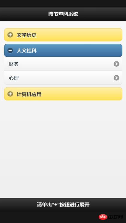
以上がjqueryモバイル折りたたみナビゲーションボタンの実装チュートリアルの詳細内容です。詳細については、PHP 中国語 Web サイトの他の関連記事を参照してください。
声明:
この記事の内容はネチズンが自主的に寄稿したものであり、著作権は原著者に帰属します。このサイトは、それに相当する法的責任を負いません。盗作または侵害の疑いのあるコンテンツを見つけた場合は、admin@php.cn までご連絡ください。