Component layout
The various layouts supported by the MIP component can make the picture screen adaptive, height-fixed, etc. Let’s see the detailed instructions below.
Supported layout types
<mip-img
    layout="responsive"
    width="350"
    height="263"
    popup=""
    alt="baidu mip img"
    src="http://ztd00.photos.bdimg.com/ztd/w%3D350%3Bq%3D70/sign=e3bb1c4b97ef76c6d0d2fd2ead2d8cc7/f703738da9773912b57d4b0bff198618367ae205.jpg">
</mip-img>
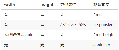
layout attribute default rules


