Module organization
Module Organization
Any CSS code that exceeds 1000 lines, you have experienced this experience:
1. What is this class? What does it mean?
2. Where is this class used?
3. If I create a xxoo class, will it cause a conflict?
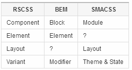
Reasonable System for CSS Stylesheet Structure The goal is to solve the above problems. It is not a framework, but allows you to build more robust and maintainable CSS code through specifications.
Components (Components)

Think from the perspective of Components, treat the modules of the website as an independent Components .
Naming components
Components Name with at least two words, separated by -, for example:
- Like button(
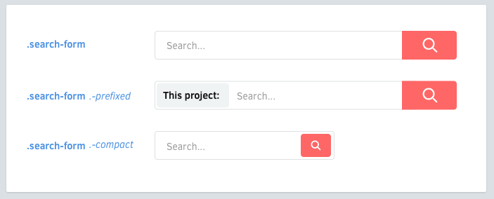
.like-button) - Search box(
.search-form) - Article Card (
.article-card)
Elements (Element)

Elements Yes Elements in Components
Naming elements The class name of
Elements should be as short as one word.
 .search-form {
    > .field { /* ... */ }
    > .action { /* ... */ }
  }
On multiple words (multiple words)
For Elements class names that require two or more words to express, underscores and underlines should not be used to connect them , should directly connect.
  .profile-box {
    > .firstname { /* ... */ }
    > .lastname { /* ... */ }
    > .avatar { /* ... */ }
  }
Avoid tag selectors
Use classnames whenever possible. The tag selector is fine to use, but its performance is slightly weaker and its meaning is unclear.
  .article-card {
    > h3    { /* ✗ avoid */ }
    > .name { /* ✓ better */ }
  }
Variants (variants)

Components and Elements may both have Variants.
Naming variants (variant naming)
Variants’s classname should be prefixed with a dash -
  .like-button {
    &.-wide { /* ... */ }
    &.-short { /* ... */ }
    &.-disabled { /* ... */ }
  }
Element variants (element variants)
  .shopping-card {
    > .title { /* ... */ }
    > .title.-small { /* ... */ }
  }
Dash prefixes (dash prefix)
Why use dash as the prefix of the variant?
- It can avoid ambiguity with
Elements - CSS class can only start with the word and
_or- - Middle lines are easier to output than underlines
Layout (layout)

Avoid positioning properties (avoid positioning properties)
Components should be reusable in different contexts, so avoid setting the following properties:
Positioning (position, top, left, right, bottom)
Floats (float, clear)
Margins (margin)
- ##Dimensions (width, height) *
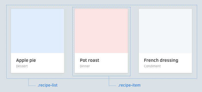
widths and floats in list component(.article-list) instead of component(.article-card) itself.
  .article-list {
    & {
      @include clearfix;
    }

    > .article-card {
      width: 33.3%;      float: left;
    }
  }

  .article-card {
    & { /* ... */ }
    > .image { /* ... */ }
    > .title { /* ... */ }
    > .category { /* ... */ }
  }
Avoid over-nesting (Avoid excessive nesting)It is easy to lose control when there are multiple nestings. You should keep no more than one nesting. /* ✗ Avoid: 3 levels of nesting */
.image-frame {
> .description { /* ... */
> .icon { /* ... */
}
}
} /* ✓ Better: 2 levels */
.image-frame {
> .description { /* ... */ }
> .description > .icon { /* ... */ }
}Apprehensions (concerns)#underline-
is a piece of bad stuff: Actually you can choose To use it specifically, just keep Components, Elements, Variantsin mind.Sometimes I can’t think of two words: Some components do use one word to express their meaning, such as aleter. But you can actually use suffixes to make it more explicit.
- .alert-box
- .alert -card
- .alert-block
- .link-button
- .link-span
- Thinking from the perspective of
Components
, named with two words (.screenshot-image) Components
inElements, named with one word (.blog -post .title)Variants
, with dash- as the prefix (.shop-banner.-with-icon)Components
can be nested inside each otherRemember, you can make things easier through inheritance
- *
Translated from:Reasonable System for CSS Stylesheet Structure


