
Maison >interface Web >tutoriel CSS >Propriétés d'animation CSS3 : Introduction à la propriété Animation
Propriétés d'animation CSS3 : Introduction à la propriété Animation

- 不言original
- 2018-08-09 16:21:043184parcourir
Le contenu de cet article explique comment utiliser CSS3 pour créer des attributs d'animation : L'introduction de l'attribut Animation a une certaine valeur de référence. Les amis dans le besoin peuvent s'y référer.
Les propriétés CSS3 ont trois attributs liés à l'animation : Transform, Transition, Animation nous avons appris ensemble Transformation et Transition, implémentons quelques effets d'animation de base sur les éléments. Je pense que ceux-ci suffisent à exciter tout le monde pendant un moment. Aujourd'hui, nous profitons de cet enthousiasme pour continuer à apprendre le troisième attribut d'animation Animation. Du sens littéral d'Animation, nous saurons ce qu'est "l'animation". " moyens. Mais l'animation en CSS3 est différente de l'animation de dessin Canvas en HTML5. L'animation n'est appliquée qu'aux éléments DOM qui existent déjà sur la page, et elle est différente des effets d'animation produits par Flash, JavaScript et jQuery, car nous utilisons CSS3. nous évite les codes js et jquery complexes lors de la création d'animations (ce qui est très heureux pour les gens comme moi qui ne comprennent pas js). Il y a juste un inconvénient : nous pouvons utiliser l'animation pour créer ce que nous voulons, mais. ils sont un peu durs. Si vous voulez faire de meilleures animations, je pense que vous devriez utiliser flash ou js. Bien que l'animation produite par Animation soit simple et grossière, je pense que cela ne peut toujours pas réduire notre enthousiasme pour l'apprendre.
Avant de commencer à présenter l'animation, nous devons d'abord comprendre une chose spéciale, à savoir les "images clés". Nous l'appelons "images clés". Les amis qui ont joué à Flash connaissent peut-être cette chose. Jetons un coup d'œil à ce qu'est cette « images clés ». Lorsque nous avons utilisé la transition pour créer un effet de transition simple plus tôt, nous avons inclus les attributs initiaux et finaux, un temps d'action de début et un temps d'action de continuation ainsi que le taux de transformation de l'action. valeurs intermédiaires. Si nous voulons Le contrôle est plus détaillé, par exemple, quelles actions je veux effectuer dans la première période et quelles actions je veux effectuer dans la deuxième période (passer au flash, cela signifie quelles actions Je veux effectuer dans la première image, et quelles actions je veux effectuer dans la deuxième image (Quelle action), il nous est difficile d'utiliser Transition pour y parvenir. À ce stade, nous avons également besoin d'une telle "image clé" pour y parvenir. contrôle. Ensuite, CSS3 Animation utilise l'attribut "keyframes" pour obtenir cet effet. Jetons d'abord un coup d'œil aux images clés :
Les images clés ont leurs propres règles de syntaxe. Leur dénomination commence par "@keyframes", suivi du "nom de l'animation" plus une paire d'accolades "{}". , entre parenthèses se trouvent quelques règles de style pour différentes périodes, un peu à la manière de notre écriture de style CSS. Pour une règle de style dans "@keyframes" composée de plusieurs pourcentages, par exemple entre "0%" et "100%", nous pouvons créer plusieurs pourcentages dans cette règle, et nous attribuons à chaque pourcentage un élément avec des effets d'animation. être ajouté avec différents attributs, afin que les éléments puissent obtenir un effet en constante évolution, comme le déplacement, le changement de couleur, de position, de taille, de forme, etc. Cependant, une chose à noter est que nous pouvons utiliser « fromt » et « to ». " représentent l'endroit où commence et se termine une animation. En d'autres termes, "de" équivaut à "0%" et "à" équivaut à "100%". Il convient de mentionner que, parmi eux, "0%" ne peut pas omettre le signe de pourcentage comme les autres valeurs d'attribut. Nous devons ajouter ici le signe de pourcentage ("%"). Sinon, nos images clés seront invalides et n'auront aucun effet. Parce que l'unité d'images clés n'accepte que des valeurs en pourcentage.
Les images clés peuvent être spécifiées dans n'importe quel ordre pour déterminer les positions clés du changement d'animation d'animation. Les règles de grammaire spécifiques sont les suivantes :
 keyframes-rule: '@keyframes' IDENT '{' keyframes-blocks '}';
 keyframes-blocks: [ keyframe-selectors block ]* ;
 keyframe-selectors: [ 'from' | 'to' | PERCENTAGE ] [ ',' [ 'from' | 'to' | PERCENTAGE ] ]*;
J'ai combiné la grammaire ci-dessus
  @keyframes IDENT {
     from {
       Properties:Properties value;
     }
     Percentage {
       Properties:Properties value;
     }
     to {
       Properties:Properties value;
     }
   }
   或者全部写成百分比的形式:
   @keyframes IDENT {
      0% {
         Properties:Properties value;
      }
      Percentage {
         Properties:Properties value;
      }
      100% {
         Properties:Properties value;
      }
    }
Parmi elles, IDENT est un nom d'animation Vous pouvez le choisir avec désinvolture. Il est préférable d'être plus sémantique. Le pourcentage est une valeur en pourcentage. Nous pouvons ajouter plusieurs de ces pourcentages. Properties est le nom de la propriété CSS, comme left, background, etc., et value est la valeur de la propriété correspondante. Il est à noter que notre from et to correspondent respectivement à 0% et 100%. Nous l’avons déjà mentionné. Jusqu'à présent, seuls les navigateurs dotés du noyau Webkit prennent en charge l'animation, je dois donc ajouter le préfixe -webkit à ce qui précède. On dit que Firefox5 peut prendre en charge la propriété d'animation de CSS3.
Regardons un exemple du site officiel du W3C
@-webkit-keyframes 'wobble' {
0% {
margin-left: 100px;
background: green;
}
40% {
margin-left: 150px;
background: orange;
}
60% {
margin-left: 75px;
background: blue;
}
100% {
margin-left: 100px;
background: red;
}
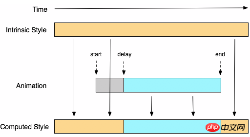
}Ici, nous définissons une animation appelée « wobble ». Son animation commence à 0 % et se termine à 100 %. a également subi deux processus de 40 % et 60 %. La signification spécifique du code ci-dessus est la suivante : lorsque l'animation wobble est à 0 %, l'élément est positionné à la position gauche de 100 px, la couleur d'arrière-plan est verte, puis à À 40 %, l'élément passe à la position gauche de 150 px. Et la couleur d'arrière-plan est orange. À 60 %, l'élément passe à la position où la gauche est de 75 px, et la couleur d'arrière-plan est bleue. 100 %, l'élément revient au point de départ où la gauche est de 100 px et la couleur d'arrière-plan devient rouge. Supposons que nous donnons à cette animation seulement 10 secondes de temps d'exécution, alors l'état d'exécution de chaque segment est comme indiqué ci-dessous :

Keyframes定义好了以后,我们需要怎么去调用刚才定义好的动画“wobble”
CSS3的animation类似于transition属性,他们都是随着时间改变元素的属性值。他们主要区别是transition需要触发一个事件(hover事件或click事件等)才会随时间改变其css属性;而animation在不需要触发任何事件的情况下也可以显式的随着时间变化来改变元素css的属性值,从而达到一种动画的效果。这样我们就可以直接在一个元素中调用animation的动画属性,基于这一点,css3的animation就需要明确的动画属性值,这也就是回到我们上面所说的,我们需要keyframes来定义不同时间的css属性值,达到元素在不同时间段变化的效果。
下面我们来看看怎么给一个元素调用animation属性
  .demo1 {
     width: 50px;
     height: 50px;
     margin-left: 100px;
     background: blue;
     -webkit-animation-name:'wobble';/*动画属性名,也就是我们前面keyframes定义的动画名*/
     -webkit-animation-duration: 10s;/*动画持续时间*/
     -webkit-animation-timing-function: ease-in-out; /*动画频率,和transition-timing-function是一样的*/
     -webkit-animation-delay: 2s;/*动画延迟时间*/
     -webkit-animation-iteration-count: 10;/*定义循环资料,infinite为无限次*/
     -webkit-animation-direction: alternate;/*定义动画方式*/
  }
CSS Animation动画效果将会影响元素相对应的css值,在整个动画过程中,元素的变化属性值完全是由animation来控制,动画后面的会覆盖前面的属性值。如上面例子:因为我们这个demo只是在不同的时间段改变了demo1的背景色和左边距,其默认值是:margin-left:100px;background: blue;但当我们在执行动画0%时,margin-left:100px,background:green;当执行到40%时,属性变成了:margin-left:150px;background:orange;当执行到60%时margin-left:75px;background:blue;当动画 执行到100%时:margin-left:100px;background: red;此时动画将完成,那么margin-left和background两个属性值将是以100%时的为主,他不会产生叠加效果,只是一次一次覆盖前一次出将的css属性。就如我们平时的css一样,最后出现的权根是最大的。当动画结束后,样式回到默认效果。
我们可以看一张来自w3c官网有关于css3的animation对属性变化的过程示意图
从上面的Demo中我们可以看出animation和transition一样有自己相对应的属性,那么在animation主要有以下几种:animation-name;animation-duration;animation-timing-function;animation-delay;animation-iteration-count;animation-direction;animation-play-state。下面我们分别来看看这几个属性的使用
一、animation-name:
语法:
animation-name: none | IDENT[,none | IDENT]*;
取值说明:
animation-name:是用来定义一个动画的名称,其主要有两个值:IDENT是由Keyframes创建的动画名,换句话说此处的IDENT要和Keyframes中的IDENT一致,如果不一致,将不能实现任何动画效果;none为默认值,当值为none时,将没有任何动画效果。另外我们这个属性跟前面所讲的transition一样,我们可以同时附几个animation给一个元素,我们只需要用逗号“,”隔开。
二、animation-duration:
语法:
animation-duration: <time>[,<time>]*
取值说明:
animation-duration是用来指定元素播放动画所持续的时间长,取值:46dd80ba616c57a652514755c74c4211为数值,单位为s (秒.)其默认值为“0”。这个属性跟transition中的transition-duration使用方法是一样的。
三、animation-timing-function:
语法:
animation-timing-function:ease | linear | ease-in | ease-out | ease-in-out | cubic-bezier(<number>, <number>, <number>, <number>) [, ease | linear | ease-in | ease-out | ease-in-out | cubic-bezier(<number>, <number>, <number>, <number>)]*
取值说明:
animation-timing-function:是指元素根据时间的推进来改变属性值的变换速率,说得简单点就是动画的播放方式。他和transition中的transition-timing-function一样,具有以下六种变换方式:ease;ease-in;ease-in-out;linear;cubic-bezier。具体的使用方法大家可以点这里,查看其中transition-timing-function的使用方法。
四、animation-delay:
语法:
animation-delay: <time>[,<time>]*
取值说明:
animation-delay:是用来指定元素动画开始时间。取值为46dd80ba616c57a652514755c74c4211为数值,单位为s(秒),其默认值也是0。这个属性和transition-delayy使用方法是一样的。
五、animation-iteration-count
语法:
animation-iteration-count:infinite | <number> [, infinite | <number>]*
取值说明:
animation-iteration-count是用来指定元素播放动画的循环次数,其可以取值d80b5def5ed1be6e26d91c2709f14170为数字,其默认值为“1”;infinite为无限次数循环。
六、animation-direction
语法:
animation-direction: normal | alternate [, normal | alternate]*
取值说明:
animation-direction是用来指定元素动画播放的方向,其只有两个值,默认值为normal,如果设置为normal时,动画的每次循环都是向前播放;另一个值是alternate,他的作用是,动画播放在第偶数次向前播放,第奇数次向反方向播放。
七、animation-play-state
语法:
animation-play-state:running | paused [, running | paused]*
取值说明:
animation-play-state主要是用来控制元素动画的播放状态。其主要有两个值,running和paused其中running为默认值。他们的作用就类似于我们的音乐播放器一样,可以通过paused将正在播放的动画停下了,也可以通过running将暂停的动画重新播放,我们这里的重新播放不一定是从元素动画的开始播放,而是从你暂停的那个位置开始播放。另外如果暂时了动画的播放,元素的样式将回到最原始设置状态。这个属性目前很少内核支持,所以只是稍微提一下。
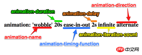
上面我们分别介绍了animation中的各个属性的语法和取值,那么我们综合上面的内容可以给animation属性一个速记法:
animation:[<animation-name> || <animation-duration> || <animation-timing-function> || <animation-delay> || <animation-iteration-count> || <animation-direction>] [, [<animation-name> || <animation-duration> || <animation-timing-function> || <animation-delay> || <animation-iteration-count> || <animation-direction>] ]*
如下图所示
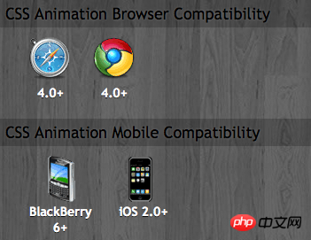
兼容的浏览器
前面我也简单的提过,CSS3的animation到目前为止只支持webkit内核的浏览器,因为最早提出这个属性的就是safari公司,据说Firefox5.0+将支持Animation。如图所示
那么到此为止,我们主要一起学习了有关animation的理论知识,下面我们一起来看两个实例制作过程,来加强对animation的实践能力
DEMO一:发光变色的button
我们这个demo主要是通过在keyframes中改变元素的background;color;box-shadow三个属性,来达到一种发光变色的button效果,我们来看看其实现代码
HTML Code:
<a href="" class="btn">发光的button</a>
CSS Code
  /*给这个按钮创建一个动名名称:buttonLight,然后在每个时间段设置不同的background,color来达到变色效果,改变box-shadow来达到发光效果*/
  @-webkit-keyframes 'buttonLight' {
     from {
       background: rgba(96, 203, 27,0.5);
       -webkit-box-shadow: 0 0 5px rgba(255, 255, 255, 0.3) inset, 0 0 3px rgba(220, 120, 200, 0.5);
       color: red;
     }
     25% {
       background: rgba(196, 203, 27,0.8);
       -webkit-box-shadow: 0 0 10px rgba(255, 155, 255, 0.5) inset, 0 0 8px rgba(120, 120, 200, 0.8);
       color: blue;
    }
    50% {
      background: rgba(196, 203, 127,1);
      -webkit-box-shadow: 0 0 5px rgba(155, 255, 255, 0.3) inset, 0 0 3px rgba(220, 120, 100, 1);
      color: orange;
    }
    75% {
      background: rgba(196, 203, 27,0.8);
      -webkit-box-shadow: 0 0 10px rgba(255, 155, 255, 0.5) inset, 0 0 8px rgba(120, 120, 200, 0.8);
      color: black;
    }
   to {
     background: rgba(96, 203, 27,0.5);
     -webkit-box-shadow: 0 0 5px rgba(255, 255, 255, 0.3) inset, 0 0 3px rgba(220, 120, 200, 0.5);
     color: green;
    }
  }
  a.btn {
    /*按钮的基本属性*/
    background: #60cb1b;
    font-size: 16px;
    padding: 10px 15px;
    color: #fff;
    text-align: center;
    text-decoration: none;
    font-weight: bold;
    text-shadow: 0 -1px 1px rgba(0,0,0,0.3);
    -moz-border-radius: 5px;
    -webkit-border-radius: 5px;
    border-radius: 5px;
    -moz-box-shadow: 0 0 5px rgba(255, 255, 255, 0.6) inset, 0 0 3px rgba(220, 120, 200, 0.8);
    -webkit-box-shadow: 0 0 5px rgba(255, 255, 255, 0.6) inset, 0 0 3px rgba(220, 120, 200, 0.8);
    box-shadow: 0 0 5px rgba(255, 255, 255, 0.6) inset, 0 0 3px rgba(220, 120, 200, 0.8);
    /*调用animation属性,从而让按钮在载入页面时就具有动画效果*/
    -webkit-animation-name: "buttonLight"; /*动画名称,需要跟@keyframes定义的名称一致*/
    -webkit-animation-duration: 5s;/*动画持续的时间长*/
    -webkit-animation-iteration-count: infinite;/*动画循环播放的次数*/
  }
效果:
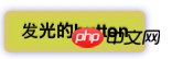 效果一
效果一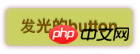 变化中效果二
为了更好的看出这个demo的效果,你可以把上面的代码复制到你本过的页面上,并使用safari和chrome,你会觉得很有意思,整个按钮好像在不停的呼吸一样。
Demo二:方形旋转变成圆型
我们这个demo是通过transform的rotate和border-radius不同值,把一个方型图片随着时间的推移,慢慢的转换成了个圆型效果,下面我们来看看其具体实现的效果
HTML Code:
   <a href="#" class="box"></a>
   <span class="click-btn">Click</span>
CSS Code:
  /*定义方型转化为圆型的动画round*/
  @-webkit-keyframes 'round' {
     from{
       -webkit-transform: rotate(36deg);
       -webkit-border-radius: 2px;
     }
  10%{
      -webkit-transform: rotate(72deg);
      -webkit-border-radius: 4px;
     }
  20% {
      -webkit-transform: rotate(108deg);
      -webkit-border-radius: 6px;
    }
  30% {
      -webkit-transform: rotate(144deg);
      -webkit-border-radius: 9px;
    }
  40%{
     -webkit-transform: rotate(180deg);
     -webkit-border-radius: 12px;
  }
  50%{
     -webkit-transform: rotate(216deg);
     -webkit-border-radius: 14px;
  }
  60% {
     -webkit-transform: rotate(252deg);
     -webkit-border-radius: 16px;
  }
  70% {
     -webkit-transform: rotate(288deg);
     -webkit-border-radius: 19px;
  }
  80%{
     -webkit-transform: rotate(324deg);
     -webkit-border-radius: 22px;
  }
  to {
     -webkit-transform: rotate(360deg);
     -webkit-border-radius: 25px;
  }
}
   /*给方型box一个初步样式*/
   a.box {
      display: block;
      width: 50px;
      height: 50px;
      background: red;
      margin-bottom: 20px;
   }
   /*圆型box的样式,并在这里应用animation*/
   a.round {
      -webkit-border-radius: 25px;
      -moz-border-radius: 25px;
      border-radius: 25px;
      background: green;
      -webkit-animation-name: 'round'; /*动画名称*/
      -webkit-animation-duration: 60s;/*播放一次所持续时间*/
      -webkit-animation-timing-function: ease;/*动画播放频率*/
      -webkit-animation-iteration-count: infinite;/*动画播放次涒为无限次*/
    }

   /*click button效果*/
   .click-btn {
       background: rgba(125,220,80,0.8);
       -moz-border-radius: 5px;
      -webkit-border-radius: 5px;
       border-radius: 5px;
       -webkit-box-shadow: inset 0 0 8px rgba(255,255,255,0.8),0 0 10px rgba(10,255,120,0.3);
       -moz-box-shadow: inset 0 0 8px rgba(255,255,255,0.8),0 0 10px rgba(10,255,120,0.3);
       box-shadow: inset 0 0 8px rgba(255,255,255,0.8),0 0 10px rgba(10,255,120,0.3);
       padding: 5px 10px;
       color: #369;
       font-size: 16px;
       font-weight: bold;
       text-align: center;
       text-shadow: 0 -1px 0 rgba(0,0,0,0.5);
       cursor: pointer;
   }
jQuery Code:
  <script type="text/javascript">
      $(document).ready(function(){
         $(".click-btn").click(function(){
             $(this).siblings().addClass("round");
          });
       });
  </script>
我们载入时box是没有任何动画效果的,当我们点击了click button看给原box上加上一个round的class名,从而触发了一个round的动作。请看效果:
未点击按钮时效果(未触发动画效果) 点击click按钮开始播放动画
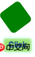
我们这里简单的介绍了两个demo的应用,其实大家可以发挥自己的想像制作出更好更多的动画效果,如果你对animation制作动画很感兴趣,你可以参考这几个网站:webdesignersblog、slope、impressivewebs这上面有许多特别有意的动画demo。
相关推荐:
Ce qui précède est le contenu détaillé de. pour plus d'informations, suivez d'autres articles connexes sur le site Web de PHP en chinois!