
Maison >interface Web >tutoriel CSS >10 effets de chargement implémentés par CSS3
10 effets de chargement implémentés par CSS3

- 不言original
- 2018-06-28 14:17:463282parcourir
Cet article présente principalement en détail 10 types d'effets de chargement implémentés par CSS3. L'implémentation des effets est simple et nouvelle, et a une certaine valeur de référence. Les amis intéressés peuvent se référer à
Combien d'effets de chargement ont été obtenus. en utilisant CSS3 Un effet de chargement courant, bien qu'il soit très simple, je le partage quand même, et je prends des notes d'ailleurs...
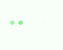
Le premier effet :

Le code est le suivant :
<p class="loading">
        <span></span>
        <span></span>
        <span></span>
        <span></span>
        <span></span>
</p>
.loading{
width: 80px;
height: 40px;
margin: 0 auto;
margin-top:100px;
}
.loading span{
display: inline-block;
width: 8px;
height: 100%;
border-radius: 4px;
background: lightgreen;
-webkit-animation: load 1s ease infinite;
}
@-webkit-keyframes load{
0%,100%{
height: 40px;
background: lightgreen;
}
50%{
height: 70px;
margin: -15px 0;
background: lightblue;
}
}
.loading span:nth-child(2){
-webkit-animation-delay:0.2s;
}
.loading span:nth-child(3){
-webkit-animation-delay:0.4s;
}
.loading span:nth-child(4){
-webkit-animation-delay:0.6s;
}
.loading span:nth-child(5){
-webkit-animation-delay:0.8s;
}Le deuxième effet :
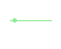
Le code est le suivant :
<p class="loading">
        <span></span>
</p>
.loading{
width: 150px;
height: 4px;
border-radius: 2px;
margin: 0 auto;
margin-top:100px;
position: relative;
background: lightgreen;
-webkit-animation: changeBgColor 1.04s ease-in infinite alternate;
}
.loading span{
display: inline-block;
width: 16px;
height: 16px;
border-radius: 50%;
background: lightgreen;
position: absolute;
margin-top: -7px;
margin-left:-8px;
-webkit-animation: changePosition 1.04s ease-in infinite alternate;
}
@-webkit-keyframes changeBgColor{
0%{
background: lightgreen;
}
100%{
background: lightblue;
}
}
@-webkit-keyframes changePosition{
0%{
background: lightgreen;
}
100%{
margin-left: 142px;
background: lightblue;
}
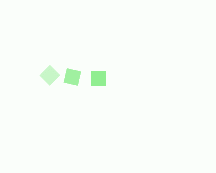
} Effets 3-5 :


Le code est le suivant :
<p class="loading">
        <span></span>
        <span></span>
        <span></span>
        <span></span>
        <span></span>
</p>
Les styles CSS du 3ème au 5ème effets sont :
.loading{
            width: 150px;
            height: 15px;
            margin: 0 auto;
            position: relative;
            margin-top:100px;
        }
        .loading span{
            position: absolute;
            width: 15px;
            height: 100%;
            border-radius: 50%;
            background: lightgreen;
            -webkit-animation: load 1.04s ease-in infinite alternate;
        }
        @-webkit-keyframes load{
            0%{
                opacity: 1;
                -webkit-transform: translate(0px);
            }
            100%{
                opacity: 0.2;
                -webkit-transform: translate(150px);
            }
        }
        .loading span:nth-child(1){
            -webkit-animation-delay:0.13s;
        }
        .loading span:nth-child(2){
            -webkit-animation-delay:0.26s;
        }
        .loading span:nth-child(3){
            -webkit-animation-delay:0.39s;
        }
        .loading span:nth-child(4){
            -webkit-animation-delay:0.52s;
        }
        .loading span:nth-child(5){
            -webkit-animation-delay:0.65s;
        }
Effets 6-8 :


Le code est le suivant :
<p class="loading">
        <span></span>
        <span></span>
        <span></span>
        <span></span>
        <span></span>
</p>
Les styles CSS du 6ème au 8ème effets sont :
.loading{
            width: 150px;
            height: 15px;
            margin: 0 auto;
            margin-top:100px;
            text-align: center;
        }
        .loading span{
            display: inline-block;
            width: 15px;
            height: 100%;
            margin-right: 5px;
            background: lightgreen;
            -webkit-animation: load 1.04s ease infinite;
        }
        .loading span:last-child{
            margin-right: 0px;
        }
        @-webkit-keyframes load{
            0%{
                opacity: 1;
            }
            100%{
                opacity: 0;
            }
        }
        .loading span:nth-child(1){
            -webkit-animation-delay:0.13s;
        }
        .loading span:nth-child(2){
            -webkit-animation-delay:0.26s;
        }
        .loading span:nth-child(3){
            -webkit-animation-delay:0.39s;
        }
        .loading span:nth-child(4){
            -webkit-animation-delay:0.52s;
        }
        .loading span:nth-child(5){
            -webkit-animation-delay:0.65s;
        }
Effets 9-10 :


Le code est le suivant :
<p class="loadEffect">
        <span></span>
        <span></span>
        <span></span>
        <span></span>
        <span></span>
        <span></span>
        <span></span>
        <span></span>
</p>
Les styles CSS sont :
.loadEffect{
            width: 100px;
            height: 100px;
            position: relative;
            margin: 0 auto;
            margin-top:100px;
        }
        .loadEffect span{
            display: inline-block;
            width: 16px;
            height: 16px;
            border-radius: 50%;
            background: lightgreen;
            position: absolute;
            -webkit-animation: load 1.04s ease infinite;
        }
        @-webkit-keyframes load{
            0%{
                opacity: 1;
            }
            100%{
                opacity: 0.2;
            }
        }
        .loadEffect span:nth-child(1){
            left: 0;
            top: 50%;
            margin-top:-8px;
            -webkit-animation-delay:0.13s;
        }
        .loadEffect span:nth-child(2){
            left: 14px;
            top: 14px;
            -webkit-animation-delay:0.26s;
        }
        .loadEffect span:nth-child(3){
            left: 50%;
            top: 0;
            margin-left: -8px;
            -webkit-animation-delay:0.39s;
        }
        .loadEffect span:nth-child(4){
            top: 14px;
            rightright:14px;
            -webkit-animation-delay:0.52s;
        }
        .loadEffect span:nth-child(5){
            rightright: 0;
            top: 50%;
            margin-top:-8px;
            -webkit-animation-delay:0.65s;
        }
        .loadEffect span:nth-child(6){
            rightright: 14px;
            bottombottom:14px;
            -webkit-animation-delay:0.78s;
        }
        .loadEffect span:nth-child(7){
            bottombottom: 0;
            left: 50%;
            margin-left: -8px;
            -webkit-animation-delay:0.91s;
        }
        .loadEffect span:nth-child(8){
            bottombottom: 14px;
            left: 14px;
            -webkit-animation-delay:1.04s;
        }
PS : Il existe en fait de nombreuses répétitions de codes de style CSS, principalement parce que les animations sont différentes , mais pour faciliter leur utilisation directe à l'avenir, ne l'organisons pas maintenant.
Ce qui précède représente l'intégralité du contenu de cet article. J'espère qu'il sera utile à l'étude de chacun. Pour plus de contenu connexe, veuillez faire attention au site Web PHP chinois !
Recommandations associées :
CSS utilise la technologie Sprites pour obtenir des coins arrondis
Environ 20 animations de chargement réalisées avec CSS3 Effective
Ce qui précède est le contenu détaillé de. pour plus d'informations, suivez d'autres articles connexes sur le site Web de PHP en chinois!