
Maison >interface Web >tutoriel CSS >Créez un grand fond rayé avec CSS3
Créez un grand fond rayé avec CSS3
- php中世界最好的语言original
- 2018-03-21 09:57:423150parcourir
Cette fois, je vais vous apporter CSS3 pour créer un fond rayé. Quelles sont les précautions pour utiliser CSS3 pour créer un fond rayé. Voici un cas pratique, jetons un oeil.
1. Pour obtenir des rayures d'arrière-plan de largeur inégale :
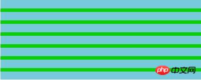
.cont{
width: 500px;
height: 200px;
background: linear-gradient(#78C9DB 70%,#0acf00 0%);
background-size: 100%  20px;
}
Si vous souhaitez définir un dégradé de largeur égale, commencez simplement Changez la valeur et la valeur de fin pour qu'elles soient complémentaires
Si vous avez besoin d'un dégradé de largeur égale et sans transition, définissez simplement les valeurs de début et de fin sur 50%.
Si vous souhaitez des rayures verticales, il vous suffit d'ajuster les valeurs x et y de background-size.
2. Fond à rayures carrelées
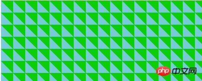
.cont{
width:500px;
height:200px;
background:linear-gradient(45deg,#78C9DB 50%,#0acf00 50%);
background-size:30px 30px;
}
3. >
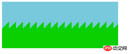
.cont{
width:500px;
height:200px;
background:linear-gradient(-45deg,#0acf00 50%,#78C9DB 50%);
background-size:30px 100%;
}
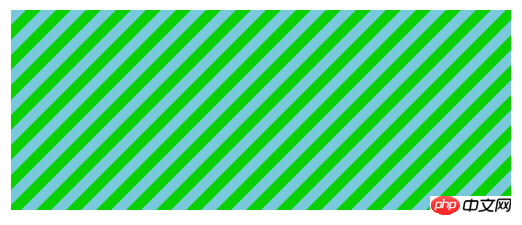
.cont{
width:500px;
height:200px;
background:linear-gradient(-45deg,#0acf00 25%,#78C9DB 0,#78C9DB 50%,#0acf00 0,#0acf00 75%,#78C9DB 0);
/*background:repeating-linear-gradient(-45deg,#0acf00,#0acf00 15px,#78C9DB 0,#78C9DB 30px);*/效果相同
background-size: 30px 30px;
}

.cont{
width:500px;
height:200px;
background:#fff repeating-linear-gradient(30deg,rgba(0,0,0,.5),rgba(0,0,0,.5)15px,transparent 0,transparent 30px);
}
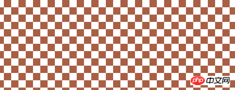
.cont{
width:500px;
height:200px;
background:#fff;
background: linear-gradient(90deg,rgba(100,0,0,.5) 50%,transparent 0),linear-gradient(rgba(100,0,0,.5) 50%,transparent 0);
background-size: 30px 30px;
}
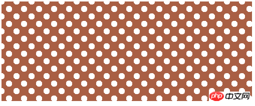
.cont{
margin:50px;
width:500px;
height:200px;
background:#a95f44;
background-image:radial-gradient(#fff 30%,transparent 0),radial-gradient(#fff 30%,transparent 0);
background-size:20px 20px;
background-position:0 0,10px 10px;  // 必须是background-size尺寸的1/2
}
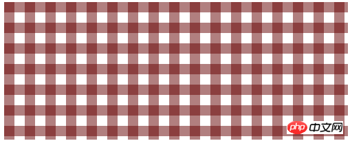
.cont{
width:500px;
height:200px;
background: #fff;
background-image:linear-gradient(45deg,#a95f44  26%,transparent 0,transparent 75%,#a95f44  0),
linear-gradient(45deg,#a95f44  26%,transparent 0,transparent 75%,#a95f44 0);
background-size:30px 30px;
background-position:0 0,15px 15px;
}
Lecture recommandée :
Effet d'invite dynamique CSS3 lorsque la souris se déplace dans l'imageComment utiliser le pied de page autocollant mise en page en CSS
Ce qui précède est le contenu détaillé de. pour plus d'informations, suivez d'autres articles connexes sur le site Web de PHP en chinois!