
Maison >interface Web >tutoriel CSS >CSS3 imitation Alibaba Cloud effet de modèle d'eau partage de code
CSS3 imitation Alibaba Cloud effet de modèle d'eau partage de code

- 小云云original
- 2018-02-23 09:34:081807parcourir
Cet article vous présente principalement les informations pertinentes sur l'exemple de code CSS3 pour imiter l'effet de motif d'eau d'Alibaba Cloud. L'éditeur pense que c'est assez bon, je vais donc le partager avec vous maintenant et le donner comme référence. Suivons l'éditeur pour y jeter un œil, j'espère que cela pourra aider tout le monde.
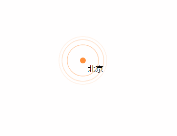
Rendu
Plus de mots, passons au code.
<!DOCTYPE html>
<html>
<head>
    <title>css3 水纹效果</title>
    <style type="text/css">
        .point_area {
            text-align: center;
            position: relative;
            width: 150px;
            height: 150px;
            transition: opacity .5s ease-out;
        }
        .point_area .point {
            position: absolute;
            top: 0;
            left: 0;
            right: 0;
            bottom: 0;
            width: 10px;
            height: 10px;
            margin: auto;
            -webkit-border-radius: 50%;
            -webkit-background-clip: padding-box;
            -moz-border-radius: 50%;
            -moz-background-clip: padding;
            border-radius: 50%;
            background-clip: padding-box;
            background: transparent;
        }
        .point_area .point_dot {
            z-index: 1;
            background-color: #ff903d;
            border: 1px solid rgba(255,144,61,.37);
        }
        .point_area .point_10 {
            width: 100%;
            height: 100%;
        }
        .point_area .point_10:after {
            content: "";
            display: block;
            position: absolute;
            top: 0;
            right: 0;
            bottom: 0;
            left: 0;
            border-radius: 50%;
            border: 2px solid #ff903d;
            opacity: 0;
            -webkit-animation: ripple 4.5s ease-out 225ms infinite;
            animation: ripple 4.5s ease-out 225ms infinite;
        }
        .point_area .point_40 {
            width: 100%;
            height: 100%;
        }
        .point_area .point_40:after {
            content: "";
            display: block;
            position: absolute;
            top: 0;
            right: 0;
            bottom: 0;
            left: 0;
            border-radius: 50%;
            border: 2px solid #ff903d;
            opacity: 0;
            -webkit-animation: ripple 4.5s ease-out .9s infinite;
            animation: ripple 4.5s ease-out .9s infinite;
        }
        .point_area .point_80 {
            width: 100%;
            height: 100%;
        }
        .point_area .point_80:after {
            content: "";
            display: block;
            position: absolute;
            top: 0;
            right: 0;
            bottom: 0;
            left: 0;
            border-radius: 50%;
            border: 2px solid #ff903d;
            opacity: 0;
            -webkit-animation: ripple 4.5s ease-out 1.8s infinite;
            animation: ripple 4.5s ease-out 1.8s infinite;
        }
        @-webkit-keyframes ripple{
            0%{
                opacity:0;-webkit-transform:scale(.1)
            }
            5%{
                opacity:1
            }
            to{
                opacity:0;
                -webkit-transform:scale(1)
            }
        }
        @keyframes ripple{
            0%{
                opacity:0;
                -webkit-transform:scale(.1);
                transform:scale(.1)
            }
            5%{
                opacity:1
            }
            to{
                opacity:0;
                -webkit-transform:scale(1);
                transform:scale(1)
            }
        }
    </style>
</head>
<body style="position: relative;">
    <p class="point_area" style="top: 158px; left: 661px; position: absolute; width: 110px; height: 110px; visibility: visible; opacity: 1;">
        <p class="point_name" style="position: absolute; top: 45px; left: 65px;">北京</p>
        <a href="#" target="_blank" class="point point_dot"></a>
        <p class="point point_10"></p>
        <p class="point point_40"></p>
        <p class="point point_shadow point_80"></p>
    </p>
</body>
</html>
Recommandations associées :
jQuery implémente Click Water Ripple animation_jquery
Ce qui précède est le contenu détaillé de. pour plus d'informations, suivez d'autres articles connexes sur le site Web de PHP en chinois!
Déclaration:
Le contenu de cet article est volontairement contribué par les internautes et les droits d'auteur appartiennent à l'auteur original. Ce site n'assume aucune responsabilité légale correspondante. Si vous trouvez un contenu suspecté de plagiat ou de contrefaçon, veuillez contacter admin@php.cn
Article précédent:6 solutions de centrage horizontal et vertical CSSArticle suivant:6 solutions de centrage horizontal et vertical CSS