
 Software TutorialOffice SoftwareHow to set the graphic outline setting for PPT_How to set the graphic outline setting for PPT
How to set the graphic outline setting for PPT_How to set the graphic outline setting for PPT

1. Open PPT, create a blank slide, and click Insert at the top of the PPT interface. Basically, many things here require clicking and inserting.

2. Find our shape in the inserted toolbar, and then some shapes of your choice will pop up. Let’s just choose a shape to demonstrate here. Do you want to choose a rectangular frame to demonstrate here? Draw it on the interface.

3. After drawing our shape graphic, we click to select the graphic we just talked about, and then click on the shape outline above. An attribute selection box will pop up here, and we can select Color, outline color, or other attributes.

4. Basically everyone is familiar with the above simple operations. Here we talk about our line settings. Here you can see that our lines only have 6 choices, but if you need to choose For others, you need to click on other lines. Generally speaking, the basic 6 types of lines can fully meet our needs.

5. After entering other lines, we can see an attribute selection box on the far right of the interface. If it is not the PowerPoint 2016 version, the location of the attribute selection is different. Here you can choose the line width and line type. There are five types of types you can choose here. In fact, the default is the first solid line.

6. The next step is to set our short line type. This kind of linear is basically rarely used here, but sometimes it can still be used for special requirements, so if you want to use it then, You can just choose according to your needs.

7. Then let’s talk about the link type. For the link type, if the short line type selected above is dotted line or dashed line, then the link type selected here will not be displayed. Effective. There are only three types of links here, namely round, shuttle, and miter. Endpoint types also include square, circular, and flat options.

8. Finally, you can set the endpoint arrow, but this arrow setting cannot be used for closed graphics. So let’s use a straight line as an example. What you can choose here is the shape and size of the arrowhead and the end of the arrow. There are many choices here, so you can choose according to your needs.

The above is the detailed content of How to set the graphic outline setting for PPT_How to set the graphic outline setting for PPT. For more information, please follow other related articles on the PHP Chinese website!

 How to make a pie chart in ExcelApr 27, 2025 am 09:37 AM
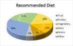
This Excel pie chart tutorial guides you through creating and customizing pie charts. Learn to build effective pie charts, avoiding common pitfalls. Pie charts, also called circular graphs, visually represent proportions of a whole. Each slice repr
 How to create a chart in Excel from multiple sheetsApr 27, 2025 am 09:22 AM
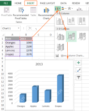
This tutorial shows how to create and modify Excel charts from data across multiple worksheets. Previously, we covered basic charting; this expands on that by addressing the common question of combining data from different sheets. Creating Charts fr
 Why use $ in Excel formula: relative & absolute cell referenceApr 27, 2025 am 09:13 AM
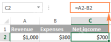
The dollar sign ($) in cell references in Excel formulas often confuses users, but its principle is simple. The dollar sign has only one function in Excel cell references: it tells Excel whether to change the reference when copying a formula to another cell. This tutorial will explain this feature in detail. The importance of Excel cell reference cannot be overemphasized. Understand the difference between absolute, relative, and mixed citations, and you've mastered half of the power of Excel formulas and functions. You may have seen the dollar sign ($) in the Excel formula and want to know what it is. In fact, you can refer to the same cell in four different ways, such as A1, $A
 Excel reference to another sheet or workbook (external reference)Apr 27, 2025 am 09:11 AM
This concise guide demonstrates how to efficiently utilize external references in Excel, enabling seamless data integration across worksheets and workbooks. Learn how to link data for automatic updates and streamline your calculations. When working
 How to make a bar graph in ExcelApr 27, 2025 am 09:08 AM
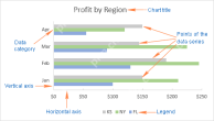
This tutorial shows you how to create and customize bar graphs in Excel, including sorting data automatically. We'll cover creating various bar chart types, adjusting bar width and colors, and handling negative values. Bar graphs, alongside pie char
 How to create formulas in ExcelApr 26, 2025 am 09:47 AM
This tutorial guides you through creating Excel formulas, starting with the basics. You'll learn to build formulas using constants, cell references, defined names, and functions. We'll also explore using the Function Wizard and direct formula entry.
 Circular reference in Excel: how to find, enable, use, or removeApr 26, 2025 am 09:30 AM
This concise guide explains Excel circular references, their pitfalls, and how to manage them. Learn to identify, locate, and eliminate circular references, or, if necessary, how to enable and utilize circular formulas. Encountering a "circula
 Excel 3D reference: refer to the same cell or range in multiple worksheetsApr 26, 2025 am 09:16 AM
This tutorial explains Excel's powerful 3D referencing feature, enabling efficient data manipulation across multiple worksheets. Learn how to reference identical cells or ranges across selected sheets, and build formulas for aggregating data from va


Hot AI Tools

Undresser.AI Undress
AI-powered app for creating realistic nude photos

AI Clothes Remover
Online AI tool for removing clothes from photos.

Undress AI Tool
Undress images for free

Clothoff.io
AI clothes remover

Video Face Swap
Swap faces in any video effortlessly with our completely free AI face swap tool!

Hot Article
Hot Tools

SublimeText3 English version
Recommended: Win version, supports code prompts!

SecLists
SecLists is the ultimate security tester's companion. It is a collection of various types of lists that are frequently used during security assessments, all in one place. SecLists helps make security testing more efficient and productive by conveniently providing all the lists a security tester might need. List types include usernames, passwords, URLs, fuzzing payloads, sensitive data patterns, web shells, and more. The tester can simply pull this repository onto a new test machine and he will have access to every type of list he needs.

Dreamweaver Mac version
Visual web development tools

Notepad++7.3.1
Easy-to-use and free code editor

PhpStorm Mac version
The latest (2018.2.1) professional PHP integrated development tool

