


This Excel pie chart tutorial guides you through creating and customizing pie charts. Learn to build effective pie charts, avoiding common pitfalls.

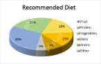
Pie charts, also called circular graphs, visually represent proportions of a whole. Each slice represents a percentage of the total. While popular, they can be misinterpreted due to the difficulty in accurately comparing angles. This tutorial shows you how to create and refine them in Excel.
Creating a pie chart in Excel is straightforward. Proper data organization is key.
1. Prepare your data: Excel pie charts need data in a single column or row, representing one data series. A separate column or row for category names is beneficial for labels and legends. Ideal pie charts have:
- One data series.
- All values greater than zero.
- No empty rows or columns.
- 7-9 data categories maximum (avoid clutter).
Example data:

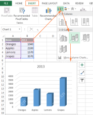
2. Insert the chart: Select your data, go to the "Insert" tab, and choose your desired pie chart type (explained below). This example uses a 2-D pie chart:

Including column/row headings in the selection adds them to the chart title.
3. Choose a style (optional): Explore different styles under the "Design" tab > "Chart Styles" group for visual enhancements.

Pie Chart Types:
- 2-D Pie Chart: The standard and most frequently used type.

- 3-D Pie Chart: Adds depth for a different perspective. Offers 3-D rotation and perspective controls.

- Pie of Pie/Bar of Pie: Useful for charts with numerous small slices. Small slices are displayed on a secondary pie or bar chart. You can manually select which categories to move to the secondary chart using the "Format Data Series" options, specifying a percentage threshold or custom selection.


- Doughnut Chart: Suitable for multiple data series related to the whole. The hole size is customizable via "Format Data Series".

Customizing your Pie Chart:
- Data Labels: Add labels for clarity. Choose label location (inside, outside, etc.) and include category names and values/percentages.


- Exploding Slices: Emphasize individual slices by moving them away from the center. Control explosion amount via "Format Data Series".


- Rotation: Rotate the chart for better visual appeal, especially to bring smaller slices to the front. Use "Format Data Series" to adjust the angle. 3-D charts offer additional rotation controls.


- Sorting: Sort slices by size (largest to smallest) for improved readability. Use a PivotTable for easy sorting without altering source data.


- Color: Change the color theme or individual slice colors for visual appeal and clarity.


- Formatting: Enhance the chart's appearance using shadow, glow, and soft edges under "Format Data Series". Additional formatting options are available on the "Format" tab.


Key Tips:
- Sort slices by size.
- Group or grey out small slices.
- Rotate for optimal viewing.
- Limit data categories (7-9 max).
- Consider direct labeling instead of a legend.
- Use 3-D effects sparingly.
Mastering these techniques will enable you to create clear, informative, and visually appealing pie charts in Excel.
The above is the detailed content of How to make a pie chart in Excel. For more information, please follow other related articles on the PHP Chinese website!

 How to make a pie chart in ExcelApr 27, 2025 am 09:37 AM
This Excel pie chart tutorial guides you through creating and customizing pie charts. Learn to build effective pie charts, avoiding common pitfalls. Pie charts, also called circular graphs, visually represent proportions of a whole. Each slice repr
 How to create a chart in Excel from multiple sheetsApr 27, 2025 am 09:22 AM
This tutorial shows how to create and modify Excel charts from data across multiple worksheets. Previously, we covered basic charting; this expands on that by addressing the common question of combining data from different sheets. Creating Charts fr
 Why use $ in Excel formula: relative & absolute cell referenceApr 27, 2025 am 09:13 AM
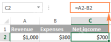
The dollar sign ($) in cell references in Excel formulas often confuses users, but its principle is simple. The dollar sign has only one function in Excel cell references: it tells Excel whether to change the reference when copying a formula to another cell. This tutorial will explain this feature in detail. The importance of Excel cell reference cannot be overemphasized. Understand the difference between absolute, relative, and mixed citations, and you've mastered half of the power of Excel formulas and functions. You may have seen the dollar sign ($) in the Excel formula and want to know what it is. In fact, you can refer to the same cell in four different ways, such as A1, $A
 Excel reference to another sheet or workbook (external reference)Apr 27, 2025 am 09:11 AM
This concise guide demonstrates how to efficiently utilize external references in Excel, enabling seamless data integration across worksheets and workbooks. Learn how to link data for automatic updates and streamline your calculations. When working
 How to make a bar graph in ExcelApr 27, 2025 am 09:08 AM
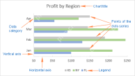
This tutorial shows you how to create and customize bar graphs in Excel, including sorting data automatically. We'll cover creating various bar chart types, adjusting bar width and colors, and handling negative values. Bar graphs, alongside pie char
 How to create formulas in ExcelApr 26, 2025 am 09:47 AM
This tutorial guides you through creating Excel formulas, starting with the basics. You'll learn to build formulas using constants, cell references, defined names, and functions. We'll also explore using the Function Wizard and direct formula entry.
 Circular reference in Excel: how to find, enable, use, or removeApr 26, 2025 am 09:30 AM
This concise guide explains Excel circular references, their pitfalls, and how to manage them. Learn to identify, locate, and eliminate circular references, or, if necessary, how to enable and utilize circular formulas. Encountering a "circula
 Excel 3D reference: refer to the same cell or range in multiple worksheetsApr 26, 2025 am 09:16 AM
This tutorial explains Excel's powerful 3D referencing feature, enabling efficient data manipulation across multiple worksheets. Learn how to reference identical cells or ranges across selected sheets, and build formulas for aggregating data from va


Hot AI Tools

Undresser.AI Undress
AI-powered app for creating realistic nude photos

AI Clothes Remover
Online AI tool for removing clothes from photos.

Undress AI Tool
Undress images for free

Clothoff.io
AI clothes remover

Video Face Swap
Swap faces in any video effortlessly with our completely free AI face swap tool!

Hot Article
Hot Tools

ZendStudio 13.5.1 Mac
Powerful PHP integrated development environment

Notepad++7.3.1
Easy-to-use and free code editor

DVWA
Damn Vulnerable Web App (DVWA) is a PHP/MySQL web application that is very vulnerable. Its main goals are to be an aid for security professionals to test their skills and tools in a legal environment, to help web developers better understand the process of securing web applications, and to help teachers/students teach/learn in a classroom environment Web application security. The goal of DVWA is to practice some of the most common web vulnerabilities through a simple and straightforward interface, with varying degrees of difficulty. Please note that this software

SublimeText3 Mac version
God-level code editing software (SublimeText3)

SublimeText3 English version
Recommended: Win version, supports code prompts!

