 Software Tutorial
 Office Software
 Detailed steps for creating a multi-layered donut chart in Excel
php Xiaobian Zimo will show you how to create a multi-layered donut chart in an Excel spreadsheet. The donut chart is not only beautiful and elegant, but also clearly displays the relationship between data. Through detailed steps, you can easily master the skills of making donut charts, making your data presentation more vivid and interesting.
1. Suppose there is the following data, namely the sales of products 1-5 from January to April.

2. After selecting the data, insert the donut chart through the following path: Top Ribbon - Insert - Chart - Pie Chart - Donut Chart.


3. After selecting the chart, in the [Design] tab, use quick layout to set the format of the donut chart. This time, the last one is used, such as picture.


4. You can set the inner diameter of the ring by selecting the ring. The smaller the inner diameter, the larger the ring. If the inner diameter of the ring is 0, the inner diameter of the ring is 0. The layer is a pie chart with no hollows.

5. Right-click on the chart, add a numeric label, and then cancel showing the value and show the percentage instead.


6. You can also select the legend, right-click to set the format, and cancel the √ in front of [Show the legend, but do not overlap with the chart], so that the circle display range is more widely.

#7. For the separation of rings, only the outermost layer of rings can be separated. When other layers of rings are selected, the separation settings will become gray and cannot be set. In addition, whether to put it into the inner ring or the outer ring depends on the placement order of the sequence.


8. When making a ring through the above method, you can have the following results for reference.


The above is the detailed content of Detailed steps for creating a multi-layered donut chart in Excel. For more information, please follow other related articles on the PHP Chinese website!
 Excel Paste Special: shortcuts to copy values, comments, column width, etc.Apr 17, 2025 am 11:54 AM
This tutorial unlocks the power of Excel's Paste Special feature, showing you how to significantly boost your efficiency with paste special shortcuts. Learn to paste values, formulas, comments, formats, column widths, and more, all while avoiding co
 How to add, copy and delete multiple checkboxes in ExcelApr 17, 2025 am 11:01 AM
This tutorial shows you how to efficiently add, modify, and delete multiple checkboxes in Excel. Last week, we explored using checkboxes for checklists, conditional formatting, interactive reports, and dynamic charts. This week, we'll focus on the
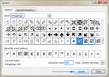
 How to insert a tick symbol (checkmark) in ExcelApr 17, 2025 am 09:53 AM
This tutorial explores six methods for inserting checkmarks in Excel, along with formatting and counting techniques. Excel offers two checkmark types: interactive checkboxes and tick symbols. Checkboxes allow selection/deselection via mouse clicks
 How to calculate age in Excel from birthdayApr 17, 2025 am 09:47 AM
The tutorial shows different ways to get age from birthday in Excel. You will learn a handful of formulas to calculate age as a number of complete years, get exact age in years, months and days at today's date or a particular date. There
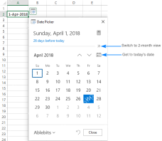
 How to insert calendar in Excel (Date Picker & printable calendar template)Apr 17, 2025 am 09:07 AM
This tutorial demonstrates how to add a drop-down calendar (date picker) to Excel and link it to a cell. It also shows how to quickly create a printable calendar using an Excel template. Data integrity is a major concern in large or shared spreadshe
 Why You Should Always Rename Worksheets in ExcelApr 17, 2025 am 12:56 AM
Improve Excel’s productivity: A guide to efficient naming worksheets This article will guide you on how to effectively name Excel worksheets, improve productivity and enhance accessibility. Clear worksheet names significantly improve navigation, organization, and cross-table references. Why rename Excel worksheets? Using the default "Sheet1", "Sheet2" and other names is inefficient, especially in files containing multiple worksheets. Clearer names like “Dashboard,” “Sales,” and “Forecasts,” give you and others a clear picture of the workbook content and quickly find the worksheets you need. Use descriptive names (such as "Dashboard", "Sales", "Forecast")
 How to archive in Outlook automatically or manuallyApr 16, 2025 am 11:48 AM
This comprehensive guide explains how to effectively manage your Outlook email storage by archiving emails, tasks, and other items across various Outlook versions (365, 2021, 2019, 2016, 2013, and earlier). Learn to configure automatic archiving, pe
 Excel: Compare strings in two cells for matches (case-insensitive or exact)Apr 16, 2025 am 11:26 AM
The tutorial shows how to compare text strings in Excel for case-insensitive and exact match. You will learn a number of formulas to compare two cells by their values, string length, or the number of occurrences of a specific character, a


Hot AI Tools

Undresser.AI Undress
AI-powered app for creating realistic nude photos

AI Clothes Remover
Online AI tool for removing clothes from photos.

Undress AI Tool
Undress images for free

Clothoff.io
AI clothes remover

AI Hentai Generator
Generate AI Hentai for free.

Hot Article

Hot Tools

ZendStudio 13.5.1 Mac
Powerful PHP integrated development environment

Zend Studio 13.0.1
Powerful PHP integrated development environment

EditPlus Chinese cracked version
Small size, syntax highlighting, does not support code prompt function

Safe Exam Browser
Safe Exam Browser is a secure browser environment for taking online exams securely. This software turns any computer into a secure workstation. It controls access to any utility and prevents students from using unauthorized resources.

Dreamweaver CS6
Visual web development tools


