 Software Tutorial
 Office Software
 Detailed steps for making a business-like bullet chart from Excel table data
Detailed steps for making a business-like bullet chart from Excel table data
1. The data usually needed to make bullet charts include different levels of evaluation baselines, target baselines and actual achieved values, as shown in the figure below.

2. Select all the data in the previous step, [Insert - Column Chart - Stacked Column Chart], and you will get the chart shown in Figure 1 below. The data in this chart is reversed in rows and columns. You need to use [Design-Switch Rows/Columns] to get the stacked column chart shown in Figure 2 below.

3. Set the target baseline. The target baseline is achieved by removing the connecting lines from the line chart. Select the data mark in the shape of a horizontal bar for the data mark. As shown in Figure 1 below, first generate a line chart, then select the line chart data, set the style of the data mark (Figure 2), and set the connection to [No Line] (Figure 3).


4. Select the actual achieved data, as shown in Figure 1 below, select the series to draw on the secondary axis, and adjust the classification spacing to 435% to form the basic structure of the bullet chart .

5. Adjust the minimum, maximum value, and scale unit of the secondary vertical axis to be consistent with the main vertical axis. This will basically complete the prototype of the bullet chart. Delete it after the adjustment is completed. The secondary ordinate axis results in the following figure.

6. The subsequent step is the beautification process. You can set the fill colors of different levels to the same color system (for example, the gray and black color system set in this example). The actual data is set to be more eye-catching. The color (such as orange in this example), the target data is set to a striking contrasting color (such as red in this example), and finally the position of the legend is adjusted to above the chart, and the following picture can be obtained after adding a title.

The above is the detailed content of Detailed steps for making a business-like bullet chart from Excel table data. For more information, please follow other related articles on the PHP Chinese website!
 How to Make Your Excel Spreadsheet Accessible to AllApr 18, 2025 am 01:06 AM
Improve the accessibility of Excel tables: A practical guide When creating a Microsoft Excel workbook, be sure to take the necessary steps to make sure everyone has access to it, especially if you plan to share the workbook with others. This guide will share some practical tips to help you achieve this. Use a descriptive worksheet name One way to improve accessibility of Excel workbooks is to change the name of the worksheet. By default, Excel worksheets are named Sheet1, Sheet2, Sheet3, etc. This non-descriptive numbering system will continue when you click " " to add a new worksheet. There are multiple benefits to changing the worksheet name to make it more accurate to describe the worksheet content: carry
 Excel Paste Special: shortcuts to copy values, comments, column width, etc.Apr 17, 2025 am 11:54 AM
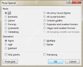
This tutorial unlocks the power of Excel's Paste Special feature, showing you how to significantly boost your efficiency with paste special shortcuts. Learn to paste values, formulas, comments, formats, column widths, and more, all while avoiding co
 How to add, copy and delete multiple checkboxes in ExcelApr 17, 2025 am 11:01 AM
This tutorial shows you how to efficiently add, modify, and delete multiple checkboxes in Excel. Last week, we explored using checkboxes for checklists, conditional formatting, interactive reports, and dynamic charts. This week, we'll focus on the
 How to insert a tick symbol (checkmark) in ExcelApr 17, 2025 am 09:53 AM
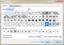
This tutorial explores six methods for inserting checkmarks in Excel, along with formatting and counting techniques. Excel offers two checkmark types: interactive checkboxes and tick symbols. Checkboxes allow selection/deselection via mouse clicks
 How to calculate age in Excel from birthdayApr 17, 2025 am 09:47 AM
The tutorial shows different ways to get age from birthday in Excel. You will learn a handful of formulas to calculate age as a number of complete years, get exact age in years, months and days at today's date or a particular date. There
 How to insert calendar in Excel (Date Picker & printable calendar template)Apr 17, 2025 am 09:07 AM
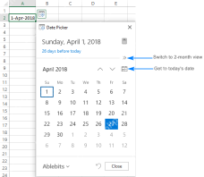
This tutorial demonstrates how to add a drop-down calendar (date picker) to Excel and link it to a cell. It also shows how to quickly create a printable calendar using an Excel template. Data integrity is a major concern in large or shared spreadshe
 Why You Should Always Rename Worksheets in ExcelApr 17, 2025 am 12:56 AM
Improve Excel’s productivity: A guide to efficient naming worksheets This article will guide you on how to effectively name Excel worksheets, improve productivity and enhance accessibility. Clear worksheet names significantly improve navigation, organization, and cross-table references. Why rename Excel worksheets? Using the default "Sheet1", "Sheet2" and other names is inefficient, especially in files containing multiple worksheets. Clearer names like “Dashboard,” “Sales,” and “Forecasts,” give you and others a clear picture of the workbook content and quickly find the worksheets you need. Use descriptive names (such as "Dashboard", "Sales", "Forecast")
 How to archive in Outlook automatically or manuallyApr 16, 2025 am 11:48 AM
This comprehensive guide explains how to effectively manage your Outlook email storage by archiving emails, tasks, and other items across various Outlook versions (365, 2021, 2019, 2016, 2013, and earlier). Learn to configure automatic archiving, pe


Hot AI Tools

Undresser.AI Undress
AI-powered app for creating realistic nude photos

AI Clothes Remover
Online AI tool for removing clothes from photos.

Undress AI Tool
Undress images for free

Clothoff.io
AI clothes remover

AI Hentai Generator
Generate AI Hentai for free.

Hot Article

Hot Tools

MinGW - Minimalist GNU for Windows
This project is in the process of being migrated to osdn.net/projects/mingw, you can continue to follow us there. MinGW: A native Windows port of the GNU Compiler Collection (GCC), freely distributable import libraries and header files for building native Windows applications; includes extensions to the MSVC runtime to support C99 functionality. All MinGW software can run on 64-bit Windows platforms.

Notepad++7.3.1
Easy-to-use and free code editor

WebStorm Mac version
Useful JavaScript development tools

Dreamweaver Mac version
Visual web development tools

SublimeText3 Mac version
God-level code editing software (SublimeText3)


