Steps to create a mixed line and column chart in PPT
php Xiaobian Yuzai will introduce you in detail the steps to create a mixed line and column chart in PPT. In PPT, mixed line and column charts can visually display data change trends, making the presentation more vivid and powerful. First, select the data source and insert the chart, then adjust the chart type to a hybrid chart if necessary. Next, set up the line and column data series, adjust the colors and styles, and finally add data labels and legends to improve the readability of the chart. With a few simple steps, you can create a beautiful and practical mixed line and column chart, making your PPT more attractive and persuasive.
1. Insert the data chart into the PPT and select [Clustered Column Chart] as the type.

2. Enter the source data and use only two columns of data. For example, the first column is monthly data and the second column is monthly cumulative data.

3. To change the chart type of the cumulative data series, click "Change Chart Type" under Chart Tools, click [Combine], select the line chart with data markers for the cumulative data, and check Secondary coordinate axis.

4. After clicking OK, the basic combination graph is obtained.

5. Add column chart and line chart Data labels. And set different colors to show distinction.

6. Further beautify the data chart, delete unnecessary elements, highlight the information, and obtain the final chart.

The above is the detailed content of Steps to create a mixed line and column chart in PPT. For more information, please follow other related articles on the PHP Chinese website!
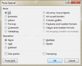
 Excel Paste Special: shortcuts to copy values, comments, column width, etc.Apr 17, 2025 am 11:54 AM
This tutorial unlocks the power of Excel's Paste Special feature, showing you how to significantly boost your efficiency with paste special shortcuts. Learn to paste values, formulas, comments, formats, column widths, and more, all while avoiding co
 How to add, copy and delete multiple checkboxes in ExcelApr 17, 2025 am 11:01 AM
This tutorial shows you how to efficiently add, modify, and delete multiple checkboxes in Excel. Last week, we explored using checkboxes for checklists, conditional formatting, interactive reports, and dynamic charts. This week, we'll focus on the
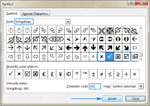
 How to insert a tick symbol (checkmark) in ExcelApr 17, 2025 am 09:53 AM
This tutorial explores six methods for inserting checkmarks in Excel, along with formatting and counting techniques. Excel offers two checkmark types: interactive checkboxes and tick symbols. Checkboxes allow selection/deselection via mouse clicks
 How to calculate age in Excel from birthdayApr 17, 2025 am 09:47 AM
The tutorial shows different ways to get age from birthday in Excel. You will learn a handful of formulas to calculate age as a number of complete years, get exact age in years, months and days at today's date or a particular date. There
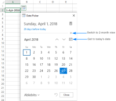
 How to insert calendar in Excel (Date Picker & printable calendar template)Apr 17, 2025 am 09:07 AM
This tutorial demonstrates how to add a drop-down calendar (date picker) to Excel and link it to a cell. It also shows how to quickly create a printable calendar using an Excel template. Data integrity is a major concern in large or shared spreadshe
 Why You Should Always Rename Worksheets in ExcelApr 17, 2025 am 12:56 AM
Improve Excel’s productivity: A guide to efficient naming worksheets This article will guide you on how to effectively name Excel worksheets, improve productivity and enhance accessibility. Clear worksheet names significantly improve navigation, organization, and cross-table references. Why rename Excel worksheets? Using the default "Sheet1", "Sheet2" and other names is inefficient, especially in files containing multiple worksheets. Clearer names like “Dashboard,” “Sales,” and “Forecasts,” give you and others a clear picture of the workbook content and quickly find the worksheets you need. Use descriptive names (such as "Dashboard", "Sales", "Forecast")
 How to archive in Outlook automatically or manuallyApr 16, 2025 am 11:48 AM
This comprehensive guide explains how to effectively manage your Outlook email storage by archiving emails, tasks, and other items across various Outlook versions (365, 2021, 2019, 2016, 2013, and earlier). Learn to configure automatic archiving, pe
 Excel: Compare strings in two cells for matches (case-insensitive or exact)Apr 16, 2025 am 11:26 AM
The tutorial shows how to compare text strings in Excel for case-insensitive and exact match. You will learn a number of formulas to compare two cells by their values, string length, or the number of occurrences of a specific character, a


Hot AI Tools

Undresser.AI Undress
AI-powered app for creating realistic nude photos

AI Clothes Remover
Online AI tool for removing clothes from photos.

Undress AI Tool
Undress images for free

Clothoff.io
AI clothes remover

AI Hentai Generator
Generate AI Hentai for free.

Hot Article

Hot Tools

Notepad++7.3.1
Easy-to-use and free code editor

Atom editor mac version download
The most popular open source editor

SAP NetWeaver Server Adapter for Eclipse
Integrate Eclipse with SAP NetWeaver application server.

SecLists
SecLists is the ultimate security tester's companion. It is a collection of various types of lists that are frequently used during security assessments, all in one place. SecLists helps make security testing more efficient and productive by conveniently providing all the lists a security tester might need. List types include usernames, passwords, URLs, fuzzing payloads, sensitive data patterns, web shells, and more. The tester can simply pull this repository onto a new test machine and he will have access to every type of list he needs.

VSCode Windows 64-bit Download
A free and powerful IDE editor launched by Microsoft


