


php Xiaobian Yuzai will introduce you in detail how to create a pie chart in Excel. A pie chart is a type of chart that visually displays the proportion of data. Making a pie chart in Excel can help you present the data distribution more clearly. In Excel, you can quickly create beautiful and informative pie charts in just a few simple steps, making data analysis easier and more intuitive. Next, let’s learn how to quickly create beautiful pie charts in Excel!
1. First find the insert option in the Excel operation interface.

#2. There is an option to insert a pie chart in the options.

#3. Click on the pie chart to select the type you want. The two-dimensional pie chart chosen here is the most commonly used pie chart.

#4. After selecting, a blank border will appear in your chart.

5. Now click to select data in your pie chart.

#6. Select the data you want to put into the graph and click OK. Here we randomly put in some data for display, and then the pie chart you selected before will display the graphic. In this way, the pie chart has been successfully inserted into the Excel table.

# 7. If you want to see the proportion of each part, it is also very simple. First click on the picture and check the data label.

#8. Now that the proportion of each area has come out, our pie chart is ready.

The above is the detailed content of How to make excel pie chart. For more information, please follow other related articles on the PHP Chinese website!

 How to convert number to text in Excel - 4 quick waysMay 15, 2025 am 10:10 AM
This tutorial shows how to convert numbers to text in Excel 2016, 2013, and 2010. Learn how to do this using Excel's TEXT function and use numbers to strings to specify the format. Learn how to change the format of numbers to text using the Format Cell… and Text to Column options. If you use an Excel spreadsheet to store long or short numbers, you may want to convert them to text one day. There may be different reasons to change the number stored as a number to text. Here is why you might need to have Excel treat the entered number as text instead of numbers: Search by part rather than the whole number. For example, you might want to find all numbers containing 50, such as 501
 How to make a dependent (cascading) drop-down list in ExcelMay 15, 2025 am 09:48 AM
We recently delved into the basics of Excel Data Validation, exploring how to set up a straightforward drop-down list using a comma-separated list, cell range, or named range.In today's session, we'll delve deeper into this functionality, focusing on
 How to create drop down list in Excel: dynamic, editable, searchableMay 15, 2025 am 09:47 AM
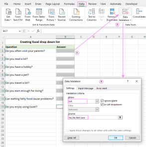
This tutorial shows simple steps to create a drop-down list in Excel: Create from cell ranges, named ranges, Excel tables, other worksheets. You will also learn how to make Excel drop-down menus dynamic, editable, and searchable. Microsoft Excel is good at organizing and analyzing complex data. One of its most useful features is the ability to create drop-down menus that allow users to select items from predefined lists. The drop-down menu allows for faster, more accurate and more consistent data entry. This article will show you several different ways to create drop-down menus in Excel. - Excel drop-down list - How to create dropdown list in Excel - From the scope - From the naming range
 Convert PDF to Excel manually or using online convertersMay 15, 2025 am 09:40 AM
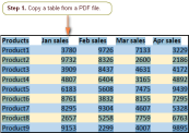
The PDF format, known for its ability to display documents independently of the user's software, hardware, or operating system, has become the standard for electronic file sharing.When requesting information, it's common to receive a well-formatted P
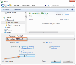 How to convert Excel files to PDFMay 15, 2025 am 09:37 AM
This short tutorial describes 4 possible ways to convert Excel files to PDF - using Excel's Save As feature, Adobe software, online Excel to PDF converter, and desktop tools. Converting an Excel worksheet to a PDF is usually necessary if you want other users to be able to view your data but can't edit it. You may also want to convert Excel spreadsheets to PDF format for use in media toolkits, presentations, and reports, or create a file that all users can open and read even if they don't have Microsoft Excel installed, such as on a tablet or phone. Today, PDF is undoubtedly one of the most popular file formats. According to Google
 How to use SUMIF function in Excel with formula examplesMay 13, 2025 am 10:53 AM
This tutorial explains the Excel SUMIF function in plain English. The main focus is on real-life formula examples with all kinds of criteria including text, numbers, dates, wildcards, blanks and non-blanks. Microsoft Excel has a handful o
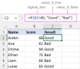 IF function in Excel: formula examples for text, numbers, dates, blanksMay 13, 2025 am 10:50 AM
In this article, you will learn how to build an Excel IF statement for different types of values as well as how to create multiple IF statements. IF is one of the most popular and useful functions in Excel. Generally, you use an IF statem
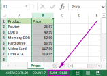 How to sum a column in Excel - 5 easy waysMay 13, 2025 am 09:53 AM
This tutorial shows how to sum a column in Excel 2010 - 2016. Try out 5 different ways to total columns: find the sum of the selected cells on the Status bar, use AutoSum in Excel to sum all or only filtered cells, employ the SUM function


Hot AI Tools

Undresser.AI Undress
AI-powered app for creating realistic nude photos

AI Clothes Remover
Online AI tool for removing clothes from photos.

Undress AI Tool
Undress images for free

Clothoff.io
AI clothes remover

Video Face Swap
Swap faces in any video effortlessly with our completely free AI face swap tool!

Hot Article
Hot Tools

VSCode Windows 64-bit Download
A free and powerful IDE editor launched by Microsoft

Notepad++7.3.1
Easy-to-use and free code editor

SAP NetWeaver Server Adapter for Eclipse
Integrate Eclipse with SAP NetWeaver application server.

SublimeText3 Mac version
God-level code editing software (SublimeText3)

ZendStudio 13.5.1 Mac
Powerful PHP integrated development environment

