


How to beautify the comparison diagram on the PPT data chart page? PHP editor Yuzai teaches you how to make data charts clearer, more vivid, and easier to understand by adjusting color matching, adding animation effects, optimizing layout, etc. Beautifying the data chart page can not only improve the overall quality of the PPT, but also make information transmission more efficient. Next, let us discuss how to make the PPT data chart page comparison diagram more attractive and expressive.

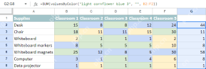
2. [Subtraction (what needs to be removed from the table)] is as shown in the figure.

3. [Addition (the part that needs to be added in the table)] is as shown in the picture.

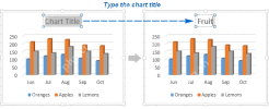
4. The final effect is as shown in the picture.

5. Then open [icon source file-turn off background] [click the ' ' next to it] [turn off unnecessary Elements】.

6. [Right-click - Change chart type - Select columnar column chart] [Fill the column chart with light blue] [Adjust the gap width].

7. Then add a flag to each [country] and then select [Chart-Edit Data-Edit in Excel Data] in [Sort tables in Excel].

8. Then change [China’s bar chart fill to red] and then [Change Title] [Select the table Add wipe animation - Effect Options - By element in series].

9. Then open the [Animation Pane-Select All Elements-Change Time to 0.3-Start-Previous Animation After that - the duration is changed to 0.3s - the background is deleted].

10. Then select [China’s Column Chart] and select [Add Animation-Pulse] [Delete the first four animations-then right-click the last animation and select After the Previous Item].

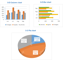
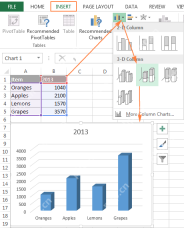
11. The course exercises for this lesson are as shown in the picture.

12. This concludes this lesson.

The above is the detailed content of How to beautify the comparison diagram of PPT data chart page. For more information, please follow other related articles on the PHP Chinese website!

 How to make a chart (graph) in Excel and save it as templateApr 28, 2025 am 09:31 AM
This Excel charting tutorial provides a comprehensive guide to creating and customizing graphs within Microsoft Excel. Learn to visualize data effectively, from basic chart creation to advanced techniques. Everyone uses Excel charts to visualize dat
 Excel charts: add title, customize chart axis, legend and data labelsApr 28, 2025 am 09:18 AM
After you have created a chart in Excel, what's the first thing you usually want to do with it? Make the graph look exactly the way you've pictured it in your mind! In modern versions of Excel, customizing charts is easy and fun. Microsof
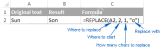 Using Excel REPLACE and SUBSTITUTE functions - formula examplesApr 28, 2025 am 09:16 AM
This tutorial demonstrates the Excel REPLACE and SUBSTITUTE functions with practical examples. Learn how to use REPLACE with text, numbers, and dates, and how to nest multiple REPLACE or SUBSTITUTE functions within a single formula. Last week, we ex
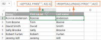 Excel FIND and SEARCH functions with formula examplesApr 28, 2025 am 09:09 AM
This tutorial details the syntax and advanced applications of Excel's FIND and SEARCH functions. Previous articles covered the basic Find and Replace dialog; this expands on using Excel to automatically locate and extract data based on specified cri
 Count & sum cells by color in Google SheetsApr 28, 2025 am 09:04 AM
Google Sheets lacks built-in functions for summarizing data based on cell color. To overcome this, custom functions are provided that consider both font and background colors for basic calculations, enabling color-based summing and counting. These
 How to make a pie chart in ExcelApr 27, 2025 am 09:37 AM
This Excel pie chart tutorial guides you through creating and customizing pie charts. Learn to build effective pie charts, avoiding common pitfalls. Pie charts, also called circular graphs, visually represent proportions of a whole. Each slice repr
 How to create a chart in Excel from multiple sheetsApr 27, 2025 am 09:22 AM
This tutorial shows how to create and modify Excel charts from data across multiple worksheets. Previously, we covered basic charting; this expands on that by addressing the common question of combining data from different sheets. Creating Charts fr
 Why use $ in Excel formula: relative & absolute cell referenceApr 27, 2025 am 09:13 AM
The dollar sign ($) in cell references in Excel formulas often confuses users, but its principle is simple. The dollar sign has only one function in Excel cell references: it tells Excel whether to change the reference when copying a formula to another cell. This tutorial will explain this feature in detail. The importance of Excel cell reference cannot be overemphasized. Understand the difference between absolute, relative, and mixed citations, and you've mastered half of the power of Excel formulas and functions. You may have seen the dollar sign ($) in the Excel formula and want to know what it is. In fact, you can refer to the same cell in four different ways, such as A1, $A


Hot AI Tools

Undresser.AI Undress
AI-powered app for creating realistic nude photos

AI Clothes Remover
Online AI tool for removing clothes from photos.

Undress AI Tool
Undress images for free

Clothoff.io
AI clothes remover

Video Face Swap
Swap faces in any video effortlessly with our completely free AI face swap tool!

Hot Article
Hot Tools

mPDF
mPDF is a PHP library that can generate PDF files from UTF-8 encoded HTML. The original author, Ian Back, wrote mPDF to output PDF files "on the fly" from his website and handle different languages. It is slower than original scripts like HTML2FPDF and produces larger files when using Unicode fonts, but supports CSS styles etc. and has a lot of enhancements. Supports almost all languages, including RTL (Arabic and Hebrew) and CJK (Chinese, Japanese and Korean). Supports nested block-level elements (such as P, DIV),

WebStorm Mac version
Useful JavaScript development tools

SAP NetWeaver Server Adapter for Eclipse
Integrate Eclipse with SAP NetWeaver application server.

Notepad++7.3.1
Easy-to-use and free code editor

VSCode Windows 64-bit Download
A free and powerful IDE editor launched by Microsoft

