


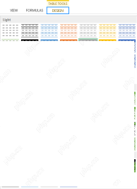
Have you ever put map graphics into excel? Friends who don’t have it, take a look here. It contains some tips on how to use EXCEL functions, such as how to use filtering and adjustment functions. Today I will share with my friends an example of an excel map chart. If you are interested, please come and study it carefully!
Open the Excel software, enter the chart interface, click the insert option, select the three-dimensional map demonstration, and then click New Demonstration. Then drag the order amount field to the height option and follow the icon.

2. Drag [Product] to [Type] and drag [Order Date] to [Time], as shown in the figure.

3. Click [Filter], click [Add Filter] model, and select [Model] to filter, as shown in the figure.

4. [Chart Options] You can adjust [Height] and [Thickness], select [Color], and adjust [Color], as shown in the figure.

5. Click [New Scene], select the [Beijing] location, click [New Scene] again, select the [Wuhan] location, and adjust the [Angle], as shown in the figure Show.

6. Click [Scene Options], adjust the [Effect] circle, and click [Play Demo] to perform a demonstration, as shown in the figure

The above is the detailed content of How to use excel map charts. For more information, please follow other related articles on the PHP Chinese website!

 How to change Excel table styles and remove table formattingApr 19, 2025 am 11:45 AM
This tutorial shows you how to quickly apply, modify, and remove Excel table styles while preserving all table functionalities. Want to make your Excel tables look exactly how you want? Read on! After creating an Excel table, the first step is usual
 Subtotals in Excel: how to insert, use and removeApr 19, 2025 am 10:26 AM
This tutorial shows you how to use Excel's Subtotal feature to efficiently summarize data within groups of cells. Learn how to sum, count, or average, display or hide details, copy only subtotals, and remove subtotals altogether. Large datasets can
 Calculate CAGR in Excel: Compound Annual Growth Rate formulasApr 19, 2025 am 10:25 AM
This tutorial explains the Compound Annual Growth Rate (CAGR) and provides multiple ways to calculate it in Excel. CAGR measures the average annual growth of an investment over a specific period, offering a clearer picture than simple year-to-year g
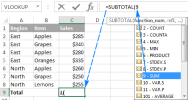 Excel SUBTOTAL function with formula examplesApr 19, 2025 am 09:59 AM
The tutorial explains the specificities of the SUBTOTAL function in Excel and shows how to use Subtotal formulas to summarize data in visible cells. In the previous article, we discussed an automatic way to insert subtotals in Excel by us
 The new Excel IFS function instead of multiple IFApr 19, 2025 am 09:54 AM
This tutorial introduces the Excel IFS function, a streamlined alternative to nested IF statements. It simplifies creating formulas with multiple conditions and improves readability. Available in Excel 365, 2021, and 2019, IFS significantly reduces
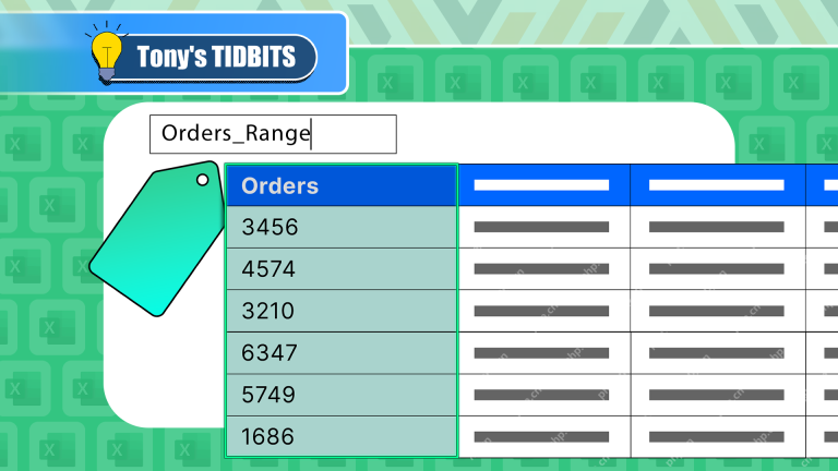 I Always Name Ranges in Excel, and You Should TooApr 19, 2025 am 12:56 AM
Improve Excel efficiency: Make good use of named regions By default, Microsoft Excel cells are named after column-row coordinates, such as A1 or B2. However, you can assign more specific names to a cell or cell range, improving navigation, making formulas clearer, and ultimately saving time. Why always name regions in Excel? You may be familiar with bookmarks in Microsoft Word, which are invisible signposts for the specified locations in your document, and you can jump to where you want at any time. Microsoft Excel has a bit of a unimaginative alternative to this time-saving tool called "names" and is accessible via the name box in the upper left corner of the workbook. Related content #
 Insert checkbox in Excel: create interactive checklist or to-do listApr 18, 2025 am 10:21 AM
This tutorial shows you how to create interactive Excel checklists, to-do lists, reports, and charts using checkboxes. Checkboxes, also known as tick boxes or selection boxes, are small squares you click to select or deselect options. Adding them to
 Excel Advanced Filter – how to create and useApr 18, 2025 am 10:05 AM
This tutorial unveils the power of Excel's Advanced Filter, guiding you through its use in retrieving records based on complex criteria. Unlike the standard AutoFilter, which handles simpler filtering tasks, the Advanced Filter offers precise contro


Hot AI Tools

Undresser.AI Undress
AI-powered app for creating realistic nude photos

AI Clothes Remover
Online AI tool for removing clothes from photos.

Undress AI Tool
Undress images for free

Clothoff.io
AI clothes remover

AI Hentai Generator
Generate AI Hentai for free.

Hot Article
Hot Tools

Notepad++7.3.1
Easy-to-use and free code editor

SublimeText3 Mac version
God-level code editing software (SublimeText3)

Dreamweaver Mac version
Visual web development tools

WebStorm Mac version
Useful JavaScript development tools

Zend Studio 13.0.1
Powerful PHP integrated development environment

