
Home >Web Front-end >H5 Tutorial >How to make time ICON method practice using css_html5 tutorial skills
How to make time ICON method practice using css_html5 tutorial skills

- WBOYWBOYWBOYWBOYWBOYWBOYWBOYWBOYWBOYWBOYWBOYWBOYWBOriginal
- 2016-05-16 15:50:561502browse
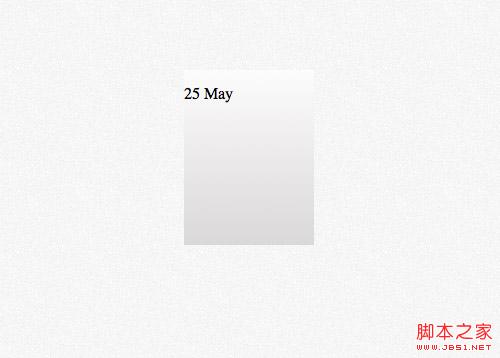
Recently I was redesigning my blog site and decided to use a calendar-style icon to display the time. The previous solution was generally to use background images. Thanks to CSS3, now we can achieve this function using CSS3. I will be using some linear-gradients, border radius and box shadow properties to replace the previous photoshop design.
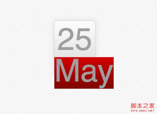
photoshop concept map 
Many designers use the method of designing directly on the browser, but I still prefer to make a photoshop concept map first. . Although many effects can now be achieved directly with CSS, the way to design effects using Photoshop is much simpler than constantly trying to modify CSS to finally achieve the effect you want. 
First create a rounded rectangle and set the rounded corner radius to 10px. Later we will use the border-radius property of CSS to implement it. 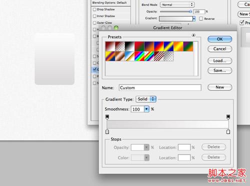
Add a vertical gradient to the rectangle. The gradient color is from #dad8d8 to #fcfcfc. 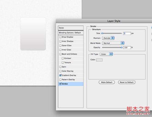
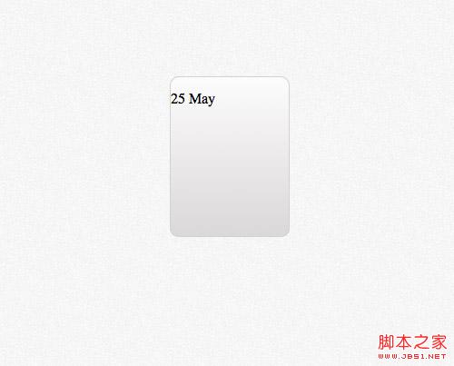
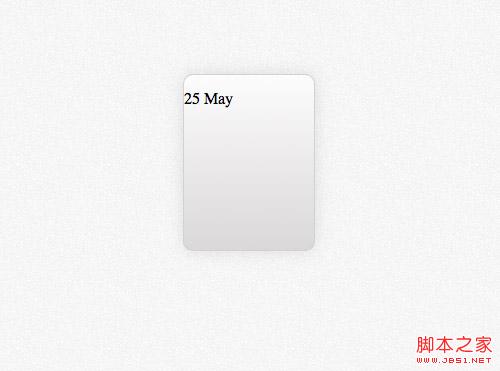
Set a 1 px stroke with the color #e3e3e3 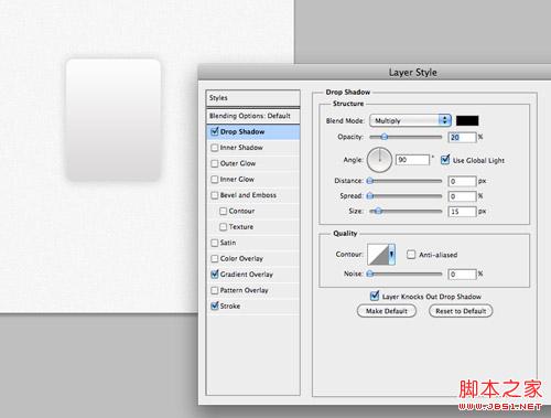
Finally add a downward shadow effect with an opacity of 20%, a distance of 0 px and a distance of 15 px size. These effects will be implemented in css using the box-shadow property. 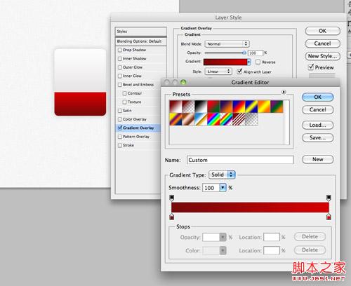
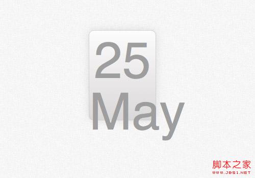
Copy the rectangle just now and remove the upper part. Modify the gradient from #790909 to #d40000 and fill the newly created rectangle where the month information will be placed. 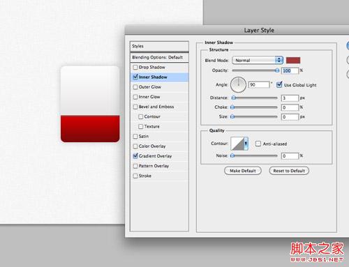
Set an inner shadow to represent the top border, color #a13838, 100% transparency, 3px distance and 0px size. 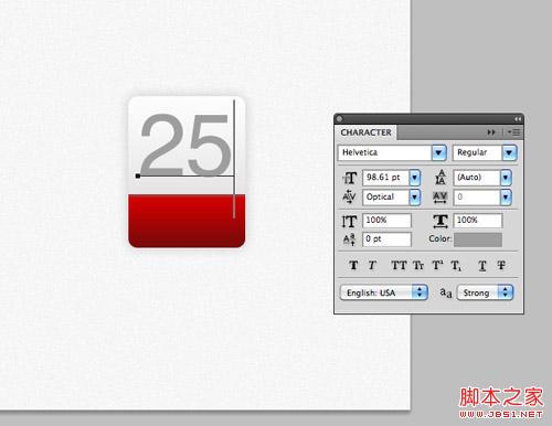
Use photoshop’s font tool to set the font effect for the time content in the upper half of the calendar icon. The font is Helvetica and the color is #9e9e9e. 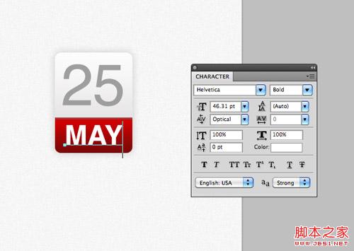
Enter the month information in the red part below, set the font to wide and the color to white. 
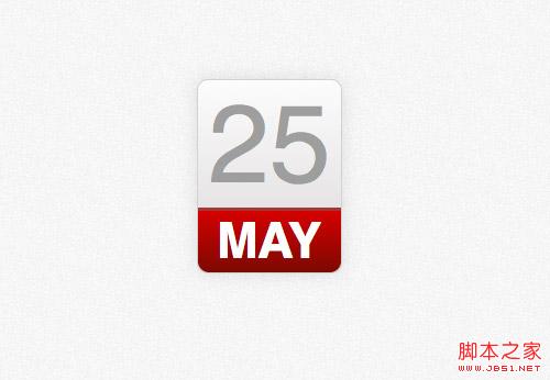
The photoshop model is completed. In the past, we would extract the image as the background and write html numbers on it, but now all of this can be achieved with css.
HTML structure
25 May
< ;/div>
The html of the ICON demo this time is very simple. We will use a div with class 'date' as the container, and then use a p tag to represent the date number. Days and months are represented by characters of different sizes in our design, so we use the tag to treat different elements differently.
css style
.date {
width: 130px; height: 160px;
background: #fcfcfc;
background: linear-gradient(top, #fcfcfc 0%,#dad8d8 100%);
background : -moz-linear-gradient(top, #fcfcfc 0%, #dad8d8 100%);
background: -webkit-linear-gradient(top, #fcfcfc 0%, #dad8d8 100%);
}
The css style first sets the height and width of the entire container, and the gradient effect can be easily achieved through the css gradient.
.date {
width: 130px ; height: 160px;
background: #fcfcfc;
background: linear-gradient(top, #fcfcfc 0%,#dad8d8 100%);
background: -moz-linear-gradient(top, # fcfcfc 0%, #dad8d8 100%);
background: -webkit-linear-gradient(top, #fcfcfc 0%,#dad8d8 100%);
border: 1px solid #d2d2d2;
border- radius: 10px;
-moz-border-radius: 10px;
-webkit-border-radius: 10px;
}
Use the border attribute to achieve the 1px border effect in photoshop, and then use border-radius to achieve the rounded corner effect. Don’t forget to add the -moz- and -webkit- prefixes for compatibility with older browsers.
.date {
width: 130px ; height: 160px;
background: #fcfcfc;
background: linear-gradient(top, #fcfcfc 0%,#dad8d8 100%);
background: -moz-linear-gradient(top, # fcfcfc 0%, #dad8d8 100%);
background: -webkit-linear-gradient(top, #fcfcfc 0%,#dad8d8 100%);
border: 1px solid #d2d2d2;
border- radius: 10px;
-moz-border-radius: 10px;
-webkit-border-radius: 10px;
box-shadow: 0px 0px 15px rgba(0,0,0,0.1);
-moz-box-shadow: 0px 0px 15px rgba(0,0,0,0.1);
-webkit-box-shadow: 0px 0px 15px rgba(0,0,0,0.1);
}
The last part of the code uses box-shadow to achieve the lower shadow effect in photoshop design. Add a horizontal and vertical offset of 0px and a blur of 15px. Use rgba to control transparency. The 105 in the photoshop design is replaced with 0.1 here.
.date p {
font- family: Helvetica, sans-serif;
font-size: 100px; text-align: center; color: #9e9e9e;
}
We use The p tag defines the style and implements the text style definition for the date. The font, text size, and text color are all copied from photoshop, and text-align is set to center. But the style also affects the month text. Next, we will define the span tag style for it separately.
.date p span {
background : #d10000;
background: linear-gradient(top, #d10000 0%, #7a0909 100%);
background: -moz-linear-gradient(top, #d10000 0%, #7a0909 100%) ;
background: -webkit-linear-gradient(top, #d10000 0%, #7a0909 100%);
}
The implementation of the red part is This is achieved by setting the linear-gradient property for the span's background. The red value is also from photoshop.
.date p span {
background : #d10000;
background: linear-gradient(top, #d10000 0%, #7a0909 100%);
background: -moz-linear-gradient(top, #d10000 0%, #7a0909 100%) ;
background: -webkit-linear-gradient(top, #d10000 0%, #7a0909 100%);
font-size: 45px; font-weight: bold; color: #fff; text-transform: uppercase;
display: block;
}
Modify the text style to match the design, set the size to 45px, set it to bold, and color Set to white and use text-transform to achieve uppercase conversion. Set the span tag as a block element so that it matches the size of the container, and set a red background.
.date p span {
background : #d10000;
background: linear-gradient(top, #d10000 0%, #7a0909 100%);
background: -moz-linear-gradient(top, #d10000 0%, #7a0909 100%) ;
background: -webkit-linear-gradient(top, #d10000 0%, #7a0909 100%);
font-size: 45px; font-weight: bold; color: #fff; text-transform: uppercase;
display: block;
border-top: 3px solid #a13838;
border-radius: 0 0 10px 10px;
-moz-border-radius: 0 0 10px 10px;
-webkit-border-radius: 0 0 10px 10px;
padding: 6px 0 6px 0;
}
The rest is to add the header border, using the border-top style, and using the border-radius attribute to implement the two lower rounded corners. A little padding attribute can give some space between the top and bottom of the month text and other elements.
Browser compatibility
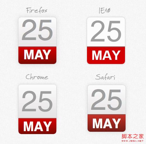
Although the improved properties of css can help us achieve the gradient and shadow effects in photoshop, we still have to face the previous requirements of web designers Facing issues with browser compatibility.
Related articles
See more- AlloyTouch full-screen scrolling plug-in creates a smooth H5 page in 30 seconds
- HTML5 actual combat and analysis of touch events (touchstart, touchmove and touchend)
- Detailed explanation of image drawing examples in HTML5 canvas 9
- Regular expressions and new HTML5 elements
- How to combine NodeJS and HTML5 to drag and drop multiple files to upload to the server