win10 20h2 is the follow-up version of win10 20h1. It has made some interface changes based on the h1 version, and has upgraded the focus assistant. Generally speaking, the editor feels that win1020h2 is more easy to use, but specifically The situation still depends on personal habits. Let’s take a look at their comparative introduction.
Which one is easier to use, win1020h1 or 20h2?
Answer: The editor thinks win1020h2 is better to use, but the specific situation still depends on personal habits.
1. The start menu of win1020h2 is more beautiful, and various theme colors can be set. (If there is a comparison picture below, win1020h1 is on the left and win1020h2 is on the right by default)

2. The computer information of win1020h1 can be viewed in "Properties", while win1020h2 can be viewed in "About" of the settings. "View in ".

3. Win10 20h2 will have a new version of Chromium core Edge browser built-in, replacing the original edge browser.

4. Win10 20h2 has added a refresh rate setting in the display settings.

5. The focus assistant in win10 20h2 can be set to be turned off to avoid disturbing users.

#6. The storage interface of win10 20h2 has stronger detection capabilities and can more intelligently identify some content that needs to be deleted.

The above is the detailed content of Comparison and introduction between win1020h1 and 20h2. For more information, please follow other related articles on the PHP Chinese website!
 win11 activation key permanent 2025Mar 18, 2025 pm 05:57 PM
Article discusses sources for a permanent Windows 11 key valid until 2025, legal issues, and risks of using unofficial keys. Advises caution and legality.
 win11 activation key permanent 2024Mar 18, 2025 pm 05:56 PM
Article discusses reliable sources for permanent Windows 11 activation keys in 2024, legal implications of third-party keys, and risks of using unofficial keys.
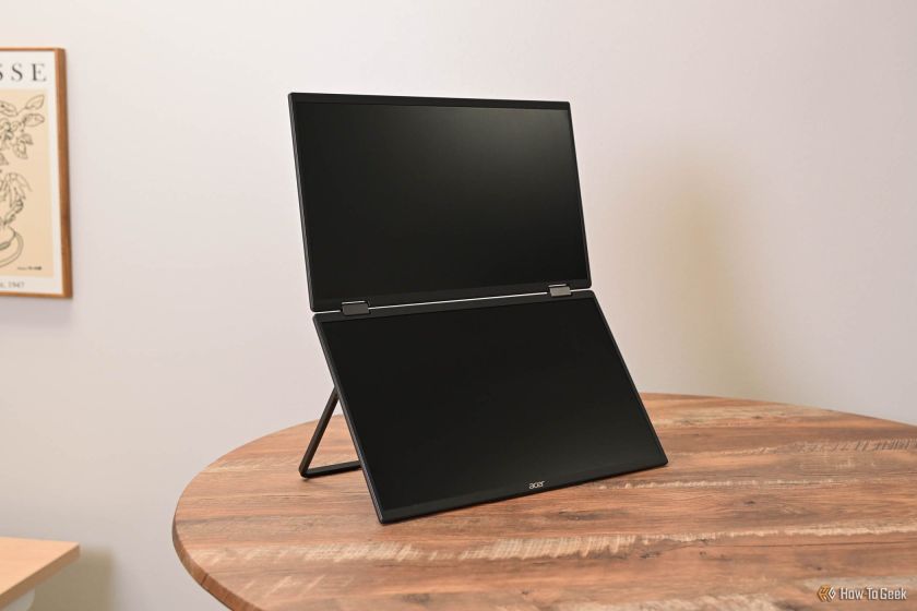 Acer PD163Q Dual Portable Monitor Review: I Really Wanted to Love ThisMar 18, 2025 am 03:04 AM
The Acer PD163Q Dual Portable Monitor: A Connectivity Nightmare I had high hopes for the Acer PD163Q. The concept of dual portable displays, conveniently connecting via a single cable, was incredibly appealing. Unfortunately, this alluring idea quic
 Top 3 Windows 11 Gaming Features That Outshine Windows 10Mar 16, 2025 am 12:17 AM
Upgrade to Windows 11: Enhance Your PC Gaming Experience Windows 11 offers exciting new gaming features that significantly improve your PC gaming experience. This upgrade is worth considering for any PC gamer moving from Windows 10. Auto HDR: Eleva
 Mozilla Thunderbird 136 Is Here, Switching to Monthly Updates by DefaultMar 07, 2025 am 01:19 AM
Firefox 136 and Thunderbird 136: Enhanced Security and Performance The latest releases of Firefox and Thunderbird bring significant improvements in video playback smoothness, browsing security, and overall user experience. Let's delve into the key u
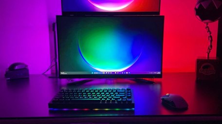 The Best Monitor Light Bars of 2025Mar 08, 2025 am 03:02 AM
Reduce eye strain and brighten your workspace with a monitor light bar! These handy gadgets adjust brightness and color temperature, some even offering auto-dimming. This updated review (03/04/2025) highlights top picks across various needs. BenQ
 How to Create a Dynamic Table of Contents in ExcelMar 24, 2025 am 08:01 AM
A table of contents is a total game-changer when working with large files – it keeps everything organized and easy to navigate. Unfortunately, unlike Word, Microsoft Excel doesn’t have a simple “Table of Contents” button that adds t
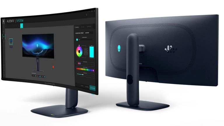 This Wild Ultra-Wide Alienware Monitor is $300 Off TodayMar 13, 2025 pm 12:21 PM
Alienware AW3225QF: The best curved 4K display, is it worth buying? The Alienware AW3225QF is known as the best curved 4K display, and its powerful performance is unquestionable. The fast response time, stunning HDR effects and unlimited contrast, coupled with excellent color performance, are the advantages of this monitor. Although it is mainly aimed at gamers, if you can accept the shortcomings of OLED, it is also suitable for office workers who pursue high efficiency. Widescreen monitors are not only loved by gamers, but also favored by users who value productivity improvement. They are great for work and enhance anyone’s desktop experience. This Alienware monitor is usually expensive, but is currently enjoying it


Hot AI Tools

Undresser.AI Undress
AI-powered app for creating realistic nude photos

AI Clothes Remover
Online AI tool for removing clothes from photos.

Undress AI Tool
Undress images for free

Clothoff.io
AI clothes remover

AI Hentai Generator
Generate AI Hentai for free.

Hot Article

Hot Tools

EditPlus Chinese cracked version
Small size, syntax highlighting, does not support code prompt function

ZendStudio 13.5.1 Mac
Powerful PHP integrated development environment

Safe Exam Browser
Safe Exam Browser is a secure browser environment for taking online exams securely. This software turns any computer into a secure workstation. It controls access to any utility and prevents students from using unauthorized resources.

Dreamweaver Mac version
Visual web development tools

VSCode Windows 64-bit Download
A free and powerful IDE editor launched by Microsoft


