 System Tutorial
 Windows Series
 Reveal the new features and interface design of Microsoft Win11, come and take a look at the interface style!
The win11 conference is getting closer and closer. There have been leaked win11 beta systems before. Compared with win10, it has not changed very much, so it may be just an initial beta system. Recently, there are various win11 systems. The concept map has leaked out, and it seems to be more biased towards the real win11 system. Let’s take a look at it together.
Microsoft win11 new features and new interface exposed
1. Operation center.
1. We can see that the previously leaked win11 operation center is almost the same as win10.

2. The real win11 system may use a split operation center similar to win10X.

2. Volume control
1. According to previous reports, the volume control of win11 will be smaller and have a shorter duration.

3. Settings Panel
1. Similar to the operation center, there is no difference between the current win11 settings panel and win10.

2. The real win11 settings panel may adopt a new design mode like the concept map.

4. Start Menu
1. The currently leaked win11 start menu is a design similar to win10X.

2. The real win11 system should have an obvious left and right classification of functions and programs like the concept map below.

5. File Manager
1. The new resource manager will be based on a smooth design and is more suitable for touch screen use.

6. Dynamic Wallpaper
1. The new dynamic wallpaper function will automatically change day mode and night mode according to the system time.

7. Built-in tools
1. Built-in alarm clock component:

2. Built-in weather Components:

3. Built-in calendar:

The above is the detailed content of Reveal the new features and interface design of Microsoft Win11, come and take a look at the interface style!. For more information, please follow other related articles on the PHP Chinese website!
 With More Expensive PC Hardware, It's Time to be Happy With What You've GotApr 14, 2025 am 06:01 AM
Current market conditions make upgrading computer hardware a costly endeavor. High prices and low supply, driven by factors like tariffs and the massive demand from AI data centers, create a challenging environment for hardware enthusiasts. However
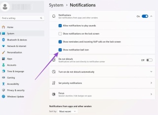 How to Customize Your Windows 11 NotificationsApr 14, 2025 am 04:05 AM
Detailed explanation of Windows 11 notification settings: Create a personalized notification experience Windows 11 integrates the Notification Center into the calendar, and although it takes some time to adapt, the frequency of notifications has not changed. If you are tired of the constantly popping up system updates and useless application notifications, this article will guide you to customize Windows 11 notifications and optimize your workflow. Global notification settings Almost all notification-related options are located in Settings in Windows 11. Step 1: Click the "Start" menu and select "Settings" (or press "Windows I"). Step 2: Select System in the left sidebar. Step 3: Click "Notification" to access all notification options.
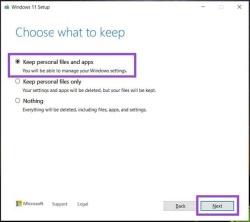 How to Reinstall Windows 11 Without Losing Apps and FilesApr 13, 2025 pm 08:01 PM
Reinstalling Windows 11: Preserve Your Apps and Files A severely corrupted Windows 11 system may necessitate a complete operating system reinstall. While a typical USB/CD installation wipes the OS partition, potentially losing data, this guide demon
 Got an AMD CPU and Aren't Using PBO? You're Missing OutApr 12, 2025 pm 09:02 PM
Unlocking Ryzen's Potential: A Simple Guide to Precision Boost Overdrive (PBO) Overclocking your new PC can seem daunting. While performance gains might feel elusive, leaving potential untapped is even less appealing. Fortunately, AMD Ryzen processo
 Bought a New Gaming PC? Don't Make These Infuriating MistakesApr 12, 2025 am 06:10 AM
Setting up a new gaming PC is thrilling, but even tech experts can make costly mistakes. Here are some common pitfalls to avoid for a smooth gaming experience. 1. Using the Motherboard's Display Output Instead of Your GPU A frequent tech support que
 Microsoft's Next Windows API Change Will Break Some AppsApr 12, 2025 am 06:07 AM
Microsoft's upcoming alteration to the Windows API will render certain applications non-functional. A GitHub search indicates that a limited number of smaller projects utilize the affected maps API, including an openHAB client and an unofficial Poké
 Microsoft 365 Service Outage Locks Family Subscribers Out of Office AppsApr 12, 2025 am 06:06 AM
Microsoft 365 Family service disruption impacts Office suite access. A widespread outage affecting Microsoft 365 Family subscribers has left many unable to access Office applications. Microsoft acknowledges the problem, but a resolution may take se
 5 Windows Settings to Change to Improve Laptop Battery LifeApr 12, 2025 am 06:04 AM
Is your Windows laptop battery draining faster than you'd like? Don't worry, you can significantly extend its life with a few simple tweaks to Windows' built-in power management features. Here's how to maximize your laptop's battery life on a singl


Hot AI Tools

Undresser.AI Undress
AI-powered app for creating realistic nude photos

AI Clothes Remover
Online AI tool for removing clothes from photos.

Undress AI Tool
Undress images for free

Clothoff.io
AI clothes remover

AI Hentai Generator
Generate AI Hentai for free.

Hot Article

Hot Tools

SublimeText3 Chinese version
Chinese version, very easy to use

SublimeText3 Mac version
God-level code editing software (SublimeText3)

SecLists
SecLists is the ultimate security tester's companion. It is a collection of various types of lists that are frequently used during security assessments, all in one place. SecLists helps make security testing more efficient and productive by conveniently providing all the lists a security tester might need. List types include usernames, passwords, URLs, fuzzing payloads, sensitive data patterns, web shells, and more. The tester can simply pull this repository onto a new test machine and he will have access to every type of list he needs.

Dreamweaver Mac version
Visual web development tools

PhpStorm Mac version
The latest (2018.2.1) professional PHP integrated development tool


