
 Web Front-endJS TutorialAn introductory guide to creating CSS3 animations with Move.js_JavaScript
On websites, CSS3 transitions and animations are currently the preferred method for creating lightweight animations. Unfortunately, many developers find their own syntax complex and confusing. If this sounds like you, maybe Move.js is the perfect solution for you. Move.js is a simple JavaScript library for creating CSS3 animations using simple functions. This tutorial will explore the basics of Move.js and provide an online demo.
Basic knowledge
Move.js provides the simplest JavaScript API for creating CSS3 animations. Let's assume we have a div with class box and we want to move the element 100 pixels from the left when the mouse moves over the div. In this case, our code would look like this:
.box {
 -webkit-transition: margin 1s;
 -moz-transition: margin 1s;
 -o-transition: margin 1s;
 transition: margin 1s;
}
.box:hover {
 margin-left: 100px;
}
Using Move.js we can simply call the set() method to achieve the same result, as follows:
move('.box')
 .set('margin-left', 100)
 .end();
Getting Started
First, visit the Move.js GitHub page and download the latest package. Extract and copy the Move.js file to your working directory. Next, include this file in your html page. The completed page should look like this:
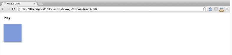
<!DOCTYPE html>
<html>
 <head>
 <title>Move.js Demo</title>
 <link rel="stylesheet" type="text/css" href="styles.css">
 </head>
 <body>
 <a href="#" id="playButton">Play</a>
 <div class="box"></div>
 <script type="text/javascript" src="js/move.js"></script>
 </body>
</html>
We have defined a div element with class box and a link with ID playButton for our demo. Let us create a styles.css file and add the following styles. Note that the following styles are not required for Move.js:
.box {
 margin: 10px;
 width: 100px;
 height: 100px;
 background: #7C9DD4;
 box-shadow: 5px 5px 0px #D1D1D1;
}
#playButton {
 display: block;
 font-size: 20px;
 margin: 20px 10px;
 font-weight: bold;
 color: #222;
 text-decoration: none;
}
Our html page should look like this:
Now, let’s write our first Move.js snippet. We need to attach an onclick event handler to the playButton and move it to the right when clicked. The JavaScript code of the event handler is as follows. This code adds transform:translateX(300px) to the box element:
document.getElementById('playButton').onclick = function(e) {
 move('.box')
 .x(300)
 .end();
};
The complete code after adding the Move.js code is as follows:
HTML
<!DOCTYPE html>
<html>
 <head>
 <title>Move.js Demo</title>
 <link rel="stylesheet" type="text/css" href="styles.css">
 </head>
 <body>
 <a href="#" id="playButton">Play</a>
 <div class="box"></div>
 <script type="text/javascript" src="js/move.js"></script>
 <script type="text/javascript">
  document.getElementById('playButton').onclick = function(e){
  move('.box')
   .x(300)
   .end();
  };
 </script>
 </body>
</html>
CSS
.box {
 margin-left: 10px;
 width: 100px;
 height: 100px;
 background: #7C9DD4;
 box-shadow: 5px 5px 0px #D1D1D1;
}
#playButton {
 display: block;
 font-size: 20px;
 margin: 20px 10px;
 font-weight: bold;
 color: #222;
 text-decoration: none;
}
Move.js method
In the previous demo, we saw the x() method. Now, let us understand the other methods of Move.js.
set(prop, val)
set() method is used to set the css attribute of the element. It takes two parameters: css attribute and attribute value. Example usage:
.set('background-color', '#CCC')
.set('margin-left', 500)
.set('color', '#222')
add(prop, val)
The add() method is used to add its already set attribute value. This method must have a numeric value in order to be used for increments. This method must have two parameters: the attribute value and its increment:
.add('margin-left', 200)
After the previous code snippet is called, 200px will be added to its value.
sub(prop, val)
sub() is the inverse process of add(). It accepts the same two parameters, but its value will be subtracted from the attribute value.
.sub('margin-left', 200)
rotate(deg)
As the name suggests, this method rotates an element by providing a numerical value as a parameter. By attaching to the element's transform property when the method is called. The following code rotates the element 90deg:
.rotate(90)
This code will add the following css to the element:
transform:rotate(90deg)
duration(n)
With this method, you can set the playback time of the animation. For example: The following code moves the element 200px from the left to the right in 2 seconds:
.set('margin-left', 200)
.duration('2s')
Another example, the code below. Move.js will modify the margin attribute of the element, set the background color, and rotate the element 90 degrees within 2 seconds.
.set('margin-left', 200)
.set('background-color', '#CCC')
.rotate(90)
.duration('2s')
translate(x[, y])
Thetranslate() method is used to modify the default position of the element, using the provided coordinates as parameters. If only one parameter is set, it will be used as the x coordinate. If a second parameter is provided, it will be used as the y coordinate:
.translate(200, 400)
x() and y()
The x() method is used to adjust the x coordinate of the element, and the y() method is used to adjust the y coordinate of the element. The parameters of the two methods can be positive or negative, as follows:
.x(300)
.y(-20)
skew(x, y)
skew() is used to adjust an angle relative to the x and y axes. This method can be divided into two methods: skewX(deg) and skewY(deg):
.skew(30, 40)
scale(x, y)
This method is used to enlarge or compress the size of the element. For each value provided, the scale method of transform will be called:
.scale(3, 3)
ease(fn)
If you have used CSS3 transitions, you know that the ease function works on the transition attribute. He specifies the act of transition. Each ease function is in, out, in-out, snap, cubic-bezeir, etc. These functions can be called through the ease() method provided by Move.js. For example:
.ease('in').x(400)
.ease('cubic-bezier(0,1,1,0)').x(400)
end()
该方法用于Move.js代码片段的结束,他标识动画的结束。技术上,该方法触发动画的播放。该方法接受一个可选的callback回掉函数。代码如下:
move('.box')
 .set('background-color', 'red')
 .duration(1000)
 .end(function() {
 alert("Animation Over!");
 });
delay(n)
正如方法所暗示的,该方法提供一个时间的数值作为动画的延时。如下:
move('.box')
 .set('background-color', 'red')
 .delay(1000)
 .end();
then()
该方法是Move.js中一个最重要的函数。他用于分割动画为两个集合,并按顺序执行。如下动画被分为两步,通过then()方法实现分割:
move('.box')
 .set('background-color', 'red')
 .x(500)
 .then()
 .y(400)
 .set('background-color', 'green')
 .end();
## 使用Move.js创建复杂动画 ##
在本教程中,我们已经写了很多基本的 动画来了解各个方法。接下来,我们使用Move.js可以很容易的创建复杂的动画。该demo阐述了Move.js的大部分内容,在demo page
上我们创建了动画的描述,代码如下:
move('.square')
 .to(500, 200)
 .rotate(180)
 .scale(.5)
 .set('background-color', '#FF0551')
 .set('border-color', 'black')
 .duration('3s')
 .skew(50, -10)
 .then()
 .set('opacity', 0)
 .duration('0.3s')
 .scale(0.1)
 .pop()
 .end();
结论
希望本篇教程能带给你关于Move.js是什么的清晰的认识和如何创建CSS3动画。使用Movejs能帮助你在一个地方正确的组织所有的动画代码。在任何时候你想修复一个动画,你就知道他在那里。

 css怎么隐藏元素但不占空间Jun 01, 2022 pm 07:15 PM
两种方法:1、利用display属性,只需给元素添加“display:none;”样式即可。2、利用position和top属性设置元素绝对定位来隐藏元素,只需给元素添加“position:absolute;top:-9999px;”样式。
 原来利用纯CSS也能实现文字轮播与图片轮播!Jun 10, 2022 pm 01:00 PM
怎么制作文字轮播与图片轮播?大家第一想到的是不是利用js,其实利用纯CSS也能实现文字轮播与图片轮播,下面来看看实现方法,希望对大家有所帮助!
 css3什么是自适应布局Jun 02, 2022 pm 12:05 PM
自适应布局又称“响应式布局”,是指可以自动识别屏幕宽度、并做出相应调整的网页布局;这样的网页能够兼容多个不同的终端,而不是为每个终端做一个特定的版本。自适应布局是为解决移动端浏览网页而诞生的,能够为使用不同终端的用户提供很好的用户体验。
 css3如何实现鼠标点击图片放大Apr 25, 2022 pm 04:52 PM
实现方法:1、使用“:active”选择器选中鼠标点击图片的状态;2、使用transform属性和scale()函数实现图片放大效果,语法“img:active {transform: scale(x轴放大倍数,y轴放大倍数);}”。
 css3动画效果有变形吗Apr 28, 2022 pm 02:20 PM
css3中的动画效果有变形;可以利用“animation:动画属性 @keyframes ..{..{transform:变形属性}}”实现变形动画效果,animation属性用于设置动画样式,transform属性用于设置变形样式。
 css3怎么设置动画旋转速度Apr 28, 2022 pm 04:32 PM
在css3中,可以利用“animation-timing-function”属性设置动画旋转速度,该属性用于指定动画将如何完成一个周期,设置动画的速度曲线,语法为“元素{animation-timing-function:速度属性值;}”。
 一文了解CSS3中的新特性 ::target-text 选择器Apr 12, 2022 am 11:24 AM
本篇文章带大家一起深入了解一下CSS3中的新特性::target-text 选择器,聊聊该选择器的作用和使用方法,希望对大家有所帮助!
 css3线性渐变可以实现三角形吗Apr 25, 2022 pm 02:47 PM
css3线性渐变可以实现三角形;只需创建一个45度的线性渐变,设置渐变色为两种固定颜色,一个是三角形的颜色,另一个为透明色即可,语法“linear-gradient(45deg,颜色值,颜色值 50%,透明色 50%,透明色 100%)”。


Hot AI Tools

Undresser.AI Undress
AI-powered app for creating realistic nude photos

AI Clothes Remover
Online AI tool for removing clothes from photos.

Undress AI Tool
Undress images for free

Clothoff.io
AI clothes remover

AI Hentai Generator
Generate AI Hentai for free.

Hot Article
Hot Tools

SublimeText3 Mac version
God-level code editing software (SublimeText3)

SublimeText3 Linux new version
SublimeText3 Linux latest version

SecLists
SecLists is the ultimate security tester's companion. It is a collection of various types of lists that are frequently used during security assessments, all in one place. SecLists helps make security testing more efficient and productive by conveniently providing all the lists a security tester might need. List types include usernames, passwords, URLs, fuzzing payloads, sensitive data patterns, web shells, and more. The tester can simply pull this repository onto a new test machine and he will have access to every type of list he needs.

WebStorm Mac version
Useful JavaScript development tools

SublimeText3 English version
Recommended: Win version, supports code prompts!

