 Technology peripherals
 AI
AI Apple Vision Pro's handling of VR is smarter than expected and may become a future industry standard
(英伟网Nweon October 7, 2023) One of the most interesting things about Vision Pro is how Apple positions its fully immersive features. Apple has always refused to use the term virtual reality and has repeatedly emphasized MR and spatial computing. So many people think that Apple is ignoring VR. But RoartoVR believes that Apple treats VR as a full-screen mode to focus attention, and Apple’s approach is smarter than everyone thinks, and it may stick to it, and may even become a method that the entire industry will adopt in the future.
Vision Pro is a very capable VR headset, but Apple has put a lot of effort into making the default VR mode feel less like you are in VR and more like see-through MR. While it's not yet fully realized, it's clear that in Apple's ideal world, when you first put on the headset, it should feel like nothing around you has changed.
Apple doesn’t want the Vision Pro to take over your real life, at least not all the time. The company has done a lot of work trying to seamlessly blend virtual images into the room around you. When you create floating UI panels, not only are they subtly transparent, but the system even estimates the lighting in the room, casting highlights and shadows on the panels so they appear to literally be floating in front of you.
Vision Pro is a powerful VR headset, there’s no denying that. In the live demonstration, Apple clearly demonstrated that this device is not only capable of providing a fully immersive VR experience, but that VR functionality is at its core. The headset also features a “digital dial” to allow users to easily switch between MR and fully immersive views

Most of the comments surrounding the Vision Pro have focused on the fact that Apple never actually said the term "virtual reality/VR" and that the headset lacks the dedicated controllers that are at the heart of most VR headsets today. It stands to reason that this is because Apple doesn't want the Vision Pro to have anything to do with VR.
As I had more time to think about my experience with the headset, and as I was able to discuss it with the people behind the product after the demo, it dawned on me that Apple doesn't want to avoid fully immersive VR, The company is actually embracing it, just in a way that's essentially the opposite of what we see in most other headsets today. Frankly, I think their approach could be the one that the entire industry adopts going forward

To understand this, let’s think about Meta’s Quest headset. While things may change soon with the release of Quest 3, so far Meta has largely made VR the primary mode of its headset, with see-through AR an optional, occasional mode. : Applications sometimes use this mode, or the user must consciously switch to this mode.
Apple’s approach to Vision Pro is the opposite. They default to see-through AR mode, but haven't neglected fully immersive VR. Instead, Apple sees VR as a way to present content that keeps users focused.
Apple considers VR to be Vision Pro’s “full screen” mode, which simply means you use it intentionally when you want to get rid of other distractions and focus on a specific piece of media.
If you think about it, this is exactly how we use full screen mode on computers and mobile phones today

Not every application on my computer launches in full screen mode and removes my system interface or hides other windows. In fact, that's not how most of the applications on my computer work. Mostly, I want to be able to see my taskbar and desktop, as well as the various windows and controls I use to manipulate data on the screen
But what if I want to go see a movie or play a game? Full screen, full screen every time.
This is because this is the experience we are focused on and we don’t want to be distracted by any other elements. We want to focus, so we eliminate all kinds of clutter and even hide the mouse.
Just like you don’t want every app on your computer to be in full-screen mode, Apple doesn’t think every app on your headset should be like this
Most should follow familiar patterns and share a common interface language. And most don't require full screen (immersive VR mode). In fact, some experiences not only don’t benefit from greater immersion, they actually get worse in certain situations. I don't need a fully immersive environment to view PDFs or spreadsheets. If I want to play chess, I don't need to delete all other windows and data. All of this can still happen, they just don’t need to be my sole focus.
Most applications can (and should) work together seamlessly. But only when we want a "full screen" experience should we allow the app to completely take over and block other content
This is how Apple treats fully immersive VR with Vision Pro. Apple isn't ignoring VR, it just thinks people don't want apps to be "full screen" all the time. When someone wants full screen, they can consciously choose to launch
As for the dial on top of the headset, while some believe this shows that Apple wants to make it faster and easier for people to escape from immersive VR experiences, I think Apple views the dial as a two-way street: it is both a "go to full screen" button , which is also the "Exit full screen" button. This is the same thing we see on most media apps.
Eventually, I think Apple's approach will become the standard for the entire industry. Apple is right: people don't want their apps to always be full-screen. Being fully immersed in something should be optional, not required.
The content that needs to be rewritten is: ---
The content that needs to be rewritten is: Original link: https://news.nweon.com/113504
The above is the detailed content of Apple Vision Pro's handling of VR is smarter than expected and may become a future industry standard. For more information, please follow other related articles on the PHP Chinese website!
 What is Model Context Protocol (MCP)?Mar 03, 2025 pm 07:09 PM
The Model Context Protocol (MCP): A Universal Connector for AI and Data We're all familiar with AI's role in daily coding. Replit, GitHub Copilot, Black Box AI, and Cursor IDE are just a few examples of how AI streamlines our workflows. But imagine
 Building a Local Vision Agent using OmniParser V2 and OmniToolMar 03, 2025 pm 07:08 PM
Microsoft's OmniParser V2 and OmniTool: Revolutionizing GUI Automation with AI Imagine AI that not only understands but also interacts with your Windows 11 interface like a seasoned professional. Microsoft's OmniParser V2 and OmniTool make this a re
 Replit Agent: A Guide With Practical ExamplesMar 04, 2025 am 10:52 AM
Revolutionizing App Development: A Deep Dive into Replit Agent Tired of wrestling with complex development environments and obscure configuration files? Replit Agent aims to simplify the process of transforming ideas into functional apps. This AI-p
 I Tried Vibe Coding with Cursor AI and It's Amazing!Mar 20, 2025 pm 03:34 PM
Vibe coding is reshaping the world of software development by letting us create applications using natural language instead of endless lines of code. Inspired by visionaries like Andrej Karpathy, this innovative approach lets dev
 Runway Act-One Guide: I Filmed Myself to Test ItMar 03, 2025 am 09:42 AM
This blog post shares my experience testing Runway ML's new Act-One animation tool, covering both its web interface and Python API. While promising, my results were less impressive than expected. Want to explore Generative AI? Learn to use LLMs in P
 How to Use YOLO v12 for Object Detection?Mar 22, 2025 am 11:07 AM
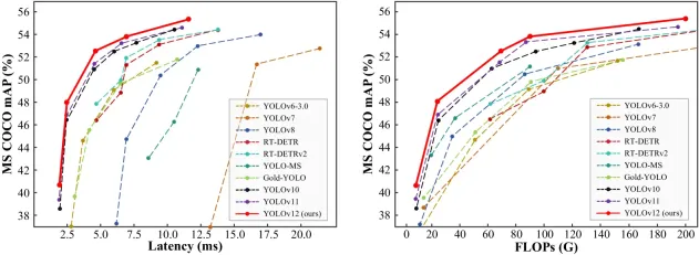
YOLO (You Only Look Once) has been a leading real-time object detection framework, with each iteration improving upon the previous versions. The latest version YOLO v12 introduces advancements that significantly enhance accuracy
 Elon Musk & Sam Altman Clash over $500 Billion Stargate ProjectMar 08, 2025 am 11:15 AM
The $500 billion Stargate AI project, backed by tech giants like OpenAI, SoftBank, Oracle, and Nvidia, and supported by the U.S. government, aims to solidify American AI leadership. This ambitious undertaking promises a future shaped by AI advanceme
 Top 5 GenAI Launches of February 2025: GPT-4.5, Grok-3 & More!Mar 22, 2025 am 10:58 AM
February 2025 has been yet another game-changing month for generative AI, bringing us some of the most anticipated model upgrades and groundbreaking new features. From xAI’s Grok 3 and Anthropic’s Claude 3.7 Sonnet, to OpenAI’s G


Hot AI Tools

Undresser.AI Undress
AI-powered app for creating realistic nude photos

AI Clothes Remover
Online AI tool for removing clothes from photos.

Undress AI Tool
Undress images for free

Clothoff.io
AI clothes remover

AI Hentai Generator
Generate AI Hentai for free.

Hot Article

Hot Tools

WebStorm Mac version
Useful JavaScript development tools

SublimeText3 Mac version
God-level code editing software (SublimeText3)

SublimeText3 Chinese version
Chinese version, very easy to use

Safe Exam Browser
Safe Exam Browser is a secure browser environment for taking online exams securely. This software turns any computer into a secure workstation. It controls access to any utility and prevents students from using unauthorized resources.

Dreamweaver Mac version
Visual web development tools


