Home >Web Front-end >H5 Tutorial >Using jquery to implement HTML5 responsive navigation menu tutorial_html5 tutorial skills
Using jquery to implement HTML5 responsive navigation menu tutorial_html5 tutorial skills
- WBOYWBOYWBOYWBOYWBOYWBOYWBOYWBOYWBOYWBOYWBOYWBOYWBOriginal
- 2016-05-16 15:48:161490browse
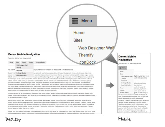
Achieved through jquery html5, when the browser window is reduced or the mobile phone is accessed, the navigation menu becomes a button drop-down menu. Rendering:
HTML code:
<br><div class="msgheader">
<div class="right"><span style="CURSOR: pointer" onclick="copycode(getid('phpcode103'));"><u>复制代码</u></span></div>代码如下:</div><div class="msgborder" id="phpcode103"><nav id="nav-wrap"><br> <ul id="nav">
<br>  <li><a href="#">Button</a></li>
<br>  <li><a href="#">Button</a></li>
<br> </ul>
<br></nav></div>
jQuery code:
The following jquery code will add
View the element through the browser and you can see that the code displayed in html is as follows:
<br><div class="msgheader">
<div class="right"><span style="CURSOR: pointer" onclick="copycode(getid('phpcode105'));"><u>复制代码</u></span></div>代码如下:</div><div class="msgborder" id="phpcode105">
<br><nav id="nav-wrap"><br> <div id="menu-icon">Menu</div>
<br> <ul id="nav">
<br>  <li><a href="#">Button</a></li>
<br>  <li><a href="#">Button</a></li>
<br> </ul>
<br></nav>
</div>
CSS code:
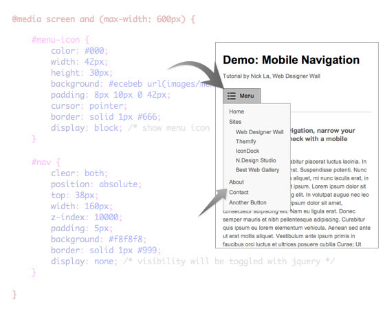
In the css code, you must first set the attribute of #menu-icon to display:none;, then use the media query to judge and then change #menu-icon to display:block;. The following is the key CSS style code , determine the style when the browser width is less than 600px:
For the final effect, please see the first rendering in the article.
Related articles
See more- AlloyTouch full-screen scrolling plug-in creates a smooth H5 page in 30 seconds
- HTML5 actual combat and analysis of touch events (touchstart, touchmove and touchend)
- Detailed explanation of image drawing examples in HTML5 canvas 9
- Regular expressions and new HTML5 elements
- How to combine NodeJS and HTML5 to drag and drop multiple files to upload to the server


