


How to create a cumulative curve graph in Python?

otive graphs graphically represent the cumulative distribution function (CDF) of a set of data, sometimes called a cumulative frequency curve. It is used to examine data distribution and discover patterns and trends. Matplotlib, Pandas, and Numpy are some of the libraries and tools provided by Python for creating otive graphics. In this tutorial, we will look at how to use Matplotlib to generate ogive graphics in Python.
To create a cumulative curve chart, we need to import the required libraries. In this example we will use Matplotlib, Pandas and Numpy. Matplotlib is a popular data visualization library for creating interactive charts and graphs in Python. Numpy, on the other hand, is used to perform complex mathematical operations. Pandas is another widely used Python library specialized for data manipulation and analysis.
grammar
plt.plot(*np.histogram(data, bins), 'o-')
In this syntax, 'data' is the data set used to create the cumulative curve chart. The frequency distribution of the data is determined by the 'np.histogram' function, which also returns the histogram's values and bin boundaries. Use 'plt.plot' to create a cumulative curve plot, using the ' 'o-' ' format string to plot the data points and connect them with lines. The '*' operator then passes the histogram values and bin bounds as separate arguments to 'plt.plot'.
Example
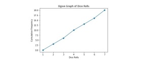
This is a simple example that creates an ogive plot to visualize the cumulative frequency distribution of a list of dice throws.
import numpy as np
import matplotlib.pyplot as plt

# List of dice rolls
rolls = [1, 2, 3, 4, 5, 6, 3, 6, 2, 5, 1, 6, 4, 2, 3, 5, 1, 4, 6, 3]

# Calculate the cumulative frequency
bins = np.arange(0, 8, 1)
freq, bins = np.histogram(rolls, bins=bins)
cumulative_freq = np.cumsum(freq)

# Create the ogive graph
plt.plot(bins[1:], cumulative_freq, '-o')
plt.xlabel('Dice Rolls')
plt.ylabel('Cumulative Frequency')
plt.title('Ogive Graph of Dice Rolls')
plt.show()
First, we created an ogive plot to visualize the cumulative frequency distribution of a set of dice throw results, by importing the necessary modules NumPy and Matplotlib. Then, the code defines a set of dice rolling results and uses NumPy's histogram function to generate a "histogram" of the data, specifying the number of groups and value range of the data. Next, use NumPy’s ‘cumsum’ function to represent the cumulative frequency of the data.
Finally, use Matplotlib's "plot" function to plot the cumulative frequencies as a logarithmic plot, with the upper limit of each bin used as the x-axis, forming an ogive plot. The resulting ogive plot shows the cumulative frequency distribution of dice throws, where the x-axis represents the values rolled and the y-axis represents the cumulative frequency of those values up to a certain point. This graph can be used to analyze the frequency and distribution of dice throws.
Output
Example
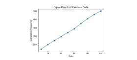
This example demonstrates an ogive plot for visualizing the distribution of 500 random numbers between 0 and 100.
import numpy as np
import matplotlib.pyplot as plt

# Generate random data
data = np.random.randint(0, 100, 500)

# Calculate the cumulative frequency
bins = np.arange(0, 110, 10)
freq, bins = np.histogram(data, bins=bins)
cumulative_freq = np.cumsum(freq)

# Create the ogive graph
plt.plot(bins[1:], cumulative_freq, '-o')
plt.xlabel('Data')
plt.ylabel('Cumulative Frequency')
plt.title('Ogive Graph of Random Data')
plt.show()
In this example, we first use NumPy to generate a data set containing 500 random numbers between 0 and 100. Then use NumPy to calculate the cumulative frequency of the data, and the interval width of each frequency is 10. Finally, use Matplotlib to plot the relationship between the cumulative frequency and the upper limit of each interval to generate an ogive plot. This example demonstrates how to create an ogive plot using Python and randomly generated data.
Output
We learned to use the Matplotlib module to create cumulative curve plots in Python, which is a simple process using the matplotlib library. By loading your data, calculating cumulative frequencies, and plotting the results, you can easily visualize the distribution of your data set and identify any patterns or trends. You can customize your graphics with labels, titles, and styles to make them more visually appealing and informative. Cumulative line graphs are useful tools in statistical analysis and can represent a variety of data, from income distributions to test scores.
The above is the detailed content of How to create a cumulative curve graph in Python?. For more information, please follow other related articles on the PHP Chinese website!

 Python vs. C : Understanding the Key DifferencesApr 21, 2025 am 12:18 AM
Python and C each have their own advantages, and the choice should be based on project requirements. 1) Python is suitable for rapid development and data processing due to its concise syntax and dynamic typing. 2)C is suitable for high performance and system programming due to its static typing and manual memory management.
 Python vs. C : Which Language to Choose for Your Project?Apr 21, 2025 am 12:17 AM
Choosing Python or C depends on project requirements: 1) If you need rapid development, data processing and prototype design, choose Python; 2) If you need high performance, low latency and close hardware control, choose C.
 Reaching Your Python Goals: The Power of 2 Hours DailyApr 20, 2025 am 12:21 AM
By investing 2 hours of Python learning every day, you can effectively improve your programming skills. 1. Learn new knowledge: read documents or watch tutorials. 2. Practice: Write code and complete exercises. 3. Review: Consolidate the content you have learned. 4. Project practice: Apply what you have learned in actual projects. Such a structured learning plan can help you systematically master Python and achieve career goals.
 Maximizing 2 Hours: Effective Python Learning StrategiesApr 20, 2025 am 12:20 AM
Methods to learn Python efficiently within two hours include: 1. Review the basic knowledge and ensure that you are familiar with Python installation and basic syntax; 2. Understand the core concepts of Python, such as variables, lists, functions, etc.; 3. Master basic and advanced usage by using examples; 4. Learn common errors and debugging techniques; 5. Apply performance optimization and best practices, such as using list comprehensions and following the PEP8 style guide.
 Choosing Between Python and C : The Right Language for YouApr 20, 2025 am 12:20 AM
Python is suitable for beginners and data science, and C is suitable for system programming and game development. 1. Python is simple and easy to use, suitable for data science and web development. 2.C provides high performance and control, suitable for game development and system programming. The choice should be based on project needs and personal interests.
 Python vs. C : A Comparative Analysis of Programming LanguagesApr 20, 2025 am 12:14 AM
Python is more suitable for data science and rapid development, while C is more suitable for high performance and system programming. 1. Python syntax is concise and easy to learn, suitable for data processing and scientific computing. 2.C has complex syntax but excellent performance and is often used in game development and system programming.
 2 Hours a Day: The Potential of Python LearningApr 20, 2025 am 12:14 AM
It is feasible to invest two hours a day to learn Python. 1. Learn new knowledge: Learn new concepts in one hour, such as lists and dictionaries. 2. Practice and exercises: Use one hour to perform programming exercises, such as writing small programs. Through reasonable planning and perseverance, you can master the core concepts of Python in a short time.
 Python vs. C : Learning Curves and Ease of UseApr 19, 2025 am 12:20 AM
Python is easier to learn and use, while C is more powerful but complex. 1. Python syntax is concise and suitable for beginners. Dynamic typing and automatic memory management make it easy to use, but may cause runtime errors. 2.C provides low-level control and advanced features, suitable for high-performance applications, but has a high learning threshold and requires manual memory and type safety management.


Hot AI Tools

Undresser.AI Undress
AI-powered app for creating realistic nude photos

AI Clothes Remover
Online AI tool for removing clothes from photos.

Undress AI Tool
Undress images for free

Clothoff.io
AI clothes remover

Video Face Swap
Swap faces in any video effortlessly with our completely free AI face swap tool!

Hot Article
Hot Tools

Notepad++7.3.1
Easy-to-use and free code editor

Dreamweaver Mac version
Visual web development tools

ZendStudio 13.5.1 Mac
Powerful PHP integrated development environment

SAP NetWeaver Server Adapter for Eclipse
Integrate Eclipse with SAP NetWeaver application server.

DVWA
Damn Vulnerable Web App (DVWA) is a PHP/MySQL web application that is very vulnerable. Its main goals are to be an aid for security professionals to test their skills and tools in a legal environment, to help web developers better understand the process of securing web applications, and to help teachers/students teach/learn in a classroom environment Web application security. The goal of DVWA is to practice some of the most common web vulnerabilities through a simple and straightforward interface, with varying degrees of difficulty. Please note that this software

